Graphical User Interface Gallery(toastytech.com) |
Graphical User Interface Gallery(toastytech.com) |
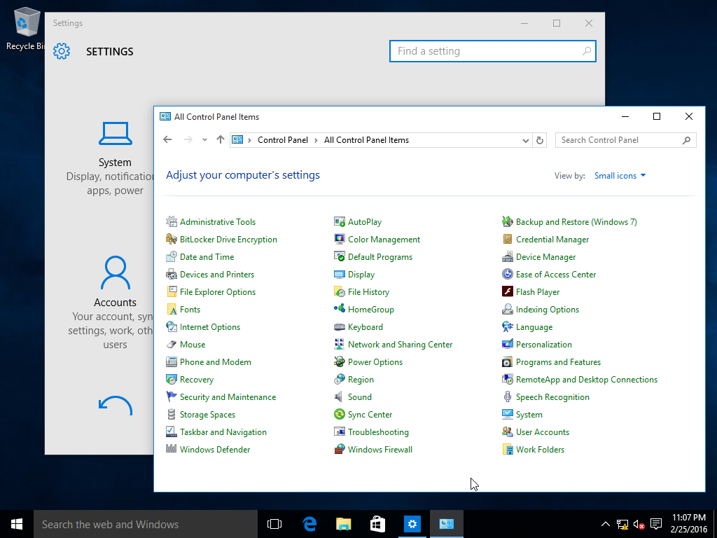
Why? It is the only - and I mean only - list of items on a screen organized horizontally in any OS I can think of. Any time you resize the window, every single item in the list is now reorganized into different rows and columns.
Ever wonder why you can never seem to find what you want in the Control Panel? It's not just because Microsoft loves to subtly change the names of core settings every year or so, but because they're constantly moving and shifting around.
Seriously, give me an example of a horizontally organized list like this in any OS - past, present, desktop, mobile... I can't think of any. Nothing else is so dumb. There must be special code in this particular window to keep it so moronic, that Microsoft continues to maintain, year after year. Amazing.
/rant
That being said I still always use the Search box to find what I'm looking for, despite (because?) having been a Windows users for decades.
I ought to at least feel some nostalgia around all these interfaces, but actually I don't. I just feel like, why on earth did I think Windows 95 was a good thing? Why didn't I see what a huge step backwards it was - at least for a user like me. The beginning of moving away from understanding the machine I was using.
I know too, the Terminal+Browser existence I have now is far from perfect, but I just feel liberated to know I don't need to spend most of my computing time navigating visually - it just doesn't suit me at all. I think the only interface now I feel as negatively about as the Windows-style interface is maybe the filesystem. Not for any rational reason I can explain - I feel like there's something wrong with our whole way of thinking about that. But I'm like a rat in a maze and can't imagine what outside of the maze might look like.
It wasn't perfect but it was amazing I think.
You could even do simple OLE by dragging the icon into another app, instead of a folder.
I so wish other OSes would copy that model.
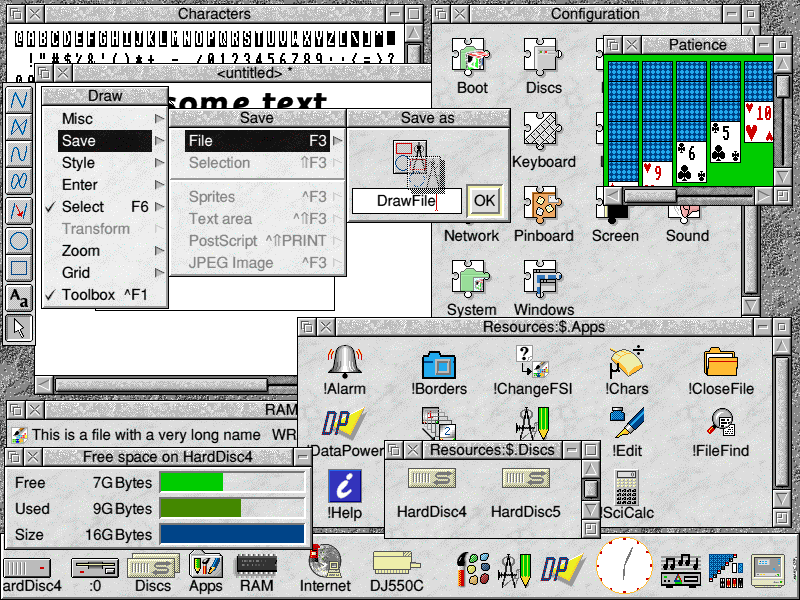
Another I've searched over and over in vain is a GUI I used on graphical terminals connected to a SINIX server. It was called Collage and looked a bit Mac-like.
The Collage GUI, I have no idea. I could never find anything about it.
(whats pretty scary is that I've run (or at least booted) nearly all of them, all the apple and x86/PC ones for sure, plus quite a number of the others). GEOS was pretty cool too.
EDIT: I guess they fixed that. I didn't follow up after I installed some third-party software a while back. I guess it wasn't third-party either, but messing with the themes [0]. I've been chugging along in blissful ignorance ever since. My bad.
[0]https://www.howtogeek.com/222831/how-to-get-colored-window-t...
> First of all, holy shit this is a dark desktop theme.
Most applications (e.g. Explorer, Edge) use windows with bright backgrounds. With such windows open, this is actually an extremely high-contrast desktop theme. Like, "Windows 95 with visual accessibility options enabled" high-contrast.
> Also that search box takes up an annoying amount of space in the task bar.
Large tap target for your finger in tablet mode.
> Like Windows 8, this still shows one long list of all programs, but now it is in one single scrolling column.
Something you flick through... in tablet mode.
> Cortana? What the hell is this? It looks like the mutant offspring of Clippy and GlaDOS!
She's actually the hologram lady from Halo. She loves bees. :)
> First they try and bring back touch screens and now they try to bring back speech recognition. Because we all know how pleasant being in an office full of loud talking idiots is.
Not for office use. Once again, this UI is dual-mode on convertible tablet PCs—which you might use for work in an office (in desktop mode), but then also use for leisure at home (in tablet mode.) It's easier to talk to a tablet than to type on it.
(It's also in part because Windows Phone has speech control, and it's good to have feature-parity, for people who know how to do something on one but not the other. And also also, requiring that everything be hooked up to the speech API makes accessibility a first-class concern for the developers. Apple is way ahead in OS-wide accessibility—and, not coincidentally, was the first to integrate OS-wide speech control.)
> Well, at least it has the usual Windows Explorer. Although those "Ribbon" toolbars are looking more cluttered than ever. Give it up already and put the menu bar back!
Experiment: take a touchscreen tablet PC. Install Windows 98 on it (in a VM, presumably.) Maximize said VM. Try navigating one of the menus with your finger.
(Explorer's ribbon really is cluttered, though, yeah.)
> Reports have it that they use different rendering engines. Perhaps this is to address local applications that are assimilated by IE breaking every time they updated it.
Probably true; at this point I wonder why Microsoft don't rebrand IE to "Legacy LAN browser" and lock it down to only access sites whitelisted via Group Policy.
---
But, in summary, over half of the article's complaints boil down to "I don't see why they did [thing that has no real disadvantages for desktop users] because I have never played with a Surface Pro for even a single minute."
No user isolation on a single-user machine, via type safe languages, was already done in Xerox PARC workstation written in Mesa/Cedar.
Actually had Apple adopted BeOS and succeeded in doing that, there wouldn't be any major UNIX desktop to talk about.
BeOS was awesome as an OS built ground-up for affordable GUI-capable personal computers. It was incredibly responsive and capable at a time when the PC alternatives were Mac OS (crashy), Windows 95 (lots of legacy baggage), and X11R5 on Linux (a clone of a knockoff of a mainframe OS).
IIRC the PARC systems cost $20k or more in today's dollars, and were strongly tied to a single programming language. (I've read about them, but haven't used one.)
(Or we could call W10 a Unix desktop. Is that allowed?)
> "the hope that Apple would purchase or license BeOS as a replacement for its aging Classic Mac OS.[4] Apple CEO Gil Amelio started negotiations to buy Be Inc., but negotiations stalled when Be CEO Jean-Louis Gassée wanted $300 million;[5] Apple was unwilling to offer any more than $125 million. Apple's board of directors decided NeXTSTEP was a better choice and purchased NeXT in 1996 for $429 million, bringing back Apple co-founder Steve Jobs.[6]"
What a different world we'd be in if Jobs had stayed at NeXT.
NeXTStep would have probably closed doors as they were already trying to survive by ditching hardware and selling OpenSTEP instead.
Which Sun played for a while, but decided to not adopt it in the end.
If we had carried through with that metaphor, and kept a 1:1 document:window relationship, we could have evolved a modern OS where a generic WIMP "document" icon was just the representation of a portable, disk-hibernated GUI process holding the memory-state of that document, rather than having a 1:1 mapping to a POSIX-filesystem file containing a custom-serialized representation of said state. (Sure, we could also have those, but maybe only "for interchange." Like how computers have directories/folders locally, but use archive files for interchange.)
Most of the time, when you were done with something, you wouldn't close it; you'd iconify it. Either it'd return to where you previously un-iconified it from; or it'd land on your Desktop; or it'd get stuck to your cursor as if you were dragging, and you'd have to drop it somewhere. It'd be sleeping at first (so, basically a minimized window); and then hibernated later. It'd just be a difference in restore-time: events, like chat-notifications from a chat-client window, would still appear even under hibernation (i.e. background services would still run for hibernated documents, unless you right-clicked and "froze" or "muted" the document or something.)
Imagine if bookmarks were just... iconified browser windows. Or if git repos were iconified IDE/text-editor sessions (which would then contain further icons for things like shell sessions spawned inside the repo.) Or—remember old MacOS?—"folders" would literally be iconified file-manager windows, separate from the underlying file-system concept of a directory (which might not be exposed in the GUI at all.)
In practice, I use search for the configuration option every single time on mac. It's great.
They added back the "active window titlebar color" feature in the 2nd Windows 10 update in late 2015: https://www.howtogeek.com/232176/whats-new-in-windows-10s-fi...
I prefer the styling available in older windows versions, but my title bars have different colours if they're focused or unfocused.