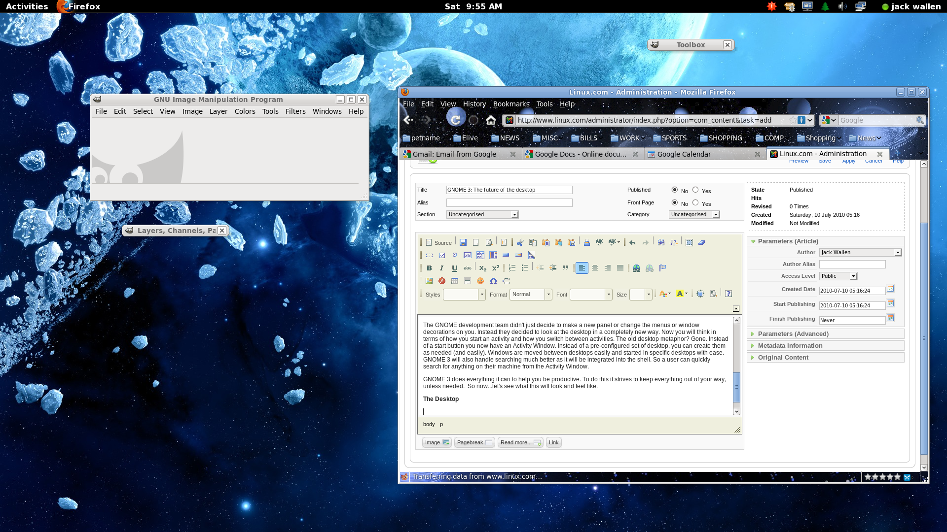
GNOME 3: The Future of the Desktop (linux.com) |
GNOME 3: The Future of the Desktop (linux.com) |
So gnome-shell will require a GPU (should work on the Intel GMA), but have the side effect of not working in virtual machines.
In fewer words: Yes, it has some 3Ds in it. ;-)
I know, I should use a "real" window manager if I need my windows to be tiled, but I feel that tiling is a real feature with a legitimate need that should be built into Gnome.
http://guake.org/ (in most repo's)
Grid:
sudo apt-get install compiz-fusion-plugins-extra
Desktop controls:
* Position and tile a window: Ctrl-Alt-[Numpad]
* Show/Hide console: F12
* Open multiple console tabs: Shift-Ctrl-T
* Change workspace: Super-[leftarrow], Super-[righarrow]
* Start any program, open any file: Alt-F2 or Super-Space (for Gnome-Do)
I think I've irrevocably put myself on the fringe by switching to a tiling window manager, though. Oh well. There's a little more elbow room out here.
I don't want to be a hater, and especially I don't want to disrespect the developers and designers who have put heart and soul in this and probably created some awesome stuff. But hyperbole like this example, and sprinkled elsewhere in the article, really gets my hackles up. I start looking at the pictures skeptically and my inner troll starts growling.
Personally my opinion is that until something fundamental changes in the IO devices or the intelligence level of the thing reading the IO devices, we've long since grabbed the low-hanging fruit and quite a bit of the not-so-low-hanging fruit. And most of the changes I see proposed for IO changes are steps back, not forward. (Like a "true 3D desktop", which is a recipe for getting the user lost in new and exciting ways, not wonderful new interface empowerment.) We've grunted what we can grunt in our point & grunt interfaces, we need either real words or more real language.
(Since people may not know this: When I say "point & grunt", it is not intended as a derogatory term per se. What it is intended to illustrate is that the rate at which we can communicate information with a computer is very limited. Point at your computer screen and pretend your finger is the mouse cursor. You can point at anything you want on the screen. Now, you have 1, 2, 3, or at any rate a small number of mouse buttons. That is, you have a grunt, and a different grunt, and on those sophisticated verbose UNIX systems, a third type of grunt, the point being that your mouse click doesn't carry all that much information. Information in the information-theoretic sense; at full blast, I'm lucky to get 10 bits a second into my computer. Try communicating with your coworkers that way all day, and you'll grow to appreciate the limitations. Computers get a lot of out it since we've had decades to learn how to cleverly prompt the user's grunts in such a way to get the most information out of it, but there's just so much we can pull, no matter how clever we are with our menus and UIs, from pointing & grunting.)
(Though when I go back and reread Kay on this, I'm actually struck by the incredible sophistication he expected of the 12-year-olds, far from "point-and-grunt".)
Actually there is because they are full-resolution images displayed at less than their true resolution (one of my pet peeves):
Firefox: right-click -> "View Image"
Chrome: right-click -> "Open Image in New Tab"
Edit: I now see this comment made multiple times below before the parent comment.
In my world there can be no talk about the future of the desktop unless:
The desktop metaphor and the current filesystem disappears.
My machine starts to monitor what I do and actually use this (The Ghost Protocol)
The machine starts to connect everything I do and build contextual maps automatically. For instance, I receive a picture in my mail and throw it into photoshop. When I then want to retrieve it I can not only look for name.psd but also for the context (Phil send it to me by mail)
Then we can talk about a the future of the desktop.
It's not just GNOME: iPhone, iPad, and Android apps are at their heart the same as activities (the Android API even uses com.android.Activity as the base class for Android apps).
Anybody knows a simple and consistant and complete desktop that I can use when Gnome got screwed?
B.T.W. I expect negative mod points for being viewed as nagger, but it is how I feel about this Gnome route.
Xfce is where I am now thanks to KDE4. If KDE4 and GNOME3 are big boosts to Xfce, I hope Linux desktop developers take the right lesson from that. If they want to keep "revolutionizing" things, they had better give us a good reason to put up with the learning curve and the sudden nosedive in usability and polish.
This, of course, isn't a new feature in GNOME 3, and so I guess it's not really relevant, but I just felt like ranting about the one thing that I think the Linux desktop has always had such a clear lead on, and that until you've used it you don't even know how much it sucks to not have it.
The first is the "task pooper." http://arstechnica.com/open-source/news/2010/02/task-pooper-...
The general idea is that things that pop up in your face are distracting, but notifications are good. Hence, the task pooper. It's a bar of wibbly-wobbly timey-wimey stuff. You drop files and such into time slots on it, and they pop up again at the end (to either disappear into a filing system after a few seconds or be bumped back a few hours). I vaguely remember hearing something about being able to shove application notifications in it. Additionally, it can boil an egg at thirty paces.
The second is Quicksilver/Launchy/Gnome-Do type functionality integrated at the GTK 3 level. http://www.cimitan.com/blog/2009/01/31/do-ifying-gtk-30/
This will never happen, but it would be amazing. No more hunting for arcane menu items in The GIMP; just type "enable indexed color" or whatever. Alas, a strong argument against is would be that it would just encourages sloppy ui design, so I doubt we'll see it any time soon.
[1] http://10gui.com/ and HN discussion here: http://news.ycombinator.com/item?id=877535
ps. Seriously, whomever put together this article for Linux.com is inepxerienced enough to embed 1920x1080 images directly into the page, rather than thumbnails?
For KDE4, Lime Snow Leopard
1> You have a 'widget dashboard'
2> The preferences panel is very similar
3> KDE4 has a features identical to Expose
Probably more, too. All of the other features and ideas have been kicking around KDE/Gnome for years. Having a separate menu bar at the top, for instance - Gnome is set like that by default, which is more similar to Mac OS than the KDE style. Desktop 'Spaces' has been available on Linux for ages, too, while some people see that as feature unique to MacOS (though it's been added to Windows in various ways recently)
There is not really such a huge difference between Mac OS and Windows, even. It adds up to a lot, but as someone who has used scores of DEs and Window managers, they all share features, concepts and traits. They all use the same basic ideas - launcher icons, a desktop, a window tasklist, windows with menu bars, buttons and titles, etc.
I'd been using KDE4 for 6-9 months when I got my first Mac and all I'm saying is, well, I see where inspiration for certain features and design came from.
KDE and Gnome do have great ideas of their own, no doubt. They don't have $300 million worth of support to make KDE as polished as MacOS, though. I wish they did - the design of these DEs is just as good or better than the mainstream systems.
The GNOME people should pay more attention to design, like using better fonts and not drenching the entire screen with dark gray. The next version is just as ugly as the previous ones.
After having written code for 20 years, I want zero responsibility for somebody else's code, and that includes doing updates.
If regressions are somewhat rare then I think I prefer automatic updates, even with the risks.
I've always said that the Gnome team is more interested in adopting good UI paradigms; this seems to pan that out.
I hope there will be an easy shell command to use the activity "find". For instance, activity firefox would start it and activity test.py could show me the activity view with all my files named test.py, etc.
If you need a more conservative distribution, you can try RHEL or Debian, or Ubuntu which is a bit more conservative than Fedora but a lot less conservative than, say, Debian. Linux distributions are about choice, really.
The other reply to your post says this, but doesn't frame it this way: open source does free you from that. You can move to any number of functionally-equivalent distros that made different decisions (from superficial things like GNOME vs KDE, or more fundamental things like how aggressive or conservative they are). Or install your own window manager. These are totally supported use cases.
But in Windows and OS X you're totally stuck.
beyond both having rounded corners? Apart from both having completely crummy file explorers?
Useful? An improvement? Oh heck yes, I like it like that. But this is no future, this is the present, and they're just slightly re-organizing.
Hyperbolic prose, indeed.
> 3. Click the Super key (often referred to as the "Windows" key).
Well, there goes my free unused keyboard shortcut modifier.
Notice one of the most requested features on the Kindle was folders for the user interface. The result they gave us isn't folders, and the actual filesystem is abstracted, but it's effectively the same.
I think the solution is not to destroy the concepts of files and folders, but to become increasingly dependent on tagging and context-sensitive searches. Most DEs have shifted to this approach; there's Spotlight in OS X, whatever that search on the start menu is called in Win7, and various daemons/systems in Linux (Beagle, Nepomuk, etc.). There are third-party utilities too, like Google Desktop Search. As those things improve, and as we see more work to narrow the filesystem concept to only things that are usable to the user and allow automatic tagging of content, usability issues will go away.
I like file systems, I understand them, but I used to program dos interrupts, and actually reading sectors of the drive. But I can understand filesystems, a lot of people don't.
What people want is an all their photos grouped together, all the vides grouped together, all their documents together. They don't understand the different between the desktop, user folder, trash can etc...
It was a shame to not actually see that go anywhere other than the prototype stage.
There need to be more thinking going into non-interaction. Actually having to interact with the computer as much as we do about the things we do, surely can't be the goal in itself.
I want my machine to make plenty of choices for me and present me with information not have me do it manually. I think that is what pisses me off the most right now.
There is something wrong and primitive about normal human beings still having to interact with their machines to get proper information.
Yeah, the last time they tried this it was called Clippy.
http://live.gnome.org/Zeitgeist http://live.gnome.org/GnomeActivityJournal
I'm basically the definitive "doesn't like Macs" user. Mac OS X is moderately better than Windows, but only by a smidgen, in my estimation, and it's certainly not a great UNIX. So, take my rants with a grain of salt.
It's also not clear to me that they actually make people more productive even if they are aware of them and understand them. Of course many nerds feel they are being more productive, but that only indicates that if you wish to sell to nerds, you should include them at least as an option.
If someone knows how to use workspaces and has cause for more than one or two windows over the course of their computer usage, I don't see how they could _not_ make someone more productive.
Anyway, workspaces are definitely something I really, really, miss when I use Windows. I regularly have a couple dozen windows open, often several of the same app but in use for different tasks, and it's kind of a nightmare to keep up with what's where.
Let's face it; distros jumped to KDE4 because they want it to be great someday and they're delivering users to support that dream. GNOME3 looks like more of the same. They're supposed to be delivering software to users, not the other way around.
Plasma might have been inspired by Dashboard, but it may not have been, and it definitely allows things that Dashboard doesn't.
Expose is part of almost all compositing window manager plugin sets of which I am aware. I don't know if OS X was the first to do this, but I don't think it's all too much of a stretch to suppose that it might be useful to see all the windows all at once occasionally.
Spaces is a non-starter; Linux DEs have had them for dozens of years, OS X 10.5 was the first appearance in OS X.
I agree that the preference panel is similar.
KDE 4 also has a huge taskbar and what is essentially a start menu. It uses a very conventional, Windows-like approach, and although it may have cribbed a few features from OS X too, Windows 95 is the dominant paradigm for a default KDE 4 installation.
> It's built on GTK+ but doesn't depend on GNOME.
The fundamental ideas behind a filesystem, packaging all data in a generic container and allowing arbitrary grouping of the containers, are extremely straightforward and intuitive, not to mention incredibly useful.
What throws people for a loop is having to share their filesystem with magic invisible gremlins that leave inscrutable files all over the place. Most filesystems come pre-loaded with mountains of this junk, which the user is made keenly aware of when they are banished to some small niche directory. But the gremlins won't even stay out of the niche; they are constantly creating folders and dumping mysterious config files there, behind the user's back.
The solution to this problem is clear and simple. A filesystem, from the user's perspective, should be empty when it comes out of the box, or at most contain a few items that the user knows exactly what they are. From then and forever, nothing should ever appear in the filesystem except what the user explicitly put there. The user is free to create, move, copy, rename or delete any file without unexpected side-effects.
It seems obvious to me that filesystems should work this way and there would be no big usability issue if they did. The problem is, we have all this old baggage attached to the filesystem, both conceptually and practically, and we are throwing out the baby with the bathwater.
You could filter by name, date, who is in it.
No, this is ludicrous and backwards, for so many reasons. Obviously you want some sort of generic data interchange layer, and voila: filesystem.
I can imagine a filesystem far more sophisticated than what we have today, with metadata, indexing, content handlers, searching, filtering, and so on. But the essential foundation for all of this is a generic package for user data.
Add another entry to the "start learning what you need to to implement this" list, I guess.
The current file systems whether MS or OSX isn't made for the amount of files that the average person deals with today.
A better system would be to allow you to search on multiple axis. But more importantly a better system would follow what you are attempting to do and limit the option space quite significantly.
Would you rather browse around the net in hierarchies or use google to find the files.
File systems like those we have today are fine when you don't have a lot of content. But it simply fails as a design system as soon as we move into terabytes of data.
Why do you think that Spotlight and QuickSilver are so popular on the mac?
Without files, you have no web and no general search. Instead you have photo-net, music-net, video-net, text-net, all orthogonal. Lame.