Evolving the Firefox Brand(blog.mozilla.org) |
Evolving the Firefox Brand(blog.mozilla.org) |
Is it the lack of an arm you don't like, or the fact it's more flat?
Good design is timeless, this is anything but.
Admittedly it doesn’t look terrible tho.
My bigger issue is that the other 9 logos don't use the same design motif beyond the colors.
The browser logo is a "fox" encircling the globe leaving a trail of fire, or speed. This is perfectly fine for a global communications tool named firefox that thinks "purpose meets performance" is it's brand identity.
but if you want to use the same design tools for the same brand identity: you need to focus on things that imply performance which none of them do except maybe a rocket. and you need them to evoke each other which, imagine for a second those were all random colored and on your phone's home screen; what about them is thematically unifying?
Everything which is not recognizably a circular fox-thing is something else.
Hypothesis: marketing people are afraid to continue a brand identity that can go on for decades, because that kind of success means that they don't have a redesign project every three years.
AT&T has been a variation on the Death Star since 1984.
IBM has been horizontally striped initials since 1972.
NBC is a peacock.
McDonald's is golden arches.
Firefox should be a flaming fox chasing its tail.
Marketing people also believe that you can sell anything with a fresh coat of paint. They are trained to sell.
I think the new icons are awful. You don't even see it's Firefox anymore. God I dislike marketing people so much. :(
Are Mozilla's designers simply following the 'debranding' or 'decorporatizing' trend? [1] [2]
[1] https://www.theatlantic.com/business/archive/2016/09/the-age...
Their Mozilla rebrand was fresh. It could be a good idea to start a new brand, and develop the name and shapes together, without the limitations of the existing Firefox brand. With all the design talent surrounding them, they could come up with something stunning.
Remember the moz://a brand change? I wonder if there is any way to measure the benefits of it, except for the paychecks to the designers.
Edit: I realized that it could be another thing. They are signalling they are alive and well. Similar to buying a 200k sport car. See how much money I can afford to do without?
It doesn't matter if the font is outdated. Think if Coca-Cola changed its logo, or the New York Times, or Pininfarina. Okay, that last one was for me. I don't expect most people to know Pininfarina.
Semi-related, Pepsi has made major changes to their logo multiple times, https://www.logaster.com/blog/pepsi-logo/
Coca-Cola's changes have been less dramatic, the font has mostly stayed the same.
I expect that most people would understand what a Pininfarina-esque logo on a car would signify, even if they don't know the name Pininfarina.
[0] https://classicreload.com/test-drive-iii-the-passion.html
(I am currently employed as a designer)
Look back in the history of most major brands, icons and trademarks and the ones that most people would consider classic all seem to come from two or three distinct eras.
The rest can be viewed as "what the hell were they thinking/smoking?", cargo culting the current fashion and much jumping on bandwagons.
as long as it's a fox chasing its tail. That IS Firefox.
But I also know after working with a number of designers, that doing re-branding of a major company is kind of a hallmark event in their careers, and this is the reason we have an evolution of brands.
I do hope they stick to the silhouette though. Apple is still very recognizable after a number of logo changes. It’s still an Apple.
Firefox being that circle makes no sense.
So far I don't see anything which is better that the current logo, though. Those might be fine logos for other projects, but none of the variants offered does a better job of saying "Firefox the browser" than what we have now.
Well, please keep iterating; finding a great logo takes creating a huge lot of variants that don't make it, and a lot of time.
Compared to let's say IBM-who has their logo printed on millions of computers-Firefox being a digital product might make it easier to change the logo.
I did think it harked back well to the old Gecko icon: https://en.wikipedia.org/wiki/Gecko_(software)
Also, Firefox's logo was a Phoenix from 2002 - 2004, did you know that?
84 was shortly after AT&T was forcibly broken up and essentially became a different company.
>>Also, Firefox's logo was a Phoenix from 2002 - 2004
yeah, when it was firebird
It also seems like they're going to have two "main logos"? And incredibly different logos for each flavor of Firefox? I used to work at Mozilla, and it was already confusing enough to explain Mozilla vs Firefox to the average person.
Their current userbase is mostly less-tech-savvy people, and I can't imagine changing the icon is going to go well for Firefox. Much like how it took Firefox a decade to convince people "The Internet" wasn't just IE's "e" logo that came preinstalled, changing their icon is going to hurt way more than it helps.
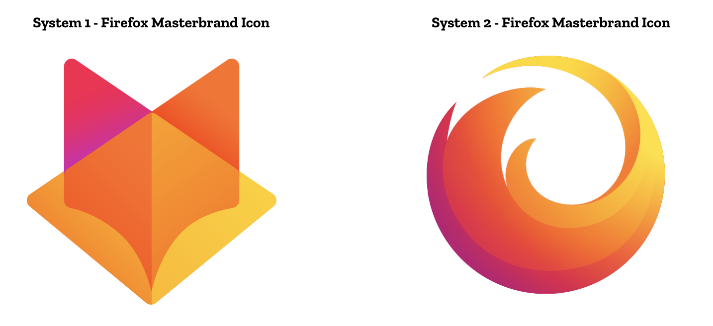
The System 2 Masterbrand Icon is the flag of Phoenix, AZ[2].
Both seem very bland and generic to me. I wanted to like them, I really did, but those are just... extremely unoriginal.
However if we're going to shout plagiarisim, the Phoenix logo is strikingly familiar to the (Rebel) Alliance Starbird which predates it by about 20 years. Given that it was chosen by popular vote, is that surprising? There's also Vauxhall Motors which has a griffin, but looks somewhat similar.
That it (intentionally) looks like an open book or magazine also distinguishes it. I think the dual image illusion (magazine/fox) is clever and it works close up and scaled down.
The Firefox globe is a good logo. Not only is it instantly recognizable, there's a clear connection between the symbolism in the image and "Firefox". I think the globe logo is also suggestive of international connectedness and cooperation - Firefox is something that brings people together.
IMO all the suggested icons represent a change for the worse. Even the one from System 1 most similar to the existing logo reduces the amount of detail and makes it harder to quickly recognize the logo at a glance.
And it's worth adding that both of these proposed design options are great work in isolation; separate from any existing market concerns, these would make for great logo systems.
But the biggest problem for any redesign is that the current Firefox globe is just so damn good. It has been refined numerous times over the past decade but iconographically—when viewed at a small size for short bursts of time—it has barely changed since the original in 2003. Each refinement has simplified the design to a point where further simplification is simply not justifiable for reasons of aesthetics or utility.
Look at the progressive simplification of the QANTAS flying kangaroo logo over the years. [0] The third-most recent logo is utterly iconic and timeless. The second-most recent iteration teetered on the edge of a cliff of oversimplification and gave the kangaroo clown feet. The current logo? The only reason that it isn't an obvious trainwreck, the only reason isn't immediately obvious that they've fallen off the cliff is because it evokes memories of the older logos when the kangaroo actually looked like a kangaroo. They've doubled down on the clown feet and given it a gradient that makes zero sense. The overall shape is so abstract that it might as well be a boomerang-like throwing or slicing implement. But it does look super modern.
[0] http://mascola.com/wp-content/uploads/2016/11/line-up-1200x8...
Maybe it's a bit harsh to lump this blog post in with the stuff I'm complaining about, but it doesn't help having daft phrases like "Do these systems reinforce the speed, safety, reliability, wit, and innovation that Firefox stands for?" (answer: no, they're small images).
I've reached a point where I just abhor marketing in general, and branding is swiftly joining it on the pile at this rate. It was in hindsight a good idea to go back to programming after getting my design degree!
Have you seen a post on here about text editors, tabs v spaces or rust vs C++? Or how about the weekly posts of "we rewrote our CRUD app from FOTM X to FOTM Y and this is why it's awesome" ?
Translation: They want to overload the Firefox name to the point where it's totally meaningless. The success of the Firefox name is no doubt the reason but this fails to recognize that's not how names work. This direction is exactly the reason why Nintendo called their console "WiiU" and that turned out about as well as this ultimately will.
There is absolutely nothing wrong with Firefox being the name of a single product. The entire underlying premise of this redesign is flawed.
"Firefox is where purpose meets performance."
The marketing direction here could not be less inspiring.
Mozilla has tried this a number of times already, and they fail spectacularly every time. I wish they'd just own the fact that they're making a web browser, and focus on making it the best web browser in the world. Not some generic platform.
Purpose meets performance? WTF? It's so generic, it could be the tagline for any automobile, sportswear, or study aid.
But why is this the case? What indicators signify this? Here's a basic test: damage them.
Strip away the colors. Make them entirely flat. Can you still identify them? Do they stand out after you've "damaged" the icon in any regard? It's just not colorblindness: what about to a viewer who sees them as slightly blurred, can you still recognize the brand? If you warp the logo, as if from a wrinkled shirt, can you point out whose brand it is?
What about on the worn surface of a sticker on someone's MacBook? Someone getting acetone on some branding materials?
Think about the branding of companies from the S&P500, when the light hits cutouts of their icons, can you identify them from the shadows?
https://www.slideshare.net/tblogosphere/pepsi-gravitational-...
https://www.cbsnews.com/news/pepsis-nonsensical-logo-redesig...
Firefox the brand is fine. Someone needs to fire all these "business" people at Mozilla.
The rest of the organization consists of deadweight: making deals with MrRobot, playing with adware, screwing up logos and testing silly IoT ideas.
Wileyfox logo: https://www.androidcentral.com/sites/androidcentral.com/file...
Bit similar?
I like the other icons that carry forward the Firefox color scheme to other shapes (system 1, row 2), that still feels firefox-y without being Firefox, and would be a good look for firefox affiliated products. When you get down to the third row of system one, or the "master brand" icon, it loses both the recognizable shape and the recognizable color scheme of the Firefox brand.
System #2 is just a mess. I don't even know what they're going for there.
Is the Mozilla organization infiltrated by saboteurs? I imagine a lot of governments and corporations will be much happier when the last trully free browser dies. Please fire those people.
Look at the images at the bottom. Look at that hip guy wearing D&G sunglasses and a hip, obviously photoshopped, firefox t-shirt. What is that? Is moz://a making a web browser or a new fashion line? Did Mugatu make this post?
I liked it better when corporations kept their masterbranding habits private.
Really? I thought it was the complete opposite, as it's the free software browser (chromium/chrome aren't really free in spirit because they are too closely related to Google), and the standard browser on Linux.
Maybe GitLab should just borrow the idea before Mozilla finalizes it... I mean, not really, but it would be pretty great if they did.
Interesting. I wasn't familiar with the GitLab logo, and immediately thought MetaMask.
I think foxes just make for really cool logos.
The logos aren't very impressive, but most people will just see the Firefox Quantum logo, and that looks largely the same, if bland and uninspired.
This is the original Mozilla logo, from the Netscape era.[1] That Godzilla takeoff was worse.
[1] https://www.i-programmer.info/images/stories/prof/iprogramme...
Moreso than explaining google vs chrome, or ms vs edge/ie?
Clearly everything that was before is now terrible, our new icons resemble the very essence of our business/existence/the human condition, and we will deign to allow you to experience it. Bonus points if they fit "growing the brand" in there somewhere!
Wait, when did techies learn to do that?
Though that in itself is a useful skill at parties:
Scenario 1: Talk about computers, person gets bored and goes away. Success! You avoided having to talk to people.
Scenario 2: Talk about computers, person is really excited to talk about computers. Success! You found a fellow dork.
(I’m an infrequent observer though, I’m sure a planespotter can chime in with more precise info.)
Those people got switched to chrome in the meantime (most of these 2000 era computers are long dead now). Actually replacing these machines with Chromebboks is a often heard advice now.
Since a year or two Firefox was actually good while Chrome stagnated, and use cases for multiple browsers also flourished (ex: keeping a “facebook browser”, or splitting google accounts between browsers). I’d expect heavy computer users to be more sensible to these merits.
> Talk about computers, person gets bored and goes away.
Ah, yes, that sounds more familiar!
[1] https://en.wikipedia.org/wiki/History_of_Firefox#Phoenix_0.1...
It definitely feels like an overcorrection right now - many designers will surely be amongst the first to go in the next recession.
(As far as fields other than tech, they’re all completely different stories regarding their relationship to visual design)
That is the biggest problem with the current "designer" bubble.
Yeah, so they rebranded. That's what I'm saying.
The other have is removing functionality like the user customization of XUL and jetpack style extensions (killing off a giant ecosystem that has yet to recover). And there's also the anti-freedom (pro-security) changes like the removal of the ability to install (or modify) your own extensions without Mozilla's approval and signing. And no, using a beta (developer/etc) manually installed does not count.
Extensions are still limited in countless little ways many months after the Quantum release. Every one of them makes the browser a bit worse than it was before. The claims about making extensions safer and more reliable have proven to be optimistic, with a string of problems around both instability and privacy since the big change.
More generally, I come across sites that don't work properly with Firefox several times a week these days. Chrome is the new "This site displays best at 800x600 in Netscape Navigator" and Firefox's market share has fallen so low that a lot of web developers simply don't test with it properly any more. Maybe this isn't Mozilla's fault, but realistically it is still their problem.
As for speed, while some people seem to find Quantum a big improvement in speed, it hasn't made Firefox noticeably faster than other major browsers for most day-to-day use.
I want to like Firefox. It was my primary browser for years, thanks to a combination of flexibility through add-ons, being relatively good for privacy and security, and having relatively good developer tools (all of these being somewhat related). But as someone who uses all the major browsers professionally, I can only assume that the leadership at Mozilla have chosen a strategy of trying to out-Chrome Chrome, and that is going about as well as anyone more objective might expect while still giving up almost everything that was a natural strength for Firefox before.
Which is what makes it weird, since a firefox is a type of panda.
“Red pandas were once thought to be closely related to the giant panda, but genetics has shown they are more closely allied with the raccoon and weasel families. They are secretive and gentle creatures, spending most of the day sleeping curled up with their tail wrapped around their head.”
The Firefox logo depicts a fox not the Red Panda (but everyone knows that). The project was supposed to be called Firebird, but another open source project had already taken up that name.
Don't forget to dimensionalize exponentially, kids!
This is in "so bad it is good" territory - sharing it with my design team tomorrow morning.
When we got a copy of this proposal, we thought that either Arnell had lost his mind, the entire agency was poisoned with a noxious gas, or it was a joke.
Amazing.
And Pepsi actually chose that logo!
> dumbiest
Same with thunderbird mail client. I iconic logo and a brand that would make an imprint.
I guess I always had a thing for animals. That’s what Ubuntu was my favorite distro. The names - Breezy Badger, Warty Warthog e.t.c
Animals evoke an emotion, they represent something.
I appreciate thoughtful design, but IMO the frequency of redesigns of Mozilla branding/subbranding/websites/subdomains only communicates a sense of vanity at this point. The visual schizophrenia between trustworthy software developer and NGO doesn't help.
[1] https://www.underconsideration.com/brandnew/archives/new_log...
Sick of seeing companies be so skittish with the boldness of their branding. These new designs look like more late-2010's-era hot garbage.
Mozilla's logo isn't changing. They want to add a new logo for Firefox, as a brand family. So the Fox-head logo would be used to identify the Firefox family of products, which they're saying they are going to grow.
You end up with a hierarchy like: Mozilla -> Firefox -> Firefox Quantum/Focus/<insert new product here>
> Each system leads with a new Firefox masterbrand icon — an umbrella under which our product lines will live.
It's a logo for the "Firefox ecosystem", not for Mozilla.