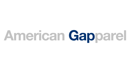
Dear Gap, I have your new logo.(weblog.muledesign.com) |
Dear Gap, I have your new logo.(weblog.muledesign.com) |
This seems like classic game theory. While it's in the design industry's collective best interest to never work on spec like this, it might be in an individual designer's best interest to design Gap's logo for free. And even if it's not, if most of them think it is, you've still lost. Believe me, I understand that Gap's move here is a slap in the face, but many designers out there will do it anyway, just for the chance to say they designed Gap's logo.
I think music and journalists (designers being grouped with journalists) are vastly different situations because of copyright law, yes. The law allowed a huge industry to grow around information asymmetry, hype, and price inflation. Journalism and graphic design seek (and work) very hard to produce things of value far greater than bloggers/crowdsource usually aspire to.
That said, blogging/crowdsource have and will continue to put a great deal of pressure on those performing at the highest levels in those fields. It's simply my hope that the top performers there will justify themselves while producing perhaps a new era of relevant work. Increased competition doesn't always involve complete steamrolling, just evolution.
(In fact, one evolution I could see happening is a design firm outsourcing some percentage of their own mock work to crowdsource sites. Prototypes are about instantiating the field of possibilities so you can learn about them and talk about them. I wouldn't be surprised if it doesn't hurt them too much to not personally generate each and every one. The real value thus becomes their professional finishing touches, the market research, etc.)
I don't think it's surprising that many people dislike the idea.
Or are you suggesting gap crowdsourced their identity requirements .. ?
For a comparison, check out this post from an old/ex-pro cover band rocker. Title of the thread was "Who is responsible for bands making peanuts?"
http://acapella.harmony-central.com/showpost.php?p=40701817&...
Crowdsourcing isn't democratising design - it's reducing the importance of good design .. in much the same way that bad acting increases our tolerance for poor quality soap operas.
Good design is clear thinking, made visual. Good design solves problems and it follows conventions which take time to understand.
The problem with gap is they went away from who they are and they're trying to sell an untrue story. Using a minimalist font like American Apparel as an attempt to be "hip" is clearly bullshit to everyone. But again it has nothing to do with the tool, rather its about the concept and thought behind the graphic and that is where Gap has slipped.
i've got a venture-backed business opportunity. we're looking for a strong application developer, and have heard good things about you, but not sure you can take on this task. we'll send along the technical and functional requirements, and it looks pretty easy. it shouldn't take more than a week of your time. after you sign our nda, we'll take a look at the application you built. if it's good, we'll pay you around a thousand dollars, maybe up to $10k.
unfortunately, we're not looking for any more founders, and don't need any support beyond the first production release. this will be a one time engagement, and we'll part ways after.
sound fair?
(read: how spec work would translate to the developer world. to me, it doesn't seem fair or reasonable -- especially if you're looking for a professional deliverable.)
People play the lottery - but I wouldn't argue it's in their best interests to do so.
And, as far as I can tell, the purpose of a logo is to provide a unique and memorable identity to the business/brand. Gap's PR/Social strategy here has reinforced their identity in ways that a professional re-redesign never could.
Gap's brand was tired, and quickly becoming forgotten after its late 90s peak... Suddenly people are talking about Gap again. You might view their response as innovative, manipulative, or your run-of-the-mill corporate spin, but there's no denying that it is a gracious response. And grand acts of public graciousness tend to reinforce rather positive feelings for a brand.
With internet and social media, companies can interact with designers much more effectively and fewer designers are needed to do the same amount of work.
So the supply side from designers is high, while the demand side is low. So the consumers can pay arbitrarily low rates. Once the not so good designers and designers who do other things just as well (high opportunity cost) move to other streams. The supply side would start having a higher say.
I also interviewed employees in a few of your stores. (They’re quite dedicated, you know.) I asked them how they felt about the company and about their interactions with customers. Because customer service may actually be the most important part of your brand. And the logo’s job is simply to help evoke those pleasant experiences.
Does anyone else find this pretentious? I somehow doubt that most of the world's biggest brands have logos that came about through this process, or at least are measurably different than they would have been if a talented designer came up with something that felt right and looked good.
http://www.murdercapers.com/corporate/companyLogos/CompanyLo...
I bet a lot of those are just variations on the original logo of the company when it was started. Maybe I'm completely wrong though; just seems like if you'd expect anyone to think that designing a new logo should include hundreds of hours and dozens or hundreds of customer and marketing surveys, it would be a branding firm who wants to charge you for all that. I'm not sure anyone else would be able to tell the difference between a logo that came from that process and one that came from a few hours of a great designer throwing out ideas.
Also, it's hard to bitch when your whole career depends on something as subjective as logo design. Because of this subjectivity it's possible a design rookie out of high school could design something as cool or cooler than the seasoned professionals, and do it for a fraction of the price (or free). Conversely, that same subjectivity allows people to get away with charging outrageous fees for design work (i.e. http://en.wikipedia.org/wiki/NeXT#cite_ref-rand_16-0)
It seems to me like Gap is damned no matter what they do.
Designers hate change (most redesigns are going to get panned). But they hate crowdsourcing way more. They were bitching in the first instance because they wanted to keep the old logo, not that they wanted the community to redesign it.
Also, logos for a brick-and-mortar store aren't like logos for a webapp (which a design rookie could do). The logo isn't just going to go on the front of the store, it's going to affect all of the materials in the store — bags/ads/signery/etc are going to be redesigned. Designing a logo as well as the entire branding scheme of the store is vastly different than sticking a cool pic next to a cool font.
That's slacktivism on a level Facebook breast cancer awareness can't even touch.
Participate or stfu is my opinion, but I'm no designer.
More here: http://www.creativereview.co.uk/cr-blog/2010/october/new-gap...
BTW the author's twitter feed, @Mike_FTW is one of the funnier feeds to follow.
aaaaaaand it turns out to be crap. Your policy of 3 (or whatever) "redesigns" turns out to give me 3 more crap designs and then, according to the contract, I have to pay you anyway. I spent $5,000 like that. Never again.
That is, assuming they do want to be treated like workers and not as artists. You hire workers, you don't hire artists, right? It'd be pretty derogatory for the real artist..
  Thanks for everyone’s input on the new logo! We’ve had
  the same logo for 20+ years, and this is just one of the
  things we’re changing. We know this logo created a lot of
  buzz and we’re thrilled to see passionate debates
  unfolding! So much so we’re asking you to share your
  designs. We love our version, but we’d like to see other
  ideas. Stay tuned for details in the next few days on this
  crowd sourcing project. [1]
But, i want to throw out there that this impulse to violently reject or passionately protect logos has an analog in language. "All living languages are always changing"[3] and same goes for logos and brand identities. Much like language or fashion, logos evolve and whatever.
And for everyone that's all "oh that's shite, i could do better," I invite you to really try your hand at this sort of thing with actual real life constraints and (gasp!) real life clients. There's all sorts of design work you can do without a client, but it takes a special type to actually, you know, design for somebody else and more hopefully, design with someone else.
[1]: http://www.facebook.com/gap/posts/159977040694165 [2]: http://blog.iso50.com/2010/10/06/gap-redesign-contest/ [3]: http://www.lsadc.org/info/ling-fields-change.cfm
edit formatting goofs always get me
I feel so ashamed.
They named it "iSnack 2.0", were met with strong derision, opened up a naming contest, and finally settled with the consumer-selected "Cheesybite". This whole rigmarole earned them quite a bit of publicity. People were even buying-up the iSnack-labeled jars before the renaming thinking they'd become collector's items.
http://en.wikipedia.org/wiki/Vegemite#Vegemite_Cheesybite:_n...
"iSnack 2.0" and the new Gap logo are too terrible to happen innocently.
They unabashedly violated two rules of logo and print media design, and it's so blatant that I can't believe it was an accident. Their logo features a gradient (print-media epic fail), and two low-contrast overlapping colors, the P and the background square (also a print-media epic fail).
I hope that the executives do not knee-jerk a reaction and demand a logo redesign, but instead play out the campaign and see how it pans out. I'm not convinced it was a mistake.
Perhaps the real redesign wasn't the logo, but their website and online presence?
Earlier this week, Gap Clothing changed their logo from the old iconic blue box logo to the new one which is essentially another Helvetica wordmark and a box placed in the corner. Mike's post (the main link), which is employing quite a bit of insincerity, assumes you knew about this before hand.
Brand New, a great brand identity blog, has more and a lively discussion about it - http://www.underconsideration.com/brandnew/archives/dont_min...
So cut out the stupid ego-drenched drama and just show the logo. He'll get a lot farther that way than demanding compensation up front anyway. Even if Gap rejects the logo, it will stand as a nice portfolio/concept piece if it is really good as guy claims.
The value of a product is set by the consumer, not by the producer. (This is true for over-inflated values as well, so don't bitch.)
If the value set is too low for the producer, he either has an inflated sense of worth, or isn't doing a good enough job of educating the consumer, or both.
In a vast majority of cases, infinite supply is exactly the world that many producers live in these days, especially on the internet.
http://blog.iso50.com/2010/10/06/gap-redesign-contest/Posting like this on the web just invites the marketing VP and the account rep to go out to dinner and laugh at your feeble attempts, over a couple of stiff drinks.
It really is exactly like Mad Men.
Kind of depressing from such a large brand, to be honest. As if it wasn't bad enough getting this kind of "Well it's just a design, it takes like five minutes, I can sketch one up right now! So here, you can do it, but we're giving you peanuts" mentality from smaller clients.
Yes. Blame goatse on me. But once you see it, it never goes away.
That said, in an argument, designers will talk about all those lovely theoretical things they were trained to do. Then, most of them will just sit down and muck around with fonts, shapes, etc until they have something that fits the bill.
Same is often true with web design (my gig). You can use your experience, gut, etc to create a $10k site, or you could spend $100k to get something not miles dissimilar but involving actual usability testing (instead of gut feel decisions), buckets of documentation, etc. You could spend $100k on a single page microsite if you wanted to take everything to the extreme with endless focus groups, eye-tracking tests, etc. Or you could just put the branding in the top left, use buttons that look like buttons, remember what worked from last time you did some A/B tests, make the text legible, etc.
It's a funny game. Most of the time I estimate/quote by rolling dice rather than spending hours trying to guess the budget of a client or the level of polish they want to pay for with a site.
Pepsi Gravitational Field
But more importantly, it's not just logo that changes when you re-brand, it's product labels, business cards, web sites, stationary, building signage, color palette, EVERYTHING. So actually, you could spend a few k on a new brand with a quality designer, or spec out a logo for a few hundred on crowdspring, and frankly that's all most smaller companies need, but for a larger company like Gap, a re-branding ends up being a huge investment, so the research makes them feel more comfortable in making the decisions on how to move forward.
It also ties in with other items here re: Design <> photoshop. Creating a graphic is to design what fitting a tyre is to performance motorsport - an element, an important one, but hardly the entire scope of what goes into it.
http://adage.com/article?article_id=146353
I don't think this is going to end well for Gap.
Wouldn't surprise me if a buy out was on the cards.
But the new logo is a mess, and looks like something you'd come up with in Powerpoint in five seconds without changing the defaults. There's nothing wrong ideas-wise with san-serif "gap" over shaded blue square, but it comes out looking bad.
http://cache.gawker.com/assets/images/gawker/2010/10/gaplogo...
http://www.eternitemedia.com/blog/wp-content/uploads/2010/01...
EDIT—it looks like someone at iso50 had the same idea: http://blog.iso50.com/wp-content/uploads/2010/10/gapdesign2s...
It's a shame. Their condensed old style serif font subtly reminds me of Nirvana's condensed serif font.
http://www.survivingthestores.com/wp-content/uploads/2010/06...
http://www.midnightincoventry.co.uk/site/images/stories/nirv...
And I have to disagree on the dice. The best situation is a client giving me their budget and me telling them the best way to spend it (often, not all of it). So, when the budget is not disclosed, instead of spending hours trying to guess their pricepoint, I just randomise the approach and then fill that budgeted time in the best way possible.
I have to wonder if there is going to be some Chambers Brothers-esque drama regarding these initiatives in the future.
Well, I suppose this is a reasonable strategy.
CP+B have done similar things, and tried to explore how crowdsourcing can create buzz (e.g. with Brammo) .. I think at one stage they even decided to ebay the services of their designers to create a sense of the agency's openness to 'new'.
It does seem that aesthetics aren't the main driver behind branding decisions any more. It's impossible to stand out by having the nicest looking identity.
Taking an approach like this makes sense on lots of levels, especially when marketing budgets have been reduced; create a couple of reasonably strong memes, which last long enough to seep into the public consciousness before they die .. and gain phenomenal exposure without spending too much. Gap get to create the hallowed 'relationship' with the customer by involving them their own brand 'journey'.
I did make myself slightly sick after reading back over that last sentence, but to an extent I think it's true. We all build up relationships with brands over time, and the course these relationships take can be manipulated.
It seems to me that a place called "Gap" should have a gap somewhere in its logo.
I don't think it's surprising that that one person dislikes the idea.
Crowdsourcing doesn't give many people an 'opportunity' to try something new - it provides the client with cheap design.
There's a very clear motivation behind providing design in this way, and the designer is always going to lose out.
I bought a design on 99designs. Had a great experience with the designer, who I recommended to my friends, and now she is getting loads of work.
I'd say that's truly meritocratic <- a good thing.
Why would you think a novice on the web with Photoshop will automatically do better than a professional with experience and who is looking beyond making a cool design?
Logos aren't just pieces of art — they also brand a company. Crowdsourcing will never match a professional brand designer.
I sincerely hope that the entire Internet is being trolled by The Gap on this one, given that the alternative is entirely depressing.
Either that or this logo is legit, meant to last, will work on consumers, and in turn will reduce designer's hourly rates around the world. :)
The rhetoric involved is an extension of the line "I can't pay you for this, but you could use it in your portfolio".
The whole process reeks of exploitation. It's bullshit, imo.
The problem is, so many people are still put in a situation where they end up with no payment.
I'd still like to know where the remaining participants will gain exposure.
* Top2 get paid directly
* Top5 get points to be ranked in a monthly leaderboard, they'll eventually get paid depending on their ranking in that leaderboard.
* Winning/ranking good will help you get a position in a review board to review other submissions and then get paid.
* You still can participate in bugraces, which generally doesn't take too much time (hours or even minutes) and get paid accordingly.
This is just a small portion of how you can make money. Granted, it is not easy, but if you're good, well, you are good.
Gain exposure? Working with big clients, AOL, ferguson, lendingTree, and a lot more - Plus, If you have a job interview, you still can get a recommendation from TopCoder with a list of your winnings/projects (it's visible in your profile anyway)
I'm speaking from experience here, It's so wrong on many levels to put all crowd sourcing websites in the same basket.
You have 99 people enter a crowdsourcing 'contest'. One design gets picked - and that person is paid.
98 people have worked on the project for nothing; which wouldn't be the case if the winner was hired in the first place.
I'm sorry, but they should just suck it up and change. Like the world around them is.
PS: I don't remember the last time that people rewarded me or anybody else just for trying. Perhaps kindergarten, but I have no clear recollections of the daily scrums in there.
I'm suggesting that the model put forth by crowdsourcing is ill-thought out and unfair.
"[..] they should just suck it up and change. Like the world around them is."
I completely disagree. People who exploit others for their own personal gain should always be challenged.