The Kawaiization of Product Design(vanschneider.com) |
The Kawaiization of Product Design(vanschneider.com) |
It's just less soft and round
[0] https://m.yahoo.co.jp/ https://smt.docomo.ne.jp/ https://www.rakuten.co.jp/
Not the same as kawaii, which means "cute".
bada-bing!
It first became popular in Japan, where there is also Hikkomori (adults refusing to leave the house), Grasseaters (young men refusing to date), and lots of fantasy harem videos on TV.
And now that the pressure increases in western societies, we see similar problems and similar escape mechanisms.
FYI alcohol is not accessible to people under 21 in Japan, thereby denying them one of the most popular western stress relieve drugs.
Alcohol isn't actually western, unless you meant that the specific beverages consumed by some Japanese youth are from western countries or just that alcohol is common for stress relief in the west, in which case I misread. It has been found to have existed in various parts of Asia for millennia (rice wine from about 7000 BC in China, distillation first recorded in India, etc.).
Well, it’s not supposed to be accessible to people under 21 in my state either.
One might say that most "design" concepts are there to escape reality (and quite a lot of "art"), by creating a substitute reality that's more pure and clear than messy reality. Both for practical (ease of use, readability) reasons and to increase sales/aesthetic appreciation. That's true for Kawaii as it is for Bauhaus or Flat Design.
i'd say that our [social/political/economic] reality is getting Kawaiized (that also dovetails with the recent simulacrum discussion), and that Kawaiization of reality is getting reflected in particular in design.
But, there is something deeply unappealing about this style. I’m not sure I can even describe it properly. It just reminds me of the most boring parts of my childhood: the aesthetic of dentist office waiting rooms, and middle school pamphlets aimed at teaching kids about sociology.
My past association with this sort of aesthetic is so innoffensively boring, I almost can’t even stand to look at it. And, as and adult, it no longer strikes me as just boring, but also insidious in the way that all marketing is insidious: it promises one thing, and behind the marketing is something else. A pleasant and inoffensive advertisement is in actuality just a regular old business who wants your money. There’s (usually) nothing evil the business, but of course the feeling portrayed by the marketing is a lie.
Kawaii is great within the culture it created it (and not cringey, in fact, cringey is a cringey neologism applied to everything these days).
But this is definitely not Kawaii - doesn't have any major kawaii characteristics as known. Cute in some way != kawaii (which might mean "cute" etymologically, but refers to a specific aesthetic).
Your description "middle school pamphlets aimed at teaching kids about sociology" is spot on (at least concerning the human-like figures and color tones).
> Bank interfaces use pastels, rounded corners and soft drop shadows to make mundane or unpleasant tasks more "fun.”
I think I lean more toward your position than the article's. I would probably refer to this trend as the infantilization of product design.
Edit: I was wondering why I had that particular word in my head. A comment further down:
> Recently discussed, an article with an almost synonymous title: “On Infantilization in Digital Environments (2015)”
At a prior start up where I worked I fought against it with all my might. I call it "infantile simulacra" design -- rather than simply making a design to convey information in a clear and simple fashion and thereby treating their user with respect, it instead invites the reader and/or viewer to experience it as if they are a cartoonified, infantalized version of themselves... and thereby implying that company or service views their users as naive children too.
But you just provided an excellent description of that style!
And may be about as lasting as it...
So even though I don't mind it at all—as stated, it's inoffensive on the surface—I think you hit the nail on the head.
"Corporate Memphis" is one way I've seen this described more accurately [0].
[0] https://qz.com/quartzy/1728767/why-editorial-illustrations-l...
In Japan we often make gratuitous use of English words (yokomoji, lit. "sideways-written characters") to make things sound more interesting than they really are, seems like it works the other way around too.
Especially hilarious when management uses English words, often improperly, when a perfectly adequate and commonly used French word exists.
Maybe it is a global trend all over the the world since English became the de facto international language.
Recently (well... back when going to the office was still a thing) I had a meeting with a senior manager at our company. At the end of the meeting, he grabbed his iPhone and said "I am going to take a selfie of the whiteboard" (in French except for the word 'selfie') thinking that meant any kind of picture.
Somebody who sees the product for the first time will have very different requirements than somebody who is seeing it every day. The latter is able to learn some productivity tricks, that might be opaque to beginner, but make the product actually easier to use.
This conclusion completely misses the point. What has changed is what "growing up" means. I see that many people around me in their late thirties care more about the environment, care more about the mental health of their children, are more playful and are better at their jobs that previous generations.
Suffering is part of adult life, that is a sad truth. But, to make life dull and hard to look like an adult is plain wrong and inverts cause and effect. A somber life without enjoyment does not show that you are "being a grownup". To be playful, to enjoy life, to want to learn and grow are characteristics not just of children but of balanced smart adults.
> Given the context of the world around us, we are searching for positivity and comfort, and that's why we add emojis to our spreadsheets.
Like any human being before us, like any living organism that has reproduced on Earth to look for comfort is the natural and responsible thing to do. Do you see lions hunting more that they need? Do you see plants growing away from the sun? Sometimes there is trade offs and you choose the lesser evil, but suffering when not needed is a dangerous stupid idea.
Was there ever really a time when ppl thought this was what growing up meant?
- Corporate Memphis uses an abridged contrast ("flat") full range palette that is meant to a) be legible and b) not stand out. Human forms are flattened, with intentionally minimized, abstract differentiation between entities. This makes sense because the emphasis is on legibility and universal visual communication, not flair.
- Kawaii uses uses an expanded range palette with a lot of emphasis on pastels and cel shading to create a 2.5D world that is probably aesthetically closer to Surrealism. Kawaii human forms are caricatures, full of cartoonish distortions. The whole point is expression, quirkiness, flair and alternate reality building.
[1] https://qz.com/quartzy/1728767/why-editorial-illustrations-l...
This is the first time that I actually like a design trend in the web. Thank god we got rid of those barely readable thin grey fonts on white backgrounds.
I recognise their communication value but they are aesthetic disasters (colour, dated cartoon style, cacophony) and they are real lowest common denominator expressions - often the equivalent of a fart noise or a “+1”. To support emoji you hand over a huge slice of product aesthetic and expressivity to something which in all essentials, is very childish.
I looked at reddit recently and all the emoji awards that can even apply background animations like flames gave me the strong impression that “this is not for adults”. For something smaller that might be a fine choice but reddit’s opportunity seems to be much larger as the pre-eminent threaded discussion site across all demographics and if anything I suspect longer form discussion skews older.
There’s a lot of ways to do hard aesthetics, but pretty much one way to do kawaii (roundness, pastels, flat appearance). Joining kawaii-sh art from different sources is way easier than joining other kinds of graphics.
I would guess that a significant part of the trend is people following the path of least resistance.
It is better than the 90's web pages where people could choose any foreground or background color, and people were free to choose yellow on green.
Anyway, design trends come and go. We have seen this in the last couple of decades with the heavy skeuomorphic designs found in earlier Apple products and then later the “flat design” trend.
I’m curious what the next trend will be?
It's almost entirely a west coast US style if anything, nothing to do with kawaii. I even find it weirdly similar to 90s software illustrations, the ancient Adobe Acrobat branding comes to mind [0]
[0] https://images-na.ssl-images-amazon.com/images/I/51wSPfBcRRL...
Personally, I find this kind of design originates in those corporate retreat exercises where you co-operate in infantalizing play-time and people are forced to compete to demonstrate submission and remove indicators of individual quality or personality as "edges" that create friction to the dynamic flow of power. In the design language, removing edges and clear lines that might signal "either/or, black and white" thinking in the design reflects this value of passive, liquid, flexibility - which is the opposite of decisive, directed, or forceful aesthetics of 80's, 90's and 00's coroporate design languages.
Compare it to the 90s-00's Italian Futurist corporate design language of some major internet companies, which was perhaps in hindsight an unfortunate choice, and was the polar opposite of the unthreatening startup languages of today.
The values implicit in the design are fascinating to consider, but a critical view of them would take the topic into more controversial territory.
Another point is that you should not generalize about the design of a product based on marketing pages. Often, the design for these pages is contracted out to studios who don't touch the rest of the product. How often do the products look and feel like the home page? Almost never.
Maybe this is a trivial point, but what I mean is: he shouldn't state this as if it were a product design trend, when (if it is a trend at all) it's a marketing trend.
Anyway, trends come and go. I don’t think there’s any meaning to be derived here beyond “attractive marketing collateral is appealing.”
This is the part of this that galls me the most. Weaponizing UI design as a substitute for UX simplicity, and using that weaponized design to bluster past the UX shortcomings of your service in your service's marketing.
Until recently, Apple's design aesthetic seemed to be borrowed from Bang and Olufsen audio gear from the 1980s. Hard-edged, stark, monochrome, good materials, barely visible controls. Sony long had a playful look, but lost out. Will Apple go with the playful look, or fight it? So far, Apple has lightened up enough to ship phones that have colored cases, but no decorative artwork.
However: I think there's a more sinister aspect that's not covered in the article. Think about how dystopian so many software products are today - the privacy violations, the toxic social interactions, the dark patterns. It makes perfect sense that the companies behind these products would lean as hard into kawaii as they can, to mask the bad stuff and make the user more receptive. Who could be worried about the personal information they're giving away when there's a cute little cartoon animal shyly asking for it?
It's the maximal safe choice, ultimate lack of imagination and fear of experimenttion. I guess makes sense business wise?
By the way its not like van Schneider (author of the article) is some kind of daring pushing the envelope designer. He might not make things cute but overall makes pretty trendy dribbly stuff.
Can we have some products and interfaces that are tailored for power users instead? I mean the ones that need your biggest plan and are creating real stuff with your apps.
It's condescending to only cater to new users and dumbing everything down. One needs to remember even grandma is a power user of some niche.
What grandma needs (according to my experience with my own grandma) is something that is consistent and doesn't change.
It doesn't matter if there are 50 buttons as long as the button she needs is always at the same place looks the same and does the same thing.
Old people are slow learners but they are not stupid. They can handle complex interfaces if you give them the time. What they can't handle is interfaces that change every week, especially those with hidden elements, no matter how simple they look.
Power users aren't born, they're created by exposure and a minimum of aptitude. Power features need to be put in places where people who use software will eventually discover them. Hiding them, or not creating them at all, is essentially wasting people's lives and money.
An example I like to use is when I visited my wife's workplace once, and while waiting for her, was asked to help with a task that involved changing some values on couple hundred entries in their e-commerce management system. They expected it to take me two or three hours, as this is how much time they spend on it every couple days. I completed it in 15 minutes, after discovering a well-hidden feature for batch-editing entries. I shared the knowledge, and that simple visit saved them countless man-hours ever since. How much more time would've been saved if that batch-editing option was more prominent, and explained in-app, instead of diminished and hidden in a place where someone who didn't know what to look for would never find it?
And what your users do with time saved is of course their decision. They may use it to complete other work, enriching their employers. Or they may blow it watching funny cat videos on YouTube, improving their mental well-being. Point is, they have a choice, they have an option to grow and get better, do their jobs faster, with less effort and less mistakes. That's the promise of technology, that's the whole point for building software in the first place.
Nowadays nobody gives a shit about solving a problem or actually getting paid customers; it's all about growth and engagement now.
Software should make it as easy as possible for people to immediately start doing something useful with it. Make advanced features available via the API, and make sure logs and APM are easy to ingest. Advanced users likely won’t have any interest in your web interface anyhow.
But when I hear your justification, maybe the blame should fall on managers. They should be the ones to understand that expertise increases productivity and therefore can be useful.
While a feature being targeted at power users is certainly not a reason to swat it down in itself, feature prioritization is usually based on impact. And it's usually easier to get impact by improving the satisfaction of a broader user base. That's why many product people tend to favor optimizing not for power user, not for beginners, but for the average user. (This whole discussion is kind of a red herring tbh).
Of course, you need a balance, and getting people to really love a product often takes things such as smartly implemented power-user features.
--
The ideological bent you choose to read into it is... interesting.
FWIW “large heads tiny limbs” has been a thing many times in the history of art, look at eg late 1800s caricatures
Why did you put differences in quotes? Do you mean something else than just differences?
Every Millennial is an adult, as are many Gen Z'ers, and these plus the first all-21st century generation are going to have come to expect emoji to exist and existed in digital spaces where emoji are a part of the jargon.
Why would it make sense for Reddit to force these people to communicate less completely than they are used to doing?
I hope that they continue to evolve into typefaces that allow for more elegant design decisions.
There is a lot of value in the emoji concept if we could separate from their design. For example, I created a reasoning tool prototype driven by emoji - it was just so ugly I had to burn it with fire. It was also inconsistent across platforms.
Sometimes I feel like adulthood is a social performance that people just aren't that into these days.
I mean, sure, there's biological adulthood, which is a bit more well-defined, but in the usual sense of the word, as a collection of tastes, behaviours, modes of expresssion, etc., perhaps it's just going out of style.
It's probably true that adulthood is increasingly playful which feeds into tricky questions about whether this is infantalisation or something more positive like increased authenticity now that we are freed from arbitrary constraints of decorum such as dress-codes, rigid hours, cap doffing etc.
I'm first to customize stuff for myself, but I've grown to believe that public-facing customization is best left severely limited when dealing with general audience.
That’s a critical feature.
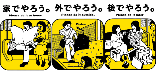
In fact, some of the government reminders can seem cruel to westerners. For example, public signs that count the number of drunk driving deaths per month.
The reason why everything important in Singapore has to be in picture language is because they have so many nationalities living together.
If I remember correctly, the subway signs were already in English, Malaysian and Chinese. But there's also plenty of Indian, Arabic, Vietnamese, and Thai citizens. And of course Japanese tourists.
An 8-language sign starts to be unwieldy, so I applaud their approach of using graphics instead.
You could have the following without the pictures: https://pradt.co/imgs/poster/pleasedoit02.gif
There's different styles to this, there's variations which are more Disney or Anime like, what's the issue? The point is to draw attention, I don't see what the need is for the ostensible seriousness, if it's not effective at educating and drawing people in to your message.
That said, it hasn't been easy. Grappling with all the usual tasks with getting set up in a new country + dealing with the pandemic and "Circuit Breaker" has been a challenge for our family, but like everyone else, we're doing our best to stay positive and adjust.
> But when I hear your justification, maybe the blame should fall on managers.
I'm really just describing the kind of software that I personally hate to use. But in any case, any time my manager asks me whether I can do something or how long it'll take, I just give him an honest estimate. If it's going to take me 3 weeks to even figure out a basic understanding of some new thing, I just tell him. If I just told him "yeah, I'll have that done in a day" every time, who exactly would be failing to communicate in that situation?
Speaking of art style of human figures on the web, my favourite one is https://undraw.co/illustrations. These are the kind of images I'd like to see more on the web, instead of Humaaans lookalikes.
There are four sets of people.
People who know 100% what kawaii is (e.g. because they're Japanese).
People who know 90% what kawaii is (because they're cultural freaks, or watch anime, or whatever)
People who have heard the term kawaii and associate with being "cute" in general.
People who don't even know what kawaii means, and don't use it.
Categories 1,2, and 3 are by far the larger in my experience (well, 1 is small except in Japan, 2 is small, 3 is small, 4 is huge). People in 1,3,4 added, category 3 is nearly insignificant, and doesn't define the term...
I first realized this after this recent HN comment: https://news.ycombinator.com/item?id=23175151
I agree that too much customization brings the focus on irrelevancies, but no customization (beyond a username) isn't right either. One compromise would be to allow avatars of a certain size but nothing else (signatures, flairs, etc.), but this becomes difficult with threaded comments. Lobsters has tiny avatars but they seem too unobtrusive.
Relatedly, StackExchange has randomly generated avatars, presumably to get around the problem of some people not customizing, but they aren't memorable.
I don't know what would be an improvement for HN. Adding images would ruin the aesthetics and make it worse for people with bad connections (of which we have surprisingly many here; the other day some people were reporting they're browsing HN from the middle of the sea!).
Wrt. customization on forums, I always found avatars to be constrained enough. Signatures were where problems started, because while usually limited in character length, with bbcode/HTML/image embeds, they were of unbounded size - and like GP mentions, often much larger than the comments themselves.
Incidentally, the non-standard capitalization on your username has drawn my eye before, so your username is more recognizable and memorable as-is. I frequently enjoy your posts.
At this point, if I had to design automated avatars for some board, I'd probably download a bunch of these silly Machine Learning image sets with 10 000 images of frogs, or something, scale every picture down to 64x64 or 128x128, and assign one to every user at random, or based on a hash of their username. I'm pretty sure this scheme would yield avatars that have all the benefits of autogenerated ones, and are also infinitely more memorable.