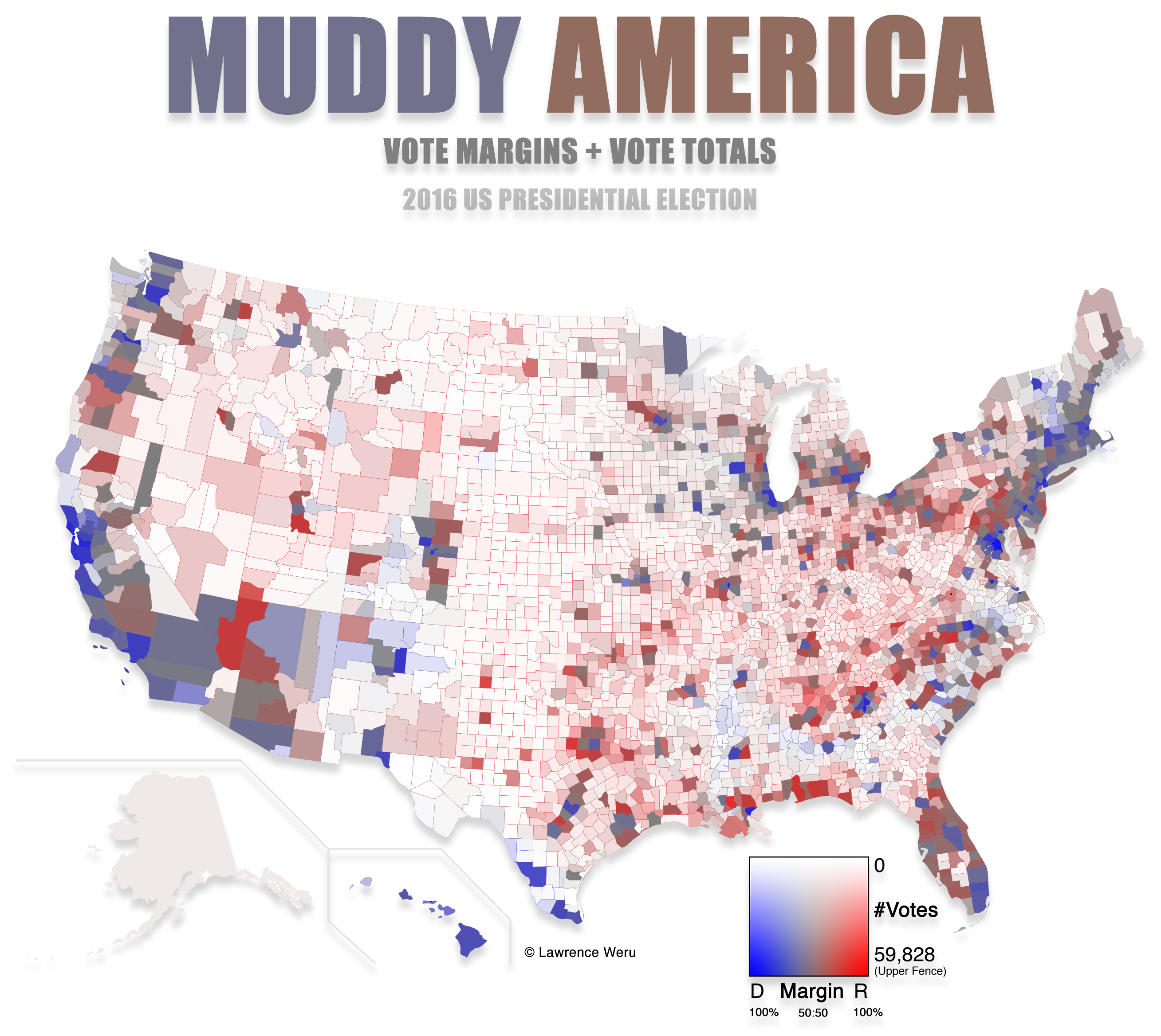
The final map for the US election in 2016 is both the most accurate and the easiest to understand I've seen so far:
https://stemlounge.com/content/images/2019/10/muddy_america_...
In this map, saturation and lightness indicate vote density and color indicates the winning party, in each county.
IMHO, this is the kind of map that should be used by every media outlet to show election results.
I don't believe there is a Grand Unified Theory of Election Maps. Use different maps to convey different facets of information.
Like he said, "most accurate and easiest to understand". ;-)
This is a better representation of the map part, not an attempt at conveying aggregated result.
This map is useful in visualizing demographics and expected voter distribution. It's more valuable for showing election predictions than newsworthy results.
That only makes sense if a state's area is the same as the number of electors it has, which isn't the case.
If you want to show an electoral college map, you'd show each state in red or blue, with lightness based on the number of electors the state provides.
But, obviously, the intent of a county-level map is not to show electors, it's to show something about the demographic makeup of voter preferences.
By my thinking, a geographically large county with 500,000 votes appears much more significant than a smaller county with the same number of votes in this map, and adjusting for density could potentially correct that?
Maps people struggle with this, they're always using maps to try to visualize a piece of data when almost always a short table would be better.
Data graphics people are themselves a subset of a family of wonks that spend 50% of their day rehashing the same tired stories, and the other 50% lamenting how innumerate people are.
Did you ever consider that maybe the reason the maps are stupid is because they're stupid as a whole, not because there's something wrong with the reader or the designer?
If you want to argue against showing the boroughs of Alaska because nobody lives there, then we need to talk about all of those empty divisions of the lower 48, too.
Land doesn't vote, people do.
I suspect that the value (white to dark scale) should be proportionate to votes/square km (or even better votes/pixel, since the projection isn't perfect at preserving area) instead of just number of votes though. In the current formula a huge county with 1000 is as dark as a tiny county with 1000 votes, but is visually much larger.
I was curious to how much that would cost so it would be clear whether a super PAC could fund it. It would involve housing people long enough to be eligible to be registered in that state.
But then the pandemic happened and people did it on their own. We'll see!
What is Q3? IQR?
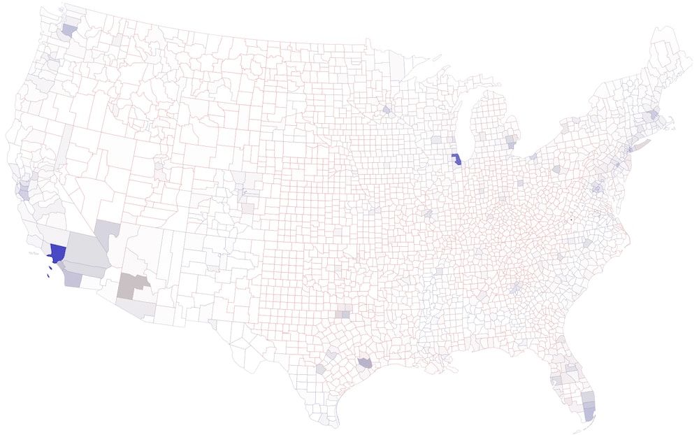
[a] https://stemlounge.com/content/images/2019/10/muddy_no_upper...
There's a section that discusses why it would be visually misleading to use a logarithmic scale, but I can't find anything that justifies the use of the statistical upper fence.
I'd be very interested if anyone could comment on why the statistical upper fence is considered less misleading for visualizing election results.
https://en.wikipedia.org/wiki/Outlier#Tukey's_fences
I agree that it would be nice to have a scaled version of the top few counties - maybe an area-corrected inset of the most populous counties over the Pacific, Atlantic, Gulf, or Lake Michigan.
Would Cook county fit in the lake, or would it need to overlay Canada? It's half the population of the state of Michigan...
Regardless, hoping this gets updated for 2020.
Only saying it this way because the population of blue is larger.
For example, North Carolina and California have similiar population densities (80 people/km^2 versus 95 people/km^2), but on the "muddy" map North Carolina looks almost unpopulated while California is very emphasised---I guess this is because North Carolina is divided into smaller counties.
I guess in the case of San Bernardino it's a giant grey rectangle, so that particular one doesn't shift the red-blue impression very much, but still... :)
Here's a recent example: https://odileeds.org/projects/hexmaps/constituencies/
And here, where the first graphic is from 1895 and uses this approach: https://www.geog.ox.ac.uk/research/transformations/gis/paper... ... and Figure 31 (p28) has an American example.
Much better to optimize to make it look mostly red/blue when the red/blue party wins the popular vote, as that's actually a linear process.
I've also learned the hardest part of my job is getting people to read and remember the data. Replacing their preconceived notions is difficult. I'll use any cheap trick (short of showing data inaccurately) to do this. So I make them the maps they love. I use the colors they expect. If I show tables, they're used by experts for further analysis and ignored by the people who actually make decisions.
>The saturated red and blue colors have an almost astrological meaning to people, it's got nothing to do with information.
That meaning is information. Is it the best thing for a nuanced data graphic? No. But showing a nuanced graphic is like handing somebody Principia Marhematica when they ask what 1 + 1 is. Sure, it had the answer. And sure, it's great for people with mathematical skill. But it's overkill most of the time.
Yes as the author points out it does not tell you anything about the number of people in the county, but trying to convey information in graphics well is difficult (and when people get it right it can be truly amazing, i.e. take Roslings talks, which really visualised public health effects and enabled many people to understand for the first time). However, everyone who regularly has to present data to people should invest time into learning about how to graph and visualise your data.
But it would miss out on other information, which I think people are interested in exploring as well. The geospatial relationships are better presented in a map, and are preserved in a choropleth map in a way that hex maps and cartogram maps would distort.
Exactly: The map is meant to show "where the votes came from" without distorting any shapes.
You’re correct that I didn’t say the overexposed graph is misleading. Neither graph is wrong, they both tell truths.
An article could probably be written about the one you’re inquiring about, that discusses how Los Angeles County, Cook County, and ~eight other counties are unlike any other county in the US in terms of population. Completely in a league of their own. As distant as they are, they may be more alike with each other than the counties surrounding them.
But there is also a lot of information to be gleaned from the photograph with the upper fence that leaves the non-outliers within gamut.
Unless you're talking about the displacement that would be required for every county to be colored blue?
The 2016 neutralizing map (right below the purple map) does this. I think it more closely matches people's perceptions about how their community aligns politically, too.
Literally white-washing (well, hue-desaturating) less populous areas out communicates something different. If you want to communicate impact on election outcome, then you just need to weight the vote per person based on people per elector instead of totaling the voting population in each area.
Is people per elector the right measure for voting power though? There is an argument to be made (successfully in some cases [1]) that voting power is inversely proportional to the square root of the population. And of course the house seats are distributed in a different which minimizes the relative differences in voters per house seat between states [2].
Point being, voting power is a tricky thing to determine.
[1]: https://en.wikipedia.org/wiki/Penrose_method
[2]: https://en.wikipedia.org/wiki/Huntington%E2%80%93Hill_method
I'd love to see muddy maps for other past presidential elections if you can get a hold of the data (and this one too, once all the votes have been counted).
Really cool work, and well-explained!
fillOpacity: (us_votes[i].total_votes / 59828),
fillOpacity: (us_votes[i].total_votes / (59828 * 50 * (feature.properties.AREALAND / 5.195e10))),
The resulting image: https://imgur.com/3K8Wwan
BTW just to double-check, I'm assuming that in this given fillOpacity formula, that a fillOpacity > 1 just resolves to 1. So like fillOpacity : min(votesPerSquareMile/upperFence, 1).
In addition to computing the quartiles correctly, I also realized you should probably use (AREALAND+AREAWATER) rather than just AREALAND... in the above image the great lakes counties look suspiciously overemphasized. :)