Behind the design of the fresh new Firefox coming June 1(blog.mozilla.org) |
Behind the design of the fresh new Firefox coming June 1(blog.mozilla.org) |
Current: https://filedn.com/l4TAWvbSe5i8mJFf1TSvpfS/Image%205-21-21%2...
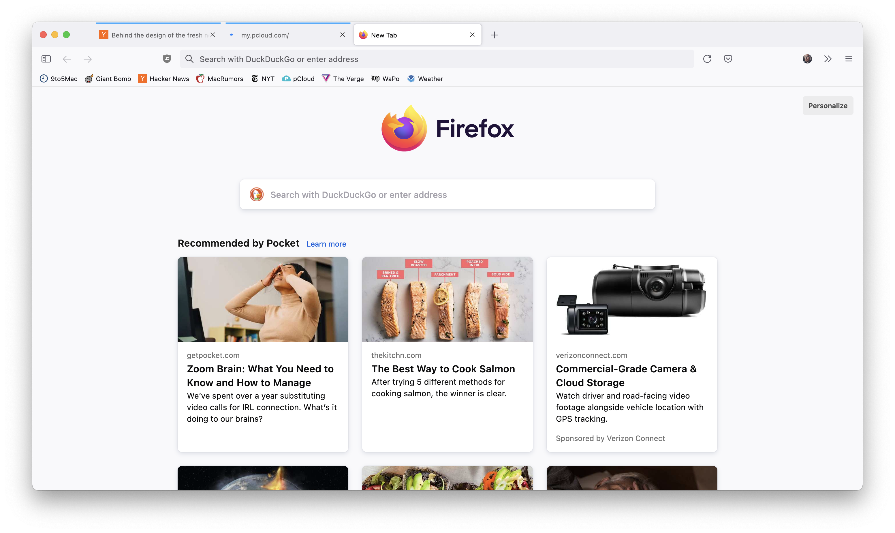
New: https://filedn.com/l4TAWvbSe5i8mJFf1TSvpfS/Screen%20Shot%202...
• Tabs look like buttons now
• Things feel taller
• Back/Forward buttons are simpler
• "Compact" UI mode is gone
• Light mode finally looks fully light instead of having a gray toolbar
• Address/Search bar no longer has blue outline when active but still gets big
I can skim text. I can't skim video. I think it's rude to provide only video - it amounts to taking my time for granted.
Of course you can put all this stuff back in the toolbar but I have many systems and this is annoying. In the super-short clips I didn't see any change to this. They still make everything pretty click-intensive.
As for the video presentation, zero information. I'll tolerate it whatever it is, but if I want to find out what has changed I'll probably have to install a nightly or beta build.
Key changes... - tabs now look like buttons. - there's no divider line between pinned tabs - icons are a bit lighter, thinner lines - bar at top is a bit taller - a few label changes here and there, but that might be the installed default language pack
Either not all the changes are in nightly (which would be odd), or I just don't know what to look for.