The Reemergence of Style in Software(future.a16z.com) |
The Reemergence of Style in Software(future.a16z.com) |
The above is the kind of sentence that you'll see in almost any fashion or arts magazine.
Pretty fluffy stuff. Not really the kind of thing we're used to, in the engineering community.
That said, I firmly believe that there's always a place for good graphic and interaction design, in technology.
I don't feel that it's a problem. Some companies will stick to "the classics," while some will go overboard with the "chrome"[0], so to speak.
Now you can continue reading. Seldom anybody learned much, when they stopped reading at the point they disagreed with.
Every piece of software for artists / designers is not intuitive. It’s sliders, knobs, modals and panels. Programmers making design software is Not A Good Idea.
The way forward is something like ProCreate, so just the software and the pen, and maybe more auxiliary devices (a color palet for instance) to become more analog again.
When we use a mark-making tool like a pen, all that's happening is that we select the area being pressed to be darkened. Technique with those tools takes years to develop, and their full use comes in tandem with additional tools like rulers, prospekt, and stencils.
So when we add knobs and sliders and modes we are simply trying to describe those kinds of intents within a precise abstraction instead of a collection of simpler tools. It does go overboard in that nobody's going to adjust every knob presented.
Maybe some kind of virtual art studio in VR would be helpful for people who want a more physically intuitive experience with some extras like undo and saving copies, but even then you're still going to have to learn a thing or two about the tool to use it, like any tool.
You mean [1] ? I dont disagree with your point but I dont understand how pro create is any different to any other design software on iPad.
Form should come after function. But often times form actually contributes to function. (In the sense of making the "right" thing intuitive to do)
Function is IMO always paramount.
https://future.a16z.com/wp-content/uploads/2021/10/Logo-Tran...
I wonder if I would hate the cubicle as much as I hate open space offices?
Can anyone who's witnessed this transition weigh in?
My father was silently aghast.. he was actually startled by seeing everyone in the room like that.. all the commotion. It had never occured to him that people could be arranged like a lab rat-maze (which it was really).
It’s hard to see if this article is really making a legit point, from a confusing typos early (swapping “form” and “function”, or claiming beige was used in software, when all displays were monochrome back then) to pulling out random historical artifacts apparently without understanding them (the Star’s portrait display was not “distinct”; on the contrary the switch to landscape happened in the mid 80s; the first Mac had both a distinct physical design and graphic clues like the trash can and floppy disk; those were not introduced in the 80s, etc).
Laid upon that are a few anodyne design “observations” that have been common in graphic design articles since the early 20th century.
I simply picked those as examples right from the beginning of the essay: the old workstations like Alto, Dorado, Dolphin, Dandelion (Star), CADR, LMI, Explorer, PERQ, blt, and even the old AAA were all portrait. That was the context into which the Star was released. It was seemingly the workstation form factor until the arrival of the PC. Likewise the sentence reading "Early computing and software stuck to shades of black, white, and beige" (emphasis mine). I only mentioned the nonsense about the trashcan later to demonstrate that this was a pervasive problem, rather than merely one brainfart at the beginning of the essay, which could have simply been poor editing.
A deeper example (which I cited) also shows up right up front: the complete misunderstanding of form vs function that implies the author really didn't know what they were talking about (to cite that is to pull in a century of famous discussion; if you don't understand it how could your argument reply upon it?)
I could go on but this essay isn't worth my (or your) time. There is a very interesting argument to be made on this topic, but this blog post isn't it.
This character has been systematically removed from the system since then, with successive updates since Apple began, lemming-like, to follow some "thought" "leader" in "design" believing that flatness in UI design was somehow "modern" and innovative. (The irony is that the flat buttons use less CPU/GPU power to render than the shaded three-dimensional ones which preceded them, something of which we now have orders of magnitude more.)
I liked skeuomorphic and i think most people find it comfortable because it s familiar. What followed that seems (from the user perspective) like a horde of conceited designers who think that the user should suffer for their superior designs. Wasting people's time trying to find where the button is, if it's pressed , or what it means, is not cool. Bicycles for the mind should make us go faster. I don't see any return of style, i see more of the same inanity, like e.g. twitter's latest redesign
So instead we now have constructor factories that turn out classes so that you can abstract away what used to be a simple Record type in Pascal, in only 5 times the number of lines of code.
I strongly suggest reconsidering, and moving to the more elegant solution.
Physician, heal thyself! :-)
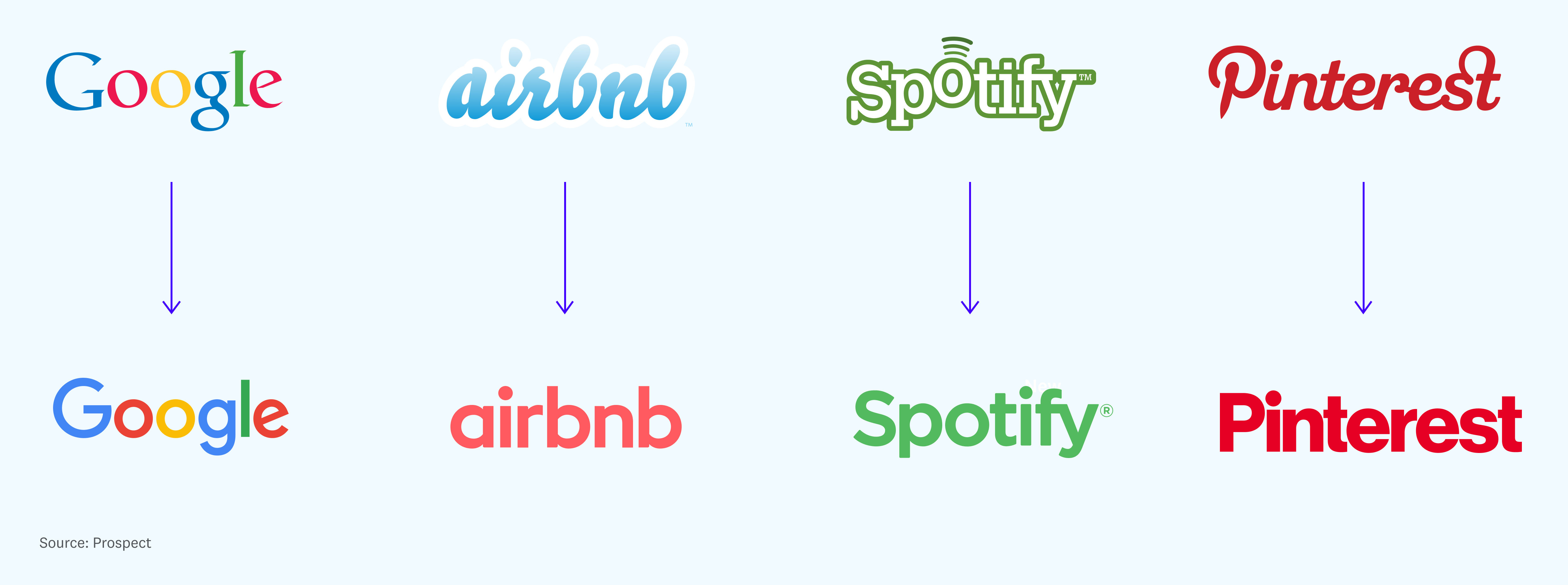
Also - it’s a little depressing to see the Cambrian explosion of graphic style in the first 30 years of consumer software reduced to Windows and KidPix. Oh well, I guess it’s on me to “be the change I want to see in the world” and do a blog post with some other examples!
Not even close to reality. Aqua, iOS "skeuomorphism" had a very defined and unique style.
It obviously wasn't some photograph of an actual desktop with some folders on top and a garbage can, as this makes it sound (not to mention that even if it was, there are 10000s of ways to have a unique style and stance in a photograph too).
Hell, old "photorealistic" GUIs were even MORE distinct from one another than today, with everybody having their same-looking flat UIs.
No, that would be NeXT OS. Through the NeXT dock had different look, and slightly different behavior.
Some examples:
The new Pinterest logo is downright offensive, given how great the original was.
The information in the logo is being reduced for specific reasons. I agree that this is de-facto loss of diversity and culture for delivery, somewhat analagous to factory methods of goods production.
My opinion is that this trend is due to a signal we're seeing where people are being pushed towards efficiency goals in their lives constantly due to pressures presented on them much of which flourished during the industrial revolution and carried through technology in the information age.
I used to enjoy looking at something and taking 20 minutes to explore what exactly it is and assess it, it's uniqueness or lack thereof, and so on. Now, 20 minutes is too much time, when I want or need something I just need Solution for what I need so I can move to the next step of my life. I don't have time to figure out what your product or service is, I need Solution and you either offer it or not, I don't care about your aesthetics or how nice it is (I do but thats often just a bonus anymore as long as it accomplishes the goal).
Heck, I don't have the time to check the space of Solution competitors to find what I need, I even outsource that to third parties to tell me what's good and not good. There are too many pressures in modern life for me to care and you better tell me what it is you do and better do it because it will effect my efficiency which directly impacts how much actual free/leisure time I do or don't have outside of my constant efficiency pressures at every turn, from everyone.
In a world with less pressures of efficiency and ROI, we're more willing to explore things when failure is acceptable and the risk is more worth the potential of enriching our lives by taking a chance on Solution and see what it's all about. Hyper competitive societies don't allow this slack space. If you take this path you better hope the risk was worth it or you're wasting piles of time and money you already didn't have.
While efficiency is important for healthy progress in society and a lack of pressure leads to complacency and stagnation, it's possible to go to extremes in either direction and I'd say weve crossed that point as a society on the productivity push. Some amount of leisure and excess are needed for human happiness. We see this everywhere, "does X, fast, cheap, best."
To be honest, I think this bit of fashion is just a pendulum that swings back and forth every decade or two.
One curious thing I noticed on the swing back in the opposite direction around the early 90s (when many logos changed from circles and constant-width strokes to ellipses and more 'stressed' letters): the new logos somehow seemed to me to be "cleaner" than the previous ones, even though that's also what I'd felt when things were going the other way.
Sure.
If you don't like the way you are treated in your organization today in an open office, you probably wouldn't like the way you are treated in one with cubicles.
Cubicle environments could be soul crushing (see the movie Office Space). They offer a bit of privacy, but noise, interruptions, a boss peering over your back at your screen unannounced could all still interrupt flow and focused work.
EDIT - Yeah. I have a certain fondness for Kai’s. But I had time to get used to them. It’s one UI in a thousand where I have time to get bedded in with it’s quirks. For all the rest - be boring.
So, it's not exactly form over function (besides thought into form is necessary for function - you can have a real world lever that is e.g. thin and crooked and it will still function as a lever, but a good lever also has good form -- e.g. be designed to have a good grip).
It's "design ideology and novelty for some manager's sake" over form and function.
I have to agree with this sentiment. I loved KPT, but that was more for the "adventure" aspect. I actually had difficulty using a lot of functions (don't ask me to remember which ones).
It's frustrating, designing innovative UI that also follows convention. It's a joy, when it works.
I have this iOS widget that I wrote[0]. It's really, really cool. Works a charm, and is easy to implement.
But I keep on not using it in my projects. It's too "in your face." I think that UI needs to get the hell out of the way, and just let the user do what they want to do.
I have a couple of more, more conventional widgets, that I use all the time[1], [2].
KPT was "in your face," like no other UI I have ever experienced.
[0] https://riftvalleysoftware.com/work/open-source-projects/#RV...
[1] https://riftvalleysoftware.com/work/open-source-projects/#RV...
[2] https://riftvalleysoftware.com/work/open-source-projects/#RV...
The Apple Pencil, and the iPad Pro (esp. the latest of each), is awesome. They did a really good job on that.
I don't use ProCreate, but that's mostly because I'm not really that kind of graphic designer.
I remember looking at "paintbox" tools for video effects, in the 1970s. We've come a long, long way, and real artists have some really nice tools at their disposal.
Because parent mention Apps were the problem? Or is it more like Apps designed for Apple Pencil will be the future? Not mouse and keyboard?
I also feel that an ‘Ink-Board’ should replace the trackpad as we know it. Basically an E-Ink tablet that serves as a stylus, pointer and control input. So that we’re not limited to discrete inputs (as opposed to analogue inputs).
And you can ofcourse create beautiful works of art with it. But in terms of usage, it’s all the same.
Now if you are lucky you got yourself a Cintiq or maybe Surface Studio edition, giving you a hands on experience.
When it comes interfacing though, I feel we haven’t really explored much. Someone here mentioned KAI power tools, which was quite intuitive and fun to use.
I just wish for more types of computing/interfacing and use of screen and see some creativity in this field.
An Ink-board does sounds interesting though!