Legend says that this was an intentional design decision, because right handed people usually have their desk lighting on the top left of their desk, giving the map a 3D like appearance.
Here's an article on the topic (german only), it seems to have caused quite the debate back in the day: https://www.swisstopo.admin.ch/de/home.detail.news.html/swis...
that is technically not correct, in the summer for sufficiently high latitudes, the sun sets in the northwest.
The point in the linked article is that the grandseigneurs of Swiss topography didn't like that the usually sunny and warm south slopes show up dark and shaded in the map (and the other way around). They felt this to be unnatural and an error to be corrected. That was back in the 1920s and obviously has not been changed.
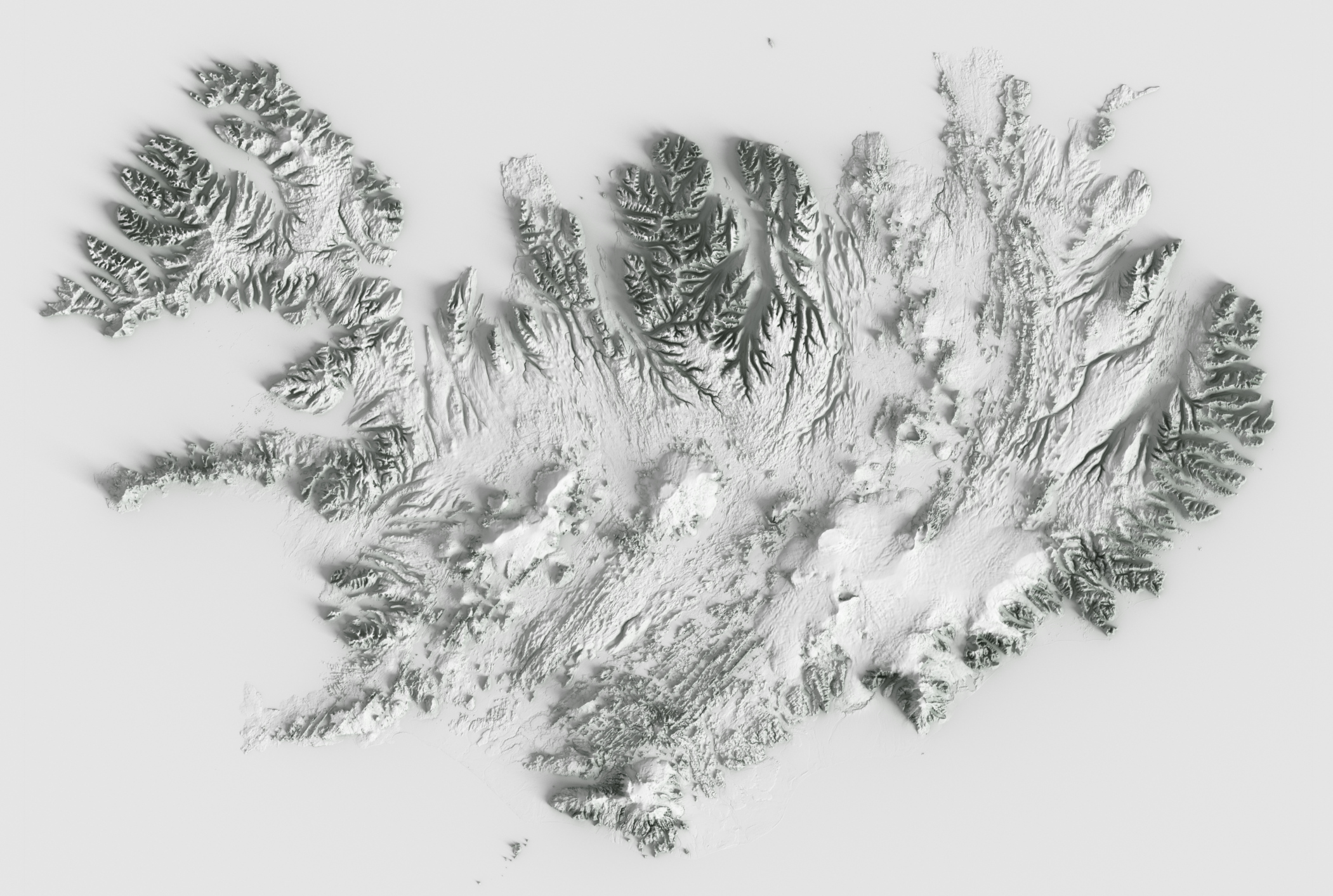
i.e. I think this type of thing: https://cartographart.com/minimalist/iceland_2_5k_orth_occlu...
works well, but that's not really a detailed map with normal cartographic details like roads and towns on overlaid with relief shading, so difficult to say.
However even if you do try and do it accurately, places on the equator are likely troublesome: i.e. the whole of Africa or something: you're unlikely to want to do the fully-accurate thing there of above the equator (or where the sun is) being shadowed from the south and below the equator being shadowed from the north, it'll likely be confusing in the middle.
I would rather say it comes from the top-left. If you orient your map with the south upwards, it will look ok, as if the relief was shaded in the morning.
edit: and if you're feeling fancy, you can render the relief shading in blender: https://somethingaboutmaps.wordpress.com/2017/11/16/creating...
Which is why the linked Daniel Huffman's technique employed the convincing results of Blender.
So the change here is .. instead of pre-written rules to determine outcomes.. use a lot of data, read and build a model from that data, to predict with statistics what the new result should look like given similar inputs.
Machine Learning is data-driven to predict, while algorithms use math and loops to derive answers.
I've decided to go directly the 3D route using Babylon.js, see here for an example: https://cubetrek.com/view/6338
Within Switzerland, it also uses Swiss-style maps as texture, outside of Switzerland a visually similar map style.
I'm looking for Beta testers, so feel free to sign up: https://cubetrek.com/
Seems to be some problem in redirecting to the "success page", your email should be verified in any case. I need to look into that.
Edit: seems to be some issue with my Nginx setup.
Great work anyhow!
Let me know if you have any other suggestions: contact@cubetrek.com
[1]: https://www.swisstopo.admin.ch/en/geodata/height/alti3d.html
[2]: https://www.swisstopo.admin.ch/en/geodata/height/surface3d.h...
On mobile I see about 5% of the left part of the images after the discussion, along with the color boundary. Brave, Android. Not sure if it just me, Javascript blocking, or what.
Or, you can throw a (relatively standard for that kind of task) neural network at the problem, have a prototype at the end of the week and something solid by the end of the month.
In those conditions it makes sense to go with the neural network based solution (however, I do hope that having this result will push people to work on a more traditional approach that is competitive with the neural network based one).
See the sections about 'hillshade' at the OpenTopoMap "from scratch" instructions, at https://github.com/der-stefan/OpenTopoMap/blob/master/mapnik...
Check Stefan "der-stefan" Erhardt's instructions to create your own OpenTopoMap service and map tiles from iron: you download elevation data and process them into shaded elevations - https://github.com/der-stefan/OpenTopoMap
A more universal solution is to orient your maps with east up (which is a common convention), and light them from wherever the sun is. Then the morning light in the rendered maps will always come from the top (in the equator), top-right (northern hemisphere) and top-left (southern hemisphere).
They mention using DEM data only, no roads, villages etc.
A good instance of the very simple explanations and theoretical solutions that, "hiding in plain sight", manage to possibly remain unseen for a very long time.
I nearby noted that "you do not cast your shadow on your documents" and that "you gather around a fire facing it". There is something even simpler:
___ the sun is above. ___
So, to represent something with a light coming from "the south" is as unnatural as lighting a face from below.
I think Google Earth (desktop) does it well, it rotates around the point where the mouse cursor is pushed. So you push the center button, it shows a marker where the pointer was, and then you rotate by moving the mouse.
At the very least I think the rotation center should be on the surface and on screen.
I would like to see a combination of the two, with the terrain pre-processed before being used in Blender.
I'd say this is a context in which "the problem of Transparency" becomes evident: we would like to "see why", to come to learn a perfected deterministic algorithm from the implicit model that the NN developed.
I still find the 'human touch' argument a bit unconvincing for this type of problem.
In fact it works with the provided example but, empirically, it does not on area detail of detailed maps. Crests and valleys will switch.
> computer UI buttons
That is a consequence of consolidated established style, not a cause.
> the whole of Africa
It will work on the view of the full shape but it will not on the area detail, where the viewer will lose the notion of global position and attempt to interpret it like any other spot.
I don't think that's always the case though: I think it's likely similar to optical illusions: you can technically correctly see it both ways, but it depends on the person's brain and what they're used to as to how their brain sees it.
> That is a consequence of consolidated established style, not a cause.
I didn't say it was a cause, I said that it might lead people to be able to more readily recognise top/left as the lighting direction more readily as "raised" due to being used to computer UIs having top/left being lighter signifying raised elements, and them being more familiar with it that way.
Try it. In my initial experiments as a cartographer, as is normal for learners I did "fix it", and tried "boreal morning or afternoon real light directions": the effect will be wrong, in an actual map. ...Learners "make it the right way" and learn that the """right""" way is wrong.
> more readily
Sure consolidated UIs will contribute in the spiral of circular consolidation of natural ("brain") patterns and conventions, but the "light from top-left" use predates UIs by very many centuries: when we read a document it is more typical to have it lit, not darkened by one's own shadow from a body interposed between sun and document; when we gather around a fire we face it.
I don't think I understand your expression there: do you mean that "the problem of producing relief bitmaps from elevation data could lead to new achievements in our knowledge relevant to Neural Nets"? I am not sure why.
If you mean, more consistently with your original parent post, "lead to improvements in the past traditional techniques towards the same goal" - I would say that I don't see much space for leaping better results than those already possible.