But hey, well done on getting it out the door!
E.g., under "lines", the rows are overlapping; https://i.imgur.com/KnOP2Wu.png ; I would think they're only supposed to just touch, with no gap, no overlap.
The boxes, similarly, don't quite line up right. https://i.imgur.com/6pVYh9a.png (Even the 100% box isn't lining up right, although somehow what FF screenshotted != what it rendered. sigh.) The point being, you want these to tile seamlessly. Oddly, they tile differently in the pictures-of-font that break up the page. (Which I'm not sure what they're supposed to be? One is called "5af1d7a5-fa60-4827-9b4f-808cdb635d59" and has no alt text. They remind me of Dwarf Fortress though.)
As other people hint, this seems like the line height is cramped. I/l/1 ambiguities is a deal breaker for any terminal font, though.
This one has those and a distinguishable zero vs. O, so far so good.
Whoops; someone pointed out that 1 and l are indistinguishable. That's a major failing.
although some characters still seem to be missing, most of them work as intended.
edit: nevermind, looks like it was using Lucida Sans instead! what is going on? does the OTF only include ASCII or something?
Because of variations on how software terminals and GUIs render fonts, this is very tricky. That’s why so many terminal programs take over box-drawing characters and implement the glyphs themselves. This way the glyphs defined by the font are a rendering failsafe and it’s sometimes better to not even implement them and leave it to the systems font substitution mechanisms.
Hardware terminals had fixed vertical spacing, which made alignment much easier.
FWIW everyone's complaining about this so I'll throw in the recent monospace release that absolutely blew me away: https://monaspace.githubnext.com/ Who needs hackers when you have Microsoft the evil tech conglomerate pumping out fonts, anyway?
https://www.pgdp.net/wiki/DP_Sans_Mono
https://www.pgdp.net/c/faq/font_sample.php
font download link at https://www.pgdp.net/phpBB3/viewtopic.php?t=70714
Obviously that is beneficial for ASCII-art (smaller vertical gaps), but plain text would benefit from at least 1.1 and maybe 1.2.
I am not a typographer but the cap height of this font (I think it's the cap height) appears quite large, when perhaps it would be better to have a slightly smaller cap height so the ASCII-art features would work well at line-height 1.0 without the letters feeling so vertically cramped.
Basically, slightly less-tall letters.
But as I say, not an expert.
I like to squeeze a lot of info on a page, why do other people get to say "no". Sure, space out your wedding invitation, I can deal, but on the daily text on my screen, that should be up to me.
I do prefer "typewriter" fonts that are more squoze horizontally, this one seems to have loosened the ol belt a little, maybe for more "squareness".
Basically changing what's on the left to what's on the right:
    ***         ***
      *           *
      *           *
      *           *
    *****         ***
One of those minor nudges in life...
EDIT: and also a monospaced comment on hn to describe it :)
> Added missing symbols + - =
> Changed the top of 1 to distinguish from letters.
https://github.com/internet-development/www-server-mono/rele...
For something you look at the entire day? Every day? Seventy five bucks, once?
I have the full licence as I use this typeface professionally. It’s the best money I’ve ever spent.
This reads very PR-ish and lame.
When it comes to ÁĚÝŘŠ etc., the Iron Curtain still sometimes rears its head from the screen, even in 2024.
And I don't get what the ASCII art have to do with anything. What does it depict? Screenshots from some scifi movie?
And finally oh god, l and 1 are literally the same.
I just can't read it.
It's not very readable with line-height set to the x-height, ironically. Cool font though.
Find some old demoscene / warez ansi headers and show it put some on the homepage perhaps?
I like the art! I like the feel and… idk, visual rhythm? One man’s inconsistent is another man’s lively. I like the tight linespacing; Am of the opinion that line art glyphs should touch each other across lines – of course! – but it can’t be solved at the font level. We need console-oriented text rendering that knows how to connect those glyps. Could be done automatically but seems awkward. Could be done even better with, say, some kind of anchor points embedded into the font file – in a particular UNICODE location maybe?
And I for one don’t really mind I and l and 1 looking similar. Distinct is better but I am fond of the historic imperfection. O and 0 absolutely need to be distinguishable though! haha
The problem is that to resolve the readability issues many people seem to be observing on that page you need to set it to 1.1 or 1.2 (try it!)
But that will break the console pseudographics.
Part of the problem with this font appears to be large, space-filling (yes, squareness is another way to put it) glyphs, when if they had a bit more of a difference between the cap height and the ascender height the full-height pseudo graphical glyph stuff would still work without the textual characters feeling so cramped.
At least, I think that is right. I know just about this stuff to be wrong in important ways.
Either way there must be a solution to this; it feels like a missed opportunity.
Iosevka (https://typeof.net/Iosevka/) is a good free alternative that I like to use for online IDEs/REPLs and such. (Berkley Mono's contract forbids this kind of usage, which I understand, but I wish I could use it more!)
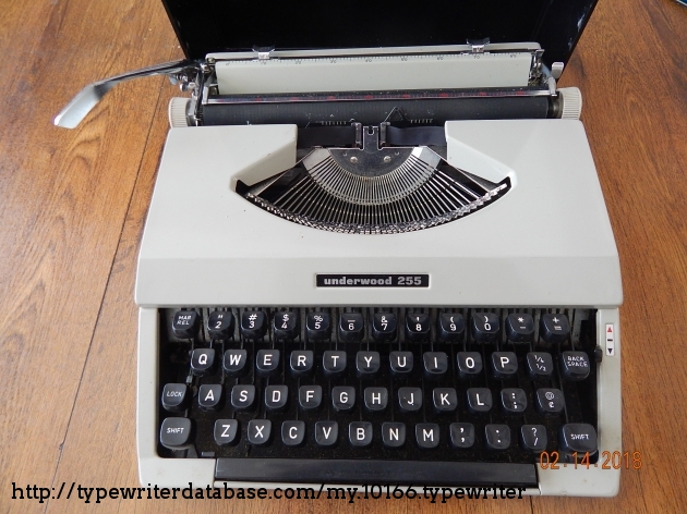
But for most typewriters, the ell (l) key also served as the numeral one key.
BTW on the same subject of fonts, you want to be able to distinguish between 1, l, and I which are not always distinguishable.
This is magnified 2x (to show the similarity). Both the sample alphabet and the "character differences" shows uppercase-eye and lowercase-ell as the identical glyph, for DPSansMono.
Underwood 255: https://typewriterdatabase.com/img/gunderwood%20_10166_15186...
Similarly you get a "!" by doing "'" backspace "."
Monospace (https://monaspace.githubnext.com/) has a feature that dynamically changes between different versions of characters and moves them inside their space in the font grid to make up for that. But even so, its bottom serifs on 1, I, and l extend to both sides.
Cascadia Code (https://github.com/microsoft/cascadia-code) has a lower-case L whose bottom serif only extends to the right. It's the typeface I use for writing code, and IMO, it's currently the best option available.
Excuse me?!
Counterexample: looking at https://www.nist.gov/srd/nist-special-database-19, the example in the manual has a lowercase L that’s just a vertical line.
Many other "code page 437" (console graphics fonts) do much better than this for readability at base line-height.
https://www.omnimaga.org/humor-and-jokes/dilbert-'we-could-o...
Agreed.