Screenshots of Old Desktop OSes(typewritten.org) |
Screenshots of Old Desktop OSes(typewritten.org) |
But using only one level of library to draw on the screen "is so lame'. /s
It would be more representative of the OS, and the era, to have a height-doubled "HiRes" screenshot, 640x200 or 640x256.
Interlaced workbench setups weren't uncommon. I ran such on and off for years for certain productivity stuff where I wanted more screen real estate, until I decided to spend money on a flicker-fixer.
System76's COSMIC DE has been a real life-changer for me in making tiling accessible.
love a good screenshot easter egg
> /tmp/med_16.sixel
... Is that Sinfest? From before the author went weird? If so, then that's certainly a very different way of feeling old than I expected when clicking the link.
P.S.: There's another in "RiscOS 3.71", and "System V Release 4 Amiga Version 1.1" references Penny Arcade. [0]
[0] https://www.penny-arcade.com/comic/2005/01/05/the-merch#
Yes it is.
I still read the comic, but it is very strange and unpleasant, really actively nasty, now: currently it's in an arc of why Jews are behind all the world's problems, and how Hitler was good really.
I am sort of staring in daily horrified fascination. It's like a slow-motion catastrophic road crash.
What the hell happened to a Japanese American to turn them full Nazi? I mean like real "the Germans were wronged, they had the right idea" Nazi?
Yes it is, was my post unclear? Following your suggestion that someone might contribute a screenshot of 1.x, which I agree would be a nice addition, I'm suggesting a "HiRes" screenshot of 2.x or 3.x would be a better representation of how it looked in-period to the vast majority of users. The point is just that the icons, text, and general UI chrome were designed for that lower vertical resolution.
I ran the interlaced modes later after buying a flicker-fixer, but didn't know of anyone who used them without one - the flicker meant those interlaced modes weren't generally considered to be very usable.
I am also glad to have switched to Linux in 2004 already. Once you have been using Linux for a while, whenever I use windows I am annoyed at how slow it is. Just file copy operations alone and then billion excuses windows developers make, trying to copsplain why it is so slow. When I have to backup 30GB, I don't want an explanation why it is slow - I simply use what is faster. And that's just one advantage of many more Linux has. (I use the commandline most of the time though, so KDE and GNOME are IMO just pointless eyecandy these days.)
Yes, it does. So much so that Apple noticed and sued.
I gave some links in:
I also hope to see resurface binaries/sources of other server implementations, Sun Symbolic Programming Environment (which includes code originally developed at Schlumberger, including LispScript), the sources of the PdB compiler, CMU Andrew wm (although is not directly related, is the ancestor of this window system, from the same authors), and whatever is related to this system.
It would be interesting a revival like Interlisp.
This collection is a great complement to the everything-x86 PC workstation jungle of the day.
I built a huge tower PC server to run NeXTStep in 1993, but I had no idea how difficult hardware comparability would be. It was a journey. But things improved quickly. So I installed lots of these: OS/2, Windows NT, NextStep, BeOS, Linux, various BSDs.
I found a Computer Shopper from that time. I'm pretty sure I bought one of the tower cases from page 786. Great stuff. Tell them I sent you!
NextStep/OSX was the only desktop OS that did not feel like a downgrade from Amiga Workbench
I think its obvious that there's a degradation in business products as they age. They become more 'competitive' which means more profit-seeking, so the marketing end of things takes over and the engineering end takes a back seat. Simplicity is replaced with shiny and complexity to catch more edge case sales. Weird cargo cults emerge, product manager cults of personality, etc instead of following proper usability guidelines. Industry fads become self-fulfilling prophecies. Lockdowns and walled gardens emerge because they are more profitable than open systems.
Today, I almost can't believe how hostile and bloaty Windows 11 is and MacOS isn't much better. At least we have FOSS, but the commercial end of things is 'late stage' and frankly awful.
There's a real tragedy how capitalism always leads here. I sometimes wonder if the USSR stuck around what a more technocratic-led system would produce compared to the West.
Speaking of the early 2000's, man, Aqua was such a good design. I appreciate the nextstep paradigm and design, but Aqua was just so futuristic, in a good way.
And virtual desktops/workspaces also had that awe-effect back then. Although with multimonitor setups this faded a bit.
The Plan 9 folks I've talked to are a bit shocked by this, but I preferred Inferno's GUI to plain old Rio/Acme etc.
However, that paradigm made computers daunting for anyone who wasn't an enthusiast. While I’m nostalgic for that level of transparency, I recognize that those hurdles stood in the way of mass adoption.
We might lament how 'dull' or 'abstracted' modern software feels, but technology's primary purpose is utility, not just to be venerated as an artifact.
THAT SAID, I still believe that user-friendliness isn't an excuse to strip away agency.
Modern simplification shouldn't feel like a forced lobotomy of the OS (or any piece of software really). There’s no reason we can't have both: an interface that stays out of the way for the average user, while providing total control for power users.
Whatever happened to progressive disclosure?
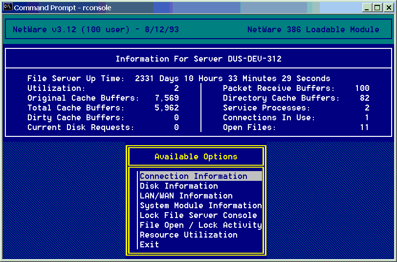
There is a `man` entry displayed in a terminal window there. The first Unix I've ever touched was HP-UX on an HP-9000 (server series, not the workstation one), and I have this memory that the underlined words you can see in that manpage as well were actually hyperlinks you can select and would bring you to the relevant section of the manpage that discussed that term. Am I fabricating that memory or is it real? I cannot find any info about it on the Internet.
Any unclean pointer fiddling in C, and the process was terminated by the OS, so the machine was wonderful to use as a development box (especially with Purify installed) for software that would later be run on Windows or Linux.
I eventually bought my own refurbished (and using academic discount) 715 (instead of a car), so I had the fastest machine in our student dorm of anyone I knew, undergrad, grad student or professor. I could just write my Master's thesis when everyone else kept re-installing Windows - the HP never crashed in 6.5 years, which has left me with deep respect for the old-schol (pre-Compaq) HP engineers. The machine (21" color CRT) occupied half of my 9 square metre dorm room, but it also kept me warm.
1.https://imgur.com/a/h6dxDRv (circa 1985)
2. https://imgur.com/a/IlJSlJT (circa 1986)
3. https://imgur.com/a/AIo3jdk (circa 1988)
I'm studying old operating systems, because it's very interesting how we've been so productive with less screen pixels than we have today. It's basically mind blowing that 800x600 pixels have been a long time enough to get work done.
Currently I'm typing this on an iPhone 17 with a larger screen and after all the years there is nothing like a good charting, dashboarding or spreadsheet on it.
There's even maybe some Actual Scientific Evidence to justify the switch: https://news.ycombinator.com/item?id=47638928
A recent favorite of mine is this one. Timestamp starts at the final submission being reviewed: https://youtu.be/DxEKF0cuEzc?si=mqE_2vpKDBsMWlKW&t=557
https://www.stardock.com/products/windowblinds/
I seem to remember it was available at the same time as the Winamp skins / viz craze.
I understand that https can do that to, but its usually the none https that does, so its a decent configuration to have
Please consider making the site https
gsettings set org.gnome.desktop.interface overlay-scrolling false
I used RISC OS at home. Was wonderful to come back to that.
Still love the old Acorn machines. I mostly use Arculator[0] nowadays for that nostalgia though.
Same here.
Windows 2 and Mac System 6 at work, RISC OS 2 at home -- faster, more responsive, more capable and flexible, and much better looking.
Some of my friends had Amigas and to me, oh wow was AmigaOS 1.x fugly.
40 years later, KDE still is.
GNOME is beautiful but it's so limited it feels like trying to operate a mouse and keyboard with my feet while sitting on my hands.
COSMIC feels fast and powerful, but it is not easy on the eyes, and the keyboard UI is poor.
On FOSS side, I would vote for afterstep, windowmaker, original GNOME with sawmill, and KDE.
I wasn't a big fan of Windows 3.1 or Motif in their heyday, but compared to the visual chaos we have nowadays they're looking pretty good.
A nice vibe coding project here would be to show these in a carousel with the UI being 1:1 pixels. It’s hard to understand just how different NeXTStep (Did I capitalize that correctly?) felt from Windows — part of it was refresh rates, but part of it was going from 800x600 to 1132x800-ish on the monitor. Color, refresh rates, monitor quality, a cool plastic color and design for the box were all part of the experience.
https://en.wikipedia.org/wiki/GEOS_(8-bit_operating_system) https://en.wikipedia.org/wiki/Berkeley_Softworks
GEM + Ventura Publisher http://www.typewritten.org/Media/Images/ventura-publisher-1....
Viewpoint http://www.typewritten.org/Media/Images/6085-viewpoint-2.0-p...
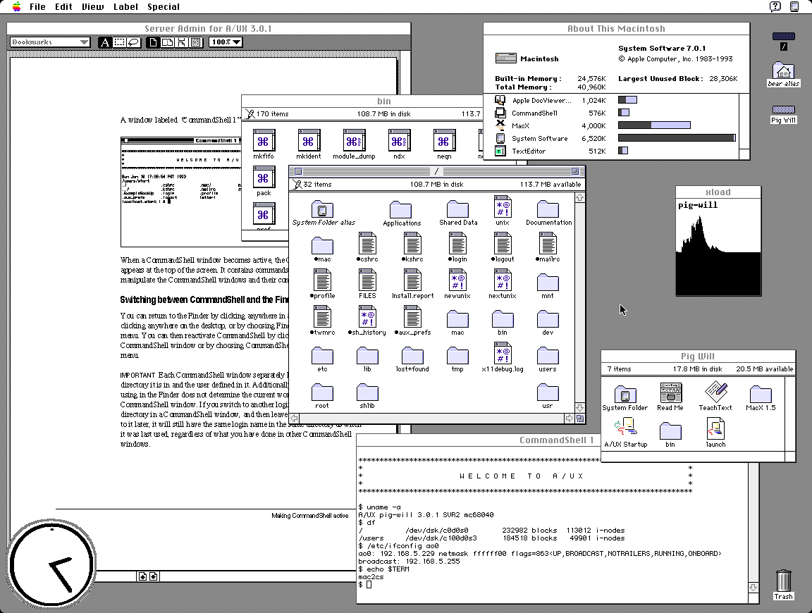
AUX http://www.typewritten.org/Media/Images/aux-3.0.1.png
It's suprising at first look that GEM tops my preferences but I recall having a very fond time on the Atari ST 520+. It had one of the best b/w monitors and TOS+GEM was orderly and uncluttered.
Only preemptive multitasking and per-window menus were missing. As a plus, the OS was in ROM, so boot times were <1s.
At first glance it looks like this is much more breadth over depth. Quite an array of systems here.
I'll be honest, 1053 might be my favourite xkcd comic ever, purely because it's so encouraging of sharing knowledge and learning new things. Always excided to see the lucky 10,000 mentioned in the wild.
It's one of my favourite things, looking at and analyzing older interfaces. Some are lovely, some are cute, some are ugly, but most are... "naïve"? I love to think about the effort, the research, the trials and tribulations. I feel I will spend a great deal of time in this page!
First and foremost to me those screenshots are somewhat disappointing as they can't match my memories. NeXT, BeOS, Irix, OpenLook, SunOS, Arthur (imagine the diversity)... they were SO awesomely impressive at insanely high multi-sync CRT resolution.
Reality simply can't match the mind's eye, at least not for me.
One that does seem to be an odd man out is Genera. What a concept.
For the people that didn’t live through this time, lining these images up makes it obvious why those that did speak of how visually impressive the Amiga was.
Except missing that sock and falling down into the dog's path and understanding the concept of fighting like cats and dogs.
I just found out that the theme song is on Wikipedia.
Certainly it doesn't feel any easier to manage multiple windows than when we had a quarter of the screen space.
When I first saw Win95 with a cleared desktop, I immediately thought - where has everything gone? Why is this empty? Decades later I still think it's cumbersome to have to look and press at bottom left to see all the programs every time.
[1] proportions and locations can be set
Also, a "sweep" button that quickly clears the desktop into a "desktop archive." I do that manually anyway with my own "sweep" folders. Every few months I delete and categorize within the sweep folder. Keeping the desktop clean and organized is the new frontier, especially as screens become smaller and people don't want to lose flow.
Verbose response, but what are your thoughts? Maybe use voice recognition that uses lip-reading through a camera to launch or modify?
Mice and keyboards are just so passe, right, but I wouldn't go so far as getting a brain chip? Maybe a spherical "touchball" that senses the pressure of each finger to move a cursor? Trackballs are too laborsome. I have my mouse on maximum sensitivity and acceleration anyway.
> Maybe use voice recognition that uses lip-reading through a camera to launch or modify?
This feels like the result of a competition to design the worst possible user interface. To about 5% of people it might be an accessibility feature, to everyone else it's worse, and people with beards, marks, or dark skinned faces are going to find it a disaster.
Historical workstation desktop interface screenshots - https://news.ycombinator.com/item?id=36191713 - June 2023 (55 comments)
Retrotechnology – PC desktop screenshots from 1983-2005 - https://news.ycombinator.com/item?id=15968745 - Dec 2017 (58 comments)
https://www.xanthos.se/~joachim/OpenVMS.html
VMS DECwindows Motif 1.0 was released in August 1991; it is difficult for me to comprehend that was 35(!) years ago. I still have a mouse pad from the release party.
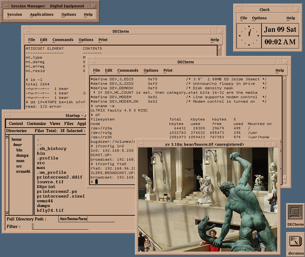
http://www.typewritten.org/Media/Images/decwindows-ultrix4.5...
Those really were magical days.
I wish projects like nextspace could get more love.
The first computers I used were 486 with DOS and early Pentiums with Windows 3.11 and nothing looked nearly as nice. Some of those old screenshots look A LOT better than stuff 10 years later that I used (incl MacOS 8 or 9).
Font rendering on Windows 3.11 was pretty decent, so long as one used the nicer TrueType fonts --- Times New Roman and Arial had man _years_ of hinting effort by Monotype which kicked in at typically screen sizes --- that said, certain apps would still use the older pixel fonts Tms Rmn and Helv (over which Linotype sued for trademark infringement which is part of why Monotype got the contract) as well as the "vector fonts" Roman and Modern which are (one can still access them in Windows 11) stick/plotter fonts like to the Hershey fonts. When I bought my copy of Windows 3.0, I drove almost 100 miles into Richmond to get a copy of Adobe Type Manager 1.0 for Windows.
I got an 800x600 LCD monitor in about 1999, and it was a massive upgrade.
Like the old Windows 98 UI (probably biased) to me just handles so much, why can't apps just look like that? Its boring sure but there's no complexity or inferred action there like modern apps ?
Why do seniors struggle to use modern mobile phones but in those days they could easily work through those UIs?
Just some ranting here but it's shockingly better than what I have currently on Mac
Yet, I remember being around in the 90s and helping seniors navigate Windows98. While it was Windows 98 offered an easier UI/UX than 3.1, was it really superior over the UI/UX of modern interfaces and application design?
I too dislike Mac interfaces, and think that KDE is likely the best UI ever. While on KDE, lets include the also German, and now discontinued, YaST over Windows98 control panel!
I also love to collect old xpm icons from that era, and try and assemble arcane FVWM configs that weave them in.
Oh, NsCDE is a great start if anyone wants to emulate some of the Solaris screenshots in the collection.
http://www.typewritten.org/Media/Images/decwindows-ultrix4.5... <-- XV! I used that back in the day. Does anyone remember gv too? GhostView? Another great Motif application for pdf documents.
Reviewing the screenshots here, I realize profoundly that something about the idealism of the 1990s is baked into them; the 1990s a time before the bad vibes of commercialism mostly destroyed the interwebs.
To me they look unwieldy, heavy and overwhelming and I can't help but think the love for them is just the love for youth or whatever
I had a monitor that had a switch in the back that would change those colors to red-yellow-green. It was still awful but at least it was less awful than white-magenta-blue
You can't really get it from these screenshots, but I'll give an example of what you're talking about.
I remember GEM when it came out, and it simply looked terrible. Not just their color choice, but simply that low resolution display there were stuck with in the day. It looked cheap, and like a toy. Specifically in contrast to the Mac, which, while it was a smaller monitor, and even lower pixel count, the overall display was crisper, and cleaner, brighter, better contrast.
The Amiga suffered similarly. Big and blocky and fuzzy.
Also, don't forget that the NeXT computers were striving for being "3M" computers. "3M" for 1M pixels, 1 MIPS, and "1 Megapenny" ($10,000). Definitely a different class of machines to OTS PCs of the day.
GEM on it actually looked really good. The problem was two fold: with the Atari you had the choice of one or the other (colour or mono), the colour was very low resolution, GEM looked squished and crappy and cheap in low (360x200) & med-res (640x200) on colour .. and on the application development side there just wasn't the same caliber and quantitiy of developers to build good looking GEM applications.
But I mean if you look at some of the better more sophisticated applications like Cubase or Calamus or the original version of Logic, they were pretty nicely designed.
The base window decorations were a bit chunky compared to the Mac .. but not awful, and also easily changed. There were accessories that re-themed things via changing the font.
GEM over top of DOS on the PC? Yeah, awful.
The Ventura Publisher branch of GEM looked decent though
The Amiga was designed to look good on the crappiest TV around. It was a home computer, not a professional workstation. But if you had a nice monitor, high-res B&W screen modes were easily available.
IRIX used the 4Dwm window manager, which is a lot more polished than other UNIX desktops. Few screens I found: https://deskto.ps/u/fathonix/d/3p6fkk https://files.catbox.moe/cognfj.jpg https://guidebookgallery.org/guis/irix/screenshots
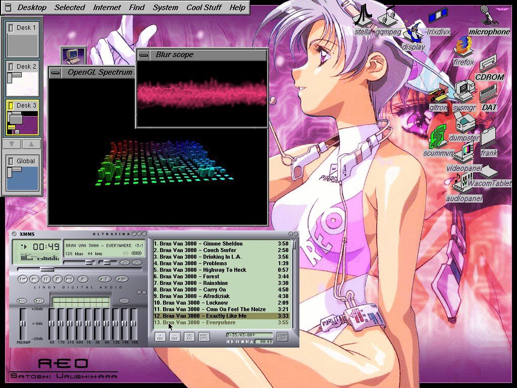
That screenshot shows songs from the band "Bran Van 3000" playing and "Drinking in L.A." is in the list, now that is trip down memory lane! (late 90s)
Thank you so much for that, haven't listened to that in a very long time.
I wonder why Apple swapped back to the right-hand scrollbars with OS X. I guess just because that's what classic MacOS and nearly everyone else did.
1. There were far more users of the classic Mac OS than there were users of NeXTstep/OPENSTEP. Mac OS X has many of OPENSTEP’s underpinnings, but it wasn’t OPENSTEP 5.0; it was Mac OS X, a continuation of the Mac but with new underpinnings. The interface was different enough to represent a new direction for the Mac but without turning the Mac UI/UX into that of NeXT.
2. At the time NeXTstep was under development (mid-late 1980s), the case law surrounding UI look-and-feel and how much borrowing and inspiration one could have before it became infringing wasn’t settled. Apple had lawsuits with Digital Research and Microsoft over whether GEM and Windows infringed on the Macintosh’s look-and-feel. Recall that NeXT was formed after Steve Jobs’ failed coup at Apple against then-CEO John Sculley. Apple sued NeXT due to Jobs’ poaching of key Apple employees who worked with him on the Macintosh and allegations that NeXT was going to use Apple’s intellectual property (in some ways NeXT could be thought of as the evolution of the “Big Mac” project Steve Jobs worked on before his departure). They ended up settling out of court, but given Apple’s litigious nature and given the history of how NeXT came to be, it was very wise for NeXTstep to feature a UI/UX that was a radical departure from the Macintosh. While I don’t think a lawsuit about right-hand scroll bars would succeed, having them on the left helps defend against allegations that NeXTstep ripped off the Mac.
There's also the distraction factor. Maybe having the bar moving on the left edge competes with moving from line to line, and the general anchoring edge of the F shaped reading pattern.
Total speculation on my part.
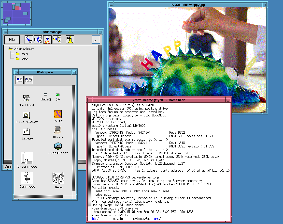
http://www.typewritten.org/Media/Images/linux-0.99p15-fvwm-m...
I once saw 4 of the SGI Onyx2 RealityMonster supercomputers in a post-production house’s render farm in London.
They were so expensive, ($1m+ per computer) that it was only financially viable if they were engaged on client work 24/7/365. Damn gorgeous things and they turned the display of those into almost an art piece for wow-ing film studio execs.
Fun times.
I feel like every geek I knew was downloading NASA images (at slow modem rates) back then.
Subsequent ones were designed by UI designers, and opinionated senior managers, who already knew how to use them, and took out usability features to make them "look nicer". This sort of worked when the opinionated manager was Steve Jobs. Most managers are not Steve Jobs.
> in some applications they seem to have taken extra steps to make it difficult to find the line to grab
Pet peeve of mine in Windows where the line is at most one pixel now. They also took away the coloured distinction between title bars for the active window, so you don't know where keystrokes are going to go.
Too many developers nowadays don't know this. On any HN discussion of UIs, I've been noticing a growing number of younger devs insisting that usability is entirely subjective (their words, not mine). It's not just that they don't know about cleverly thought-out things such as safe triangles in nested menus or all the affordances/signifiers espoused by Don Norman et al. The bigger problem is that they don't know what they don't know, and they come across as being unwilling to learn.
It does make UX discussions frustrating and meaningless when they could, and should, be interesting and a learning experience for us all.
Steve indirectly had a hand in this, by emphasizing the humanities. That, unfortunately, backfired as a sort of positive feedback loop.
Someone hired a few underemployed artists onto the team, and the artists invited all their friends and soon took over the department.
People that in an alternate timeline would be smoking weed whilst sculpting wood in a derelict loft somewhere are now the lead designers, using our software as the canvas of a perpetual avant-garde art piece.
They also need to look productive to justify their jobs, so the need to change things is constant.
That's why in 2026 you could have a PhD in CS and still need to watch a YouTube video to learn how to change the volume.
Can anyone name a single substantive UI improvement in the last 20 years? They're simply hiding or moving stuff around at this point while no one has even touched accessibility.
I'm afraid that the core of the problem is something far more simple and fundamental.
The people designing desktop apps today simply never learned the conventions that make desktop applications good. They grew up with smartphone apps, web apps, electron apps, games, etc.
In fact, you can observe from things like JavaFX, Flutter, WPF, etc., that the trend has long been about the ability of easily creating custom widgets like you could with Javascript (or Flash), rather than the convenience of having a library of widgets that look and feel exactly the same as every other widget in the system.
I have a lot of thoughts on things like PC usability today. You're right that UX research would have heavily contributed to the design on these older systems. As computers moved from the warehouse to the living room they had to be easier to use and understand for people without CS degrees. I think it is fair to assume *some* things about what people these days are familiar with when it comes to the desktop GUI, but usability should receive more focus now even if it slightly hinders aesthetic. A friend of mine has been teaching a college program for video editing and she has students who needed her to explain what files and folders are. This is not the first time I've heard of things like this.
Smartphones and tablets have obfuscated so many basic functions and features that it is actively harming people's understanding of how to use a computer. Things like window sizing, executables, how apps know where things are, and how programs are installed. Android does allow users to peek behind the curtain more than iOS but Google has been going down the path of locking down Android. I haven't been in an elementary school classroom for like 17 years but I remember having computer lab time where we would learn how to use Windows 95/98. I think what has benefited my friends and others my age (~30) is that we grew up when computers were in the home and were usable enough for us to log in and intuit our way around but there was enough friction that made it so we would have to figure things out on our own.
With desktop OS I feel a lot of designers don't know how to use them. They grew up with phones and never use a desktop OS outside of work.
It's worthwhile to note that this was not just research in a vacuum, but a lot of user studies where they literally watched and studied people using the software and how they were confused, found or didn't find functionality, etc. Lots of interviews, talking to people, boiling things down to how actual people struggled with the software.
The latest design of interfaces is designed by people who have barely used a desktop computer and have no idea of the conventions or advanced usage. They create terrible UIs because they have no idea what a good UI is and they often don't even use the product they create.
But we did gain some nice things!
- Tabs.
- Titlebar buttons and other space-saving measures.
- Document editors remembering unsaved changes.
- Forms that validate on focus lost, instead of submission.
- Ctrl+P menus to fuzzy-search all actions and settings (we need more of those).
- Easy syncing (if I open Spotify on any device I'll see the same playlists, my clipboard is shared between phone/desktop/notebook, Immich integrates local and remote media, etc).
- Program-specific URL protocols, so that you can click on a link and have it open in a separate program (like `steam://open/games`).
- Map widgets, a small miracle we take for granted.
- Package managers/app stores that cleanly install and uninstall applications.
This has been net negative. Now everyone thinks it’s ok to shove every control up there and there’s nowhere to grab a window to move it that isn’t also a button. But the OS interprets button click and mouse drag as cancel the button click.
I wish people would stop doing this.
We HAVE HI DPI screens with large resolutions and even 640x480 had title bars!!!!!
What space could possibly need saving?
Not always positive. The form briefly loses focus for two seconds (while you open your password manager or whatever) and you are shouted at to “PLEASE ENTER A VALID USERNAME” in red.
Tabs aren't really new: look at BeOS which could "tab" windows..
That said I agree with you that tab are really nice, especially the way VSCode manage them with the vertical list of opened files (I switched from vim to VSCode due to this feature).
There is a very practical reason for this; most GUI apps are webapps (whether local or not is irrelevant), and the fetch API was so poorly thought out that it was not possible to get an indicate of progress - all if gives you is inprogress or done (nothing in between).
As a result the loading indicator can only indicate in-progress or done.
There might have been worse ways to design the fetch API, but off-hand, I can't think of any - what came before it was immensely better for a user experience.
None of the gains you list have anything to do with user interfaces. They would all or mostly be possible in any of the older desktop environments shown.
I grew up with Windows XP. We had most of these (except the titlebar buttons — although on second thought some custom Windows Media Player skins did have that, haha).
We all carried USB sticks around. So you always had your files with you. The computer itself was interchangeable, for the most part. (Which also led to my interest in portable apps.)
Should have been a generic window manager feature.
Wasn’t that in Emacs for decades?
Just give me the option to view a log of what is happening under the hood. Tell me which step of the process you are at, what files are you copying etc.
This can be really annoying when I don't want to save these changes
Plus, I don't believe Cancel reverts changes the user made if they clicked Apply already. So your suggestion would go against how the UX of OK/Apply/Cancel has historically worked.
The absolute peak, for me, though are those early releases of MacOS X. Cheetah and Puma were both incredible, both in appearance, and in use. They looked fantastic but they still had all the affordances and comprehensibility of earlier interfaces.
One thing that's also very noticeable to me: title bars are title bars and nothing else. It's just easy to grab windows and move them, resize them, etc. Nowadays I really struggle sometimes to find a place in (what should be) the titlebar to drag a window in many application.
We have lost indeed.
defaults write -g NSWindowShouldDragOnGesture -bool true
Ubuntu is great for resizing - alt + middle click anywhere on the window. If only other OS'es could do the same.
Not Ubuntu -specific. On all my setups alt+LMB moves, alt+RMB near any edge resizes that specific edge.
No need for pixel-perfect grabbing.
I wonder how hard it would be to make a thing for that...
Perhaps though this is learned behaviour from scrollbars being tiny. I'd rather have the extra screen space. The scrollbar is usually a nuisance when I accidentally touch it (touchscreen) and the page jumps away.
This is critical for decisions like: "Should I read the whole thing?" and for building a mental map of the whole document.
I use the scrollbar to scroll between parts of the document if I need to flick back and forth quickly, say between the data and the interpretation, once I have that mental map and know where things roughly are.
While reading, I'm dragging or wheeling.
https://learn.microsoft.com/en-us/visualstudio/ide/how-to-tr...
Almost every time. Scrolling with the mouse has bugs in Windows (focus on the active field) and fine grained scrolling is not possible with the mouse.
As much as it pains me to say it: custom Linux distros are not often deployed en masse. Especially not the ones that “look old”.
Hardware features are contained in the kernel. GUI has nothing to do with them.
GUI frameworks provide features for applications to draw their UI.
A selection of numerous windows managers and desktop environments allows you to choose the best GUI shell to work in.
It is somewhat of a bazaar, with different components sometimes not fitting perfectly into each other and there's a constant migration to a best new thing, whether it's systemd, pulseaudio, wayland or pipewire, but generally things work OK and it's not like Windows today offers a significantly different experience.
Windows is beyond salvation at this point.
I don't know why people suggest Linux for desktop use at the first swoop. I dislike it. I dislike how janky its various GUI desktop managers are, I dislike how edge cases that are handled straightforwardly on Windows just aren't on Linux. Things like high pixel density, different audio setups, multi-touch trackpad support, notebook battery life management, and more. The bazaar thing contributes to all of these sharp edges and jank.
And more importantly I dislike the sanctimony of the Linux community, I dislike the distribution and the linking model of most desktop distributions, I dislike how it is 'developers first' and not 'users first', unless a giant entity rewrites the entire user mode stack to provide a useful, straightforward, and mostly intuitive platform interface (that is, Android).
An OS is more than the kernel. It is the entire platform including user-mode libraries, toolkits, and applications. For all its faults, I find the Windows platform better than any Linux distro platform, except one.
> Hardware features are contained in the kernel. GUI has nothing to do with them.
What I listed aren't only hardware features; they are platform interfaces that can be programmed against to produce user-mode applications without having to muck around with kernel interfaces. In fact the less as a user or user-mode developer I have to work with the kernel, the better, and Windows provides a gigantic surface area for that.
I am happy with how Windows works, I like a Windows workflow, I like developing for and on Windows, I like gaming on Windows. I've used it for 26 years and broadly have no issues with it. It is a pretty superb platform which regressed after Windows 10, and about 99% of the problems with it are user-mode frameworks and applications, thin coats of paint. Windows isn't even close to 'beyond salvation'.
There is a custom skin editor as well, so you can tailor the look of Windows to anything you choose, so you can probably get very close to the Windows 2000 look you are seeking.
That being said I do notice that many of the rounded corners aren't fully transparent...
I know that you said "no React" but you might want to try ReactOS. Of course if you don't need Windows-specific driver support Linux+Wine might suffice for your needs.
What the parent wants doesn’t exist, it’s interesting to see people give suggestions for alternatives. It’s clear that their priority are these underlying features and they wish it had a boxy grey UI, not that the boxy grey UI is the only requirement and everything else is optional.
https://github.com/larsbrinkhoff/bagley-nottingham-tapes
For now we have the sources of NeWS 1.1 (and operators.h if you look more in depth) and X/NeWS 2.0. I also have the RBuss sources (an incomplete clone), but I have to ask the author if they can be put on the internet.
P.S: check BitSavers and Don Hopkins archives...
> Unfortunately they haven't released them yet, because of the unknown copyright situation.
I’m guessing that’s a euphemism for “almost all software archival work[1] is, technically, illegal enough to ruin the life of everyone who touches it”. This includes stuff like the Space Cadet Pinball for Linux that was on the front page recently and had approving comments from the original programmers. (I believe pre-commercialization Unix is one of the rare exceptions, assuming you ignore the copyrights of everyone who sent their patches to Bell Labs unofficially, as both the authors of those patches and the Bell Labs folks did.)
And it’s fair and probably correct to be afraid here. I just want to point out that this is one of the places where “legal” and “ethical” unequivocally point in opposing directions, and waiting for the legal situation to become more favourable is pretty much equivalent to never doing it. Software has the misfortune of having happened after the advent of pervasive copyright, so there are no out-of-copyright old masters that we could legally base our art on.
Any chance of getting them to donate the code anonymously to one of the willing sacrifices^W^W well-known community figures like Jason Scott?
https://www.donhopkins.com/home/pub/NeWS/
there’s also
https://www.donhopkins.com/home/archive/NeWS/
https://www.donhopkins.com/home/archive/news-tape/
(take care that the news-tape subdirectory of the former is very similar but not identical to the latter)
and most notably
https://www.donhopkins.com/home/code/NeWS/
https://www.donhopkins.com/home/NeWS/
(these are not identical either),
while the correct place to look on Bitsavers is
As other commentors have said, the overriding concern with these older OSs was to make them as easy as possible to use. It would never have crossed these developers' minds to, for example, hide the scrollbar because they think it looks ugly.
Looking at a screenshot doesn't really tell you anything if you're not familiar with it, but it's a nice reminder of using that software for those who are.
In most of the comments here, I'm not seeing "nostalgia" or "the love for youth". I'm seeing frustration with how the carefully researched and developed principles have been forgotten.
For others, the hardware wasn't important, but some of the functionality isn't apparent in a static screenshot. For example, I loved OS/2 and the Workplace Shell. It had functionality similar to Windows COM or CORBA in that everything on the system exposed an interface that could be easily scripted or used by other applications. The built-in scripting language was Rexx which I feel could have played the role Python does now if only OS/2 had taken off. Using OS/2 from 1.3 onwards felt like you were using a computer from the future.
I wholeheartedly agree, they're quite a regression.... although I don't think this is a popular opinion around here.
When people say "something used to be better" they usually don't mean literally, they mean that for the circumstances, it was better. Of course, more modern systems support more hardware, more features, etc., but if you made those same modern technical improvements on top of an older designs, you'd get much better results.
To me it looks like software design has been massively overtaken by "form over function", everyone just wants a unique "brand" but the actual UX is complete dogshit. Borderless buttons, zero indication what's clickable, no visual delimiters for different areas of programs, no good shortcut / altkey menu support, etc....
This has somehow infected even Linux to such a crazy extent...
UIs back then were dense, didn't waste large amounts of space in a misguided attempt to be "minimalist", and had affordances for ease of use. There was no scrollbar hiding, no animations that made the user wait for no reason other than the designer's ego, very visible borders on windows and buttons that made finding/resizing them easier, large bars at the top of windows that let you move them around, and actual text for most buttons instead of icons that are anyone's guess what they mean. Thankfully some of this can be dialed back in the Windows 11 accessibility settings, at least for missing scrollbars and getting rid of time wasting animations, but a lot of programs don't respect those.
That's right there is a good indicator for which programs care about their users. I'm using your program because I want to actually do something, not waste time watching your designers show off.
I've disabled animations on my Android phone too, and it gives an extremely noticable speedup. Menus appear right when I click them, instead of a second later as they slide into existence. Too bad iPhones just replace the slide with a fade of equal duration; disrespect for the user's time like that is yet another reason I will never buy one.
Those older GUIs didn't try to hide the filesystem hierarchy either. It infuriates me to no end when I use a new OS and have to hunt down the way to show the disk root, or filename extensions, or hidden files. MacOS was especially bad; I had to look up a freaking keyboard shortcut that I never would have found on my own. The common reason is so "normal people" can use the interfaces, but I think that's infantilizing and is why tons of Gen Z don't know what files or folders are. Most people can learn .docx means a Word document, and C:\Users\TheirName is where their files are.
(Notable shoutout, the GNOME open/save dialogs are the absolute worst. I wish distros wouldn't default to it. People will just go right back to Windows 11 because it's somehow better.)
There's some improvements possible, for sure. I'd like to see some programs put hint letters over buttons when you press a modifier like Ctrl so you can easily see what the shortcuts are. I don't know of any that do, but it'd be very useful for more complex software like drawing programs or word processors.
edit: typo
I'll never understand who in their right mind would think that in a save dialog, if I start typing, I mean to search for something instead of trying to change the name of the file. It's really baffling.
There's a nice emulator here, a WebAssembly RiscPC one. Works quite well: https://rpcemu.m-h.org.uk/
Have you come across the Stardot[0] community yet? I feel like you'd enjoy it. Fair warning: it's more focused on the Acorn computers themselves (both 8-bit and 26/32-bit) than the continuing development of RISC OS. That said, I personally think it's great.
There could also be a feed/notification/realtime panel built into it for programs to insert into. I'd also have a bottle shown there, and I could talk to the genie that lives there. Everytime it wanted to talk, the color would change.
Or just a prompt/chat box.
What would you suggest? Maybe a start window that opens to full screen on the off-chance it's pressed? They're fairly fidgety things, right?
Of course, a smaller but no less surprising number of projects don't. The complexity of such a report is so low, though, that one might as well try for software that you actually use
I remember being amazed at how sharp the Amiga Workbench looked when I upgraded from an old TV to a "real" monitor. On the flip side, I was disappointed with how the ground in Cannon Fodder was now a collection of individual crisp pixels, instead of all blurring together as before. That gave me a very clear illustration of how it was "designed to look good on the crappiest TV".
Having to resize a window by grabbing it just outside the visible border is so wrong.
https://blog.hiler.eu/win32-the-only-stable-abi/
>Win32 is the only stable ABI on Linux
Though macOS I think has a similar issue.
Web browsers had to innovate because OSes, DEs and GUI toolkits stagnated. Tabs and better sandboxing came from web the browser.
I can generate scroll events or use keys like HOME/PGUP/PGDN/END or even search forward/back via keyboard to jump around. And I also suffer when a slightly misplaced click causes a disorienting scroll instead of hitting some other interaction target near the window edge.
https://github.com/microsoft/PowerToys/pull/47024
https://learn.microsoft.com/en-ca/windows/powertoys/grab-and...
Is it me or do 3/4 of the pages not load any images?
The title took me a moment to work out. I suppose it was written by someone who speaks in an accent where "OS-some" sounds like "awesome". It does not to me.
It was 20 or 30 years after the last time I saw a Hauppuage TV card that I saw an explanation of how it's meant to be pronounced:
https://en.wikipedia.org/wiki/Hauppauge_Computer_Works
Then some years later, I mentioned this to someone, and he said it aloud and I realised that my mental effort to pronounce "HAWP-og" was completely wrong. To me, it sounds something more like "whore-porg".
But when I was assigned an Ultra (1?) workstation at my first full-time job, I found that it was a better user and development experience to ignore it and use Linux on my Dell notebook, which I think was a Pentium MMX running somewhere around 200 MHz.
"Trust Me, You Want SunOS 4.1.4 on Your Older Sun Boxes"
(May 4, 2026)
https://oldsilicon.com/technologies/sunos-414-older-sun-boxe...
You say that, but I have seen in the wild a scroll gesture to increase or decrease the value of a telephone number.
Wasn't even capped at zero, so I could scroll to a negative (phone) number.
True, it's not a good solution and there is Subvocal Recognition (SVR) that detects electrical signals in the neck or jaw using pads. Hall effect keyboards are pretty good in terms of sensitivity I find.
Lip reading by HAL was also a disaster for Frank Poole.
Maybe a large screen that can easily be flipped vertical/horizontal would work well. People already do it with the their smartphones - why not stationary screens? Have the OS detect when it happens so it can make any predetermined layout changes. Maybe have it rotate using a small motor? Cable connections into a base unit to avoid entanglement.
In terms of screens - I think two volume dials to adjust for brightness and another one for blue-light would be ideal. It should be super easy to do at a hardware level. On 24 hour programs if really pedantic. Maybe an external "volume dial" pad that can be plugged into a USB-C would be suffice and it could have a light and movement sensor as well to take a computer out of (and into) suspend and set the desired brightness according to the environment.
There are rechargeable closet lights that already have movement and light sensors - just need to adapt it to a screen.
Good news: all of this except the motorization is already available from Dell and others. Common office setup. I often see people with one screen in portrait format for reading documents.
In any case, it was a "Pulcinella Secret", and anybody reading his replies on HN could easily find all his distributions, and it is replicated also on tenox.pdp-11.ru (but it's incomplete, since that there are only the contents of /home/code/NeWS".
On BitSavers there are the OpenWindows 2.0 source tapes other than the binaries (these last ones are also available inside SunOS 4.1.1 install CD, both for Sun-3 and Sun-4), but to extract them you need a specific tool, then you extract the tar dists.
In my then job we called Win98 "GameOS" and I have zero nostalgia for it and the horrid IE4 "Active Desktop". Yuck.
By XP the rot and bloat were getting serious.
W2K was the peak. All downhill since.
I have tried to persuade people a few times now. This may amuse.
2022:
https://www.theregister.com/software/2022/06/21/risc-os-is-3...
2024:
https://www.theregister.com/software/2024/05/02/risc-os-open...
I wish I could get the senior GNOME team to use RISC OS for a while. It is so very visible that GNOME >= 3.x is a Windows copy with things removed and re-arranged, because that's all anyone on board has seen or knows.
Sometimes I am starting to feel like how my dad looked many years ago when I tried to teach him how to use Windows. He simply couldn't see the window borders. With the latest designs I am reaching this point too. I am struggling moving and resizing windows because I can't tell where the border is.
This was even worse in an RDP session. No drop shadows. I'm not sure who thought "everything should be flat and white" was a good idea.
It's just the old Windows 2.0 look.
Which is what? Windows natively has like 4 official looks. You can click around the 2 (!) settings programs and pop open windows for basically every framework windows has created (and deprecated) in the last 2 decades.
Star definitely didn't have multi-click.
There are user-centric and dev-centric Linux distros. Windows is "Microsoft cloud onboarding" centric, and the experience has been dramatically degrading for years.
If that were not the case, why would senior executives at Microsoft say things like "we've heard you" and "we intend to reverse the suck in the coming year"? Even their management knows users hate the Win11 experience, and have placed it on their backlog....
> I dislike how janky its various GUI desktop managers are...igh pixel density, different audio setups, multi-touch trackpad support
These things are objectively better on a modern KDE linux. Out of the box I can output youtube videos to a dual-Sonos / Airpod setup by... clicking the sound icon, which pulls up an interface reminescent of "Windows 7, when the mixer wasn't terrible".
The reasons not to use KDE these days are because you need Windows software (usually: edge, teams, Office), or especially because LibreOffice is terrible. The core desktop experience, however, is notably and demonstrably less jank than the mess that is Windows 11.
They are not.
I use a KDE distribution at work. I regularly see GPU texture copy bugs like random lines across the middle of the display, or along the bottom edge. I use a 4K 144 Hz 16:9 display, and the Linux platform absolutely struggles with getting the scaling, resolution, and colour depth on all the dozens of GUI toolkits correct. Subpixel antialiasing doesn't work on many applications. It doesn't matter if I am using Wayland or X; both are bad experiences.
> dual-Sonos / Airpod setup by... clicking the sound icon
Speaking of sound... Linux doesn't even pick up my Audient interface unless I physically reinsert the USB cable. It doesn't have a channel or volume control for audio feedback from my mic to my outputs. If I change the output volume slider down from 100%, the actual volume output is asymmetric—one channel is considerably louder than the other at 50%.
I have experienced issues with wpa_supplicant, iwd/iwctl, and systemd-networkd fighting each other. Why are there even so many network managers? Why does the platform not provide one?
I will disagree until the cows come home that any Linux desktop interface (again, bar Android... but like I said, Android is almost an entirely different platform) is less jank than Windows. People bring up Windows' old UIs, but said UIs still work. gpedit.exe, regedit.exe, msc.exe, services.exe, ncpa.cpl, perfmon.exe, windbg.exe, these are things that haven't changed in nearly 3 decades.
Android has a horrible interface.
I'm not a regular KDE user, but it's a different universe than a barely customizable interface filled with generational cruft with garbage over the top of it spitting ads at you, saving everything to the cloud, etc.
Most Linux desktops are quiet. They may be a little buggy at times, but Windows is just as buggy at times.
Right now my laptop is connected to 4K Dell display and it works perfectly in clamshell mode. I never saw any random lines across the middle of display, GPU acceleration seems to work fine, WebGPU in my Chromium browser works fine, video decode accelerated so 4K video eats a tiny bit of CPU. I can't say anything regarding color depth, everything seems to work fine for me. My display reports "3840x2160, 60Hz 30bit" info. I'm using 2x scaling and fonts are rendered properly (not blurry) in all applications I'm using.
My WiFi is configured using NetworkManager, I don't have iwd installed and systemd-networkd is not enabled. It somewhat helps that I'm using Arch and I decide what to install and what to enable.
I agree that Android provides much more polished system and I'd be happy to switch to desktop Android if that ever will be a thing. I don't like Linux desktop. It's just the only desktop operating system that does not suck for me.
Most people haven't experienced "addressable interfaces" like Emacs and don't know what they're missing when they only have visuospatial navigability. I would like to see searching and jumping make bigger impacts in mainstream UX design.
For me Windows 3 (and especially 3.1) was the first time where you could work all day without having to drop to the DOS prompt to get work done. I was running Windows 3.1 when I first used the Mosaic browser on the then new world wide web and my life was never the same again.
Its original advocate and designer, Lee Lorenzen, left DR to go create his own startup and make Ventura Publisher (which shipped with its own copy of GEM). Which was then bought up by Xerox. Which is also where Lorenzen came from in the first place before DR. (GEM came out of his desire to build out a Xerox Star-like system for commodity PCs, which he tried to pitch at Xerox but failed, so did at DR instead.)
On the ST side it went off in other directions, the two codebases forked significantly.
Nemanja Trifunovic's recent history is pretty good, I thought.
https://nemanjatrifunovic.substack.com/p/history-of-the-gem-...
Choosing to interpret you literally:
Apple sued, and DR had to cripple GEM 2. The Atari ST version was unaffected.
https://www.nytimes.com/1985/10/01/business/digital-research...
https://books.google.im/books?id=w3IudMVoEusC&pg=PA2&redir_e...
Caldera made it GPL in 1999.
https://www.theregister.com/on-prem/1999/04/27/gem-the-gui-t...
The FreeGEM project modernised it and added back not only all the functionality that DR removed, such as overlapping windows and desktop icons and things, but also additional features from the runtime-only GEM/4 and GEM/5, such as Bézier curves and things.
https://www.seasip.info/Gem/History/freegem2.html
OpenGEM was the last distro of FreeGEM getting updates, and it's included in FreeDOS.
https://multiboot-windows.dscloud.me/All_Pages_for_DOS_GUIs/...
Back on the Atari ST, EmuTOS started out as a minimal stub boot ROM for the all-FOSS AFROS replacement OS for the Aranym emulator; over time, EmuTOS evolved into a complete FOSS replacement ROM for the ST line -- and to recreate GEM, they went back to some of those Caldera source files.
https://emutos.sourceforge.io/
As to the bigger more general question of why PC GEM didn't compete...
DR's GUI was originally one element of DR's catalogue. GEM ran on Concurrent DOS, and DR-DOS included a cut-down version that's just a file-manager and app-launcher, called ViewMAX.
https://en.wikipedia.org/wiki/ViewMAX
(The beta version of ViewMAX 3 ended up FOSS too.)
DR had a full multitasking DOS-compatible OS on the 286, something like 4 years before OS/2 1.0. However, it used a feature that Intel removed from the shipping 80286 chip. The shipping PC AT could not multitask DOS apps on Concurrent DOS 286.
So DR pivoted: it turned CDOS 286 into FlexOS, an RTOS that happened to have some DOS compatibility. It turned GEM into X/GEM, a multitasking version that could use the underlying OS's multitasking.
(ViewMax on DR-DOS 6 can manage multitasking full-screen DOS sessions using DR's TaskMAX multitasker.)
FlexOS with X/GEM evolved into many forms, and was sold by Siemens and many other companies, as an embedded control RTOS for all kinds of hardware.
The last ones on sale were for cash registers -- PC-based point-of-sale tills. IBM 4690 OS was still on sale in the 2000s, and it's based on DR FlexOS and X/GEM, with app development in Java that displays in a GUI that was a remote descendant of GEM.
Toshiba still supports it.
https://commerce.toshiba.com/wps/portal/marketing/?urile=wcm...
You can even run MagiC on Linux now:
It'd be a very jumpy bar, but it helps develop intuitions. "The first part is always slower on this machine", "when it gets stuck on this spot I need to reset my router", "this part will be slow because the request is large", etc.
Even if fetch ran over UDP, or a direct serial connection, or IP over Avian carrier, it'd still be a poor API that doesn't allow progress indication.
We used to have the cursor indicating this in the good old days.
This is a failure of whatever framework the web dev is leaning on instead of actually programming the computer.
It is perfectly possible to get real progress information other than yes/no. Web sites had it for years before lazy spinners took over.
>> As a result the loading indicator can only indicate in-progress or done.
> This is a failure of whatever framework the web dev is leaning on instead of actually programming the computer.
No, it's a failure of fetch.
I don’t think it’s a stretch to say that most of the problem can be traced back to the transition to Mobile first design. The motivations were arguably pretty innocent in general. If there were no downsides, it’s nice that there isn’t a separate code base and an entirely separate set of capabilities for desktop and little 5-inch phone screens. However, the way that we have achieved that - nearly across the board - is by lobotomizing the experience everywhere.
And because of fashion (those artists who control the UX can’t resist it), even in places where that doesn’t even make any sense because there is no mobile version (say, B2B SaaS products that only get used on a desktop), they still feel the need to cosplay as a mobile app by using all the same stupid design elements (the ••• and “hamburger” menus, the giant grids of “tiles” that should have been a table, etc.
That's basically the curse. Fucking fashion. If that human concept wouldn't exist, UIs today would be way way better. But no, we have to keep changing it forever and with each iteration worse and worse. UI enshittification at its pinnacle.
That thing Windows has where you can drag a window to the top of the desktop and it pops up a few quick options for resizing. I would love it if KDE Plasma had this.
On the desktop? No.
In human-computer interaction? The multitouch UI using a capacitative touchcreen, as used in the iPhone (2007, so 19 years ago) and iPad (2010).
This redefined how UIs work, so yeah, it's vastly significant.
The trouble is that now there's a whole generation of developers and desighers who literally grew up with it and its imitations, and they're trying to apply its "simplicity" to desktop WIMP GUIs. In the process they are removing things like, you know, the "M" of WIMP (whether it's "mouse" or "menu") because they don't see it as important.
That person’s gonna be very rare, while lots of over-25s have that experience.
Also, there's simply the reminiscing back to the era when these were out. When they were NEW, and revolutionary.
All things that cannot be conveyed from a static screenshot.
Consider NeXTStep. Something you cannot see from these images are that when you moved a window on NS, the entire window moved. Not a frame, the entire thing. This was not normal in the day. Or that NS used Display PostScript. "Not only are they moving the entire window, they're using DPS to do it!" PostScript was powerful, and expensive, and for printers. Yet, here it was.
Or how fast BeOS was, and its cool filesystem, and other aspects.
It's certainly an interesting question to ask folks that have opinions simply on the cosmetics of the various images that we see here, but appreciate that for the folks that "were there", at least for me, I'm not just remembering what it looked like, it's much more than that.
I will never forget when the Mac first came out, my friend and I went to see one at a computer store. And my friend just sat there, mouth agape, moving the mouse back and forth across the menubar, seeing them popup and popdown as it moved, and just going "Woooowwww".
That was a factor of available memory bandwidth to the framebuffer. Single-frame updates are something that only became definitely possible around the late 1990s to early 2000s, and that depending on what resolution and color depth you were running. High quality display settings would initially be quite slow to update. In many old PC games, full-screen displays would visibly update with a smooth windowblinds effect. You couldn't do any better than that, because screen updates were dog slow.
1993 PowerBook 145B (25 MHz 68030) https://www.youtube.com/watch?v=4cQo29SIIgU
1994 PowerBook 540c (33 MHz 68040) https://www.youtube.com/watch?v=peWIysrf7DY this one is a bit chunkier in the video recording than real life since enabling the external video visibly slows the graphics down
Today’s OS are aesthetically pleasing, especially with the right combination of windows, but using them is a frustrating experience.
I don't know about. All the different apps and OS windows are so inconsistent with each other. There is not much sense of an overall aesthetic. Just a mishmash of vaguely similar styles.
I did not know about this, but I did notice my own menu-rage every time a submenu disappears!
Not sure how stuff like this gets deployed in the first place, guess we're just a few people left who test things we develop before we push them to the public, I'd rather believe that than that people just don't care anymore...
Guess they've never been on the phone with an elderly relative in tears because she can't figure out basic tasks on an iPad anymore after years of learning how.
That's when you realize you, as a highly-skilled technical person, can't either, because they've moved, hidden, or otherwise obfuscated them.
Yesterday I learned there are two icons in the Files app called "..."
Yes, two.
Incidentally I was looking for how to delete a file, which is now deliberately missing from the object's context menu, and intentionally hidden under one of these.
I had to authorize something with Firebase, for which I had to auth with Google, for which I had to do a MFA with my (Pixel) phone.
Usually it's "are you trying to auth" and finger-to-the-scanner, but around that time this particular way didn't work. It also didn't want to send me a text or a call to auth me.
No, I had to find an OTP code. Easy, right? Wrong. The instructions, and the docs, don't match where it was in that particular version of Android, and there were a bunch of blind alleys that were named basically the same.
It took me like 10 minutes, on stage, browsing my phone (thankfully, not casted to screen) to find the friggin' option. Thankfully the cohost was doing the presenting at that time, but it was pretty lousy.
And this is using Google's OS on a Google phone doing a Google auth flow for a Google property. And I'm a techie who's been using Android for 15+ years now. And I did the exact same dance a few weeks before that - also so roundabout I had no idea how I stumbled on the correct page.
User experience my ass.
PS. The regular "are you trying to sign in?" flow works again. No idea what happened - wasn't me.
To think that we used to trust mere mortals - without even a signing certificate or developer membership - with the power to customize every toolbar in a Microsoft application, and to set every font and color for the whole UI of the system. People made their computer environments ugly in some cases. And it was fine, because they owned those freaking computers, so who the heck has any business telling them not to?
Sorry, clearly it bugs me a lot how much we’ve lost.
You are always designing something with a target audience in mind, and the next, e.g. mobile phone will very likely be used by someone who has interacted briefly with a similar device, so you may re-use some already learnt patterns.
The very early UXs built heavily on desktop metaphors (like folders), but at this point many (and an increasing number of) people are more familiar with OS UI n-1 than a typical office setting.
So I don't think jumping to this conclusion is correct - there are well-designed software, it has just become much much cheaper to create new ones, so the average quality has necessarily went down.
And Windows-shift-up to make a window fill the vertical space of the screen without changing its width.
I never touched a real PenPoint device, sadly. I never got to use a real NeXT cube -- they were formidably expensive over on my side of the Atlantic, the price of a _high end_ new car before I could afford a car at all.
I own an original copy of NeXTstep with manuals and have run it inside Previous, but it's not the same.
Mac OS X of course gets one the underpinnings of NeXTstep, but the UI has gotten kind of weird since 10.6.8 which was the last version I used regularly, making me wish that there was a "No iPad influence" checkbox for the UI.
That said, I'm glad to still be able to run Macromedia FreeHand/MX, and of course, modern hardware is just magical in terms of processing power, esp. for 3D.... but the way styluses have been crippled in Windows since Fall Creator's Update makes me a little angry every time I have to toggle stylus behaviour when switching apps (I actually leave the Settings app open) --- at least Firefox has a checkbox for disabling a stylus scrolling....
I played with a 30something friend's brand new ReMarkable a few years ago. I was torn between tears and rage. It is so miserable and dumb and primitive. I own 2 Newtons. The poor guy was shocked and baffled by my reaction.
Yes, I agree, Snow Leopard was peak OS X. Riccardo Mori wrote eloquently about this:
Windows finally implemented it via PowerToys: https://learn.microsoft.com/en-us/windows/powertoys/grab-and...
I love software like Gimp, Blender, Inkscape, etc, that matured over decades and kept their soul.
If I had managed to snag an Axiotron ModBook, I'd almost certainly still be using it w/ Snow Leopard.
Oh yes indeed. I was on the edge of the FreeGEM project: I did some bug-fixing, documentation, translation, and stuff like that. I ended up learning a lot about the history of ST GEM, and one aspect was how its cleanly-layered design let people just re-implement bits and plug them back into the original.
Which is what led to FreeMINT and TOS 4, and the desire for a FOSS distro of that is what led to AFROS.
> You can even run MagiC on Linux now
Oh! I knew he'd open-sourced it. I did mention MagiC in passing in my follow-up to Nemanja's history:
https://liam-on-linux.dreamwidth.org/96552.html
I didn't realise there had been recent activity. I must try it. Thank you!
Too bad it's 100% assembler. Though very nicely written assembler.
Hm. I have a Firebee downstairs untouched. I am tempted to point an LLM at the MagiC sources and have it port to Coldfire :-)
> Hm. I have a Firebee downstairs untouched.
:-o
> I am tempted to point an LLM at the MagiC sources and have it port to Coldfire :-)
I would be interested to see a video of the result!
When I was checking out the MacBook Neo a while back I was disappointed that the resolution is not natively x2 scaled. It uses fractional scaling when macOS handles fractional scaling quite poorly. I've set the resolution on my M1 MBP to 1280x800 so it was x2 scaled and clarity improved significantly. But I also sacrificed usable space because apps don't adjust, everything is just made larger.
At work I use 1 or 2 monitors plus the laptop screen (on Windows). At home I just use a single 55" 4K TV for my monitor and place apps center, left, right, and up top for rarely used stuff (on Linux). The desktop metaphor always wanted a big display but you're right - most Windows apps expect a full 1920x1080 for themselves.
On KDE, something nice is that if you have a maximized window and a panel on the top of the screen, I can drag that panel to grab the window (or maybe it was a setting of Latte dock or something). And since window titlebars nowadays can be cluttered with buttons, it is a predictable way to grab those windows only using the mouse.
That you were more or less forced to adopt these KDE shortcuts so that you could work around the fact that they had cannibalized the title bar for a purpose it was not designed for.
You were forced to change your workflow and everybody else is having to be forced to adapt because they changed a metaphor that has remained stable on the desktop for over 40 years
UX design is treated as a subjective matter, as if it is equally valid to clearly label UI elements as it is to have magic, nondescript UI pixels that serve as vital control surfaces.
Go watch videos of the research Xerox did on UI/UX and HCI in general, and weep for what we have lost...
Also KDE seems pretty staunchly _against_ client-side decorations with buttons other than the window manager buttons.
All of the "positive" items I listed come with drawbacks. I didn't realize I might be in the minority for this one, since I genuinely prefer the new workflow.
...And sometimes I'm using OpenBSD, so titlebar buttons introduce a titlebar I didn't want, and didn't need, which doesn't match the rest of my desktop customizations.
It's just a bad paradigm.
I use Firefox. I also use macOS a lot. Firefox assumes your tabs are horizontal. Mine are not (using a built in feature).
So it doesn't use the title bar much. So there's an option to turn it off. It's off by default. Result, the actual top bar is a cluttered toolbar and it's hard to move the Firefox window.
We could go back and forth on things like "the ribbon" being better or worse, but the fact that it changes depending on window size is an incredible sin. Hello, everyone! Learn how to click a tiny 5x5 pixel arrow or lose your menu items forever!
I look at retail for examples of this. If you watch an experienced cashier who interacts with a system all day, they have perfect muscle memory of the keyboard or keypad, and operate it so fast that you would have to ask them to slow down to understand what they're doing.
Now many of those have been replaced with touchscreens, which are noticeably worse -- since the UI is never fast, you have to stop and wait for the next UI to appear after many of the steps, instead of letting the keyboard buffer do it for you, which worked great on a decades-old system. But, I assume the companies who allowed that replacement believed it was worth it to be able to onboard a new cashier just a bit quicker, with a UI that looks just like the iPads that they were raised on, complete with big unlabeled icons and "three lines" or "•••" buttons.
Meanwhile I live in a world where opening five Salesforce tabs locks them all up.
Fkeys are arguably a huge tragedy, here we have keys, twelve of them, that could have been used for simple one-fingered operation, but they were put to use pretty sparingly for a long time (basically F2 and Alt-F4 were the only common ones most people used, with F1 for Help and F11 often used for Full Screen as honorable mention) so the laptop manufacturers reused them, leading to a world where they go from being the easiest and best keyboard shortcut keys, to one of the worst, since you probably need to teach people how to find and use a 'Fn' key to use them.
It seems now it’s not worth learning the keystrokes because everything is a website or changes randomly. Ah, for the days when Excel supported Lotus 1-2-3 shortcut mode for decades.
Up to a point -- although Mozilla added vertical tabs about a year ago, it's pretty clear nobody uses them, same as nobody left at Microsoft is competent enough at customising a Windows desktop to know how to use vertical taskbars, so they removed that option from Win11.
But saying that, although I do not like GNOME, I review the new version every 6 months, so I do try it. I find the same problem with GNOME CSD apps.
It is not confined to the problem of moving windows. The GNOME developers are clearly obsessed with gestures -- even the welcome tour contains instructions on trackpad gestures, and my machines have the trackpads disabled. I use mice, because I prefer them.
With a mouse on Linux, the middle-button has 4 main functions:
1. Open web links in a new background tab.
2. Middle-click the title bar to push the window behind other windows.
3. Middle-click in text to insert the currently-selected text at the cursor.
4. Close browser tab.
I do these things hundreds of times a day. Literally, no hyperbole.
GNOME has removed functions #2 and #3.
From this it seems apparent to me that the GNOME developers do not really know how to use mice effectively, and mainly use laptops with trackpads.
My argument for the titlebar is that it was at least researched UI/UX convention done by Apple/IBM/Microsoft at the nascence of personal computing. These are the primitives that arose from that research.
It is not out of what I happen to like that I argue this. I personally am deeply frustrated by cursor-y window controls. I much prefer a tiled interface with a top menu bar and copious keyboard shortcut compositions. I, if I could, would Never use the mouse, and if I needed axial control for a 3d environment would prefer to use an analog stick of some sort. Unfortunately those are not the conventions we have for general computing, especially in the workplace.
We are in general forced to use the conventions given to us by the major OS providers. One of those used to be the titlebar, with which you could use the cursor to control the window. The insistence of the current tech industry to shove any button they like up there without regard for these conventions that have been set for decades (and were in many cases of this sin set by their company: M∫/M$ --the integral symbol is a slop 'S') is causing real economic harm in terms of lost productivity from broken muscle memory and wasted actions
Today I have one 3:2 and one portrait monitor so compacted titlebars are particularly poor design.
Thankfully KDE for the most part does not indulge in that, and let’s you fix window borders, but they have other failures such as hard coded button order in dialogs.