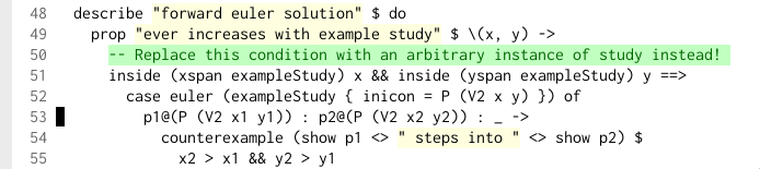
Also, I had to use reader view for TFA because of this silly pixelated font. Ironic, considering that the article is about readability.
Yeah. Pink for keywords, orange for arguments, yellow for strings, green for functions, blue for classes and purple for constants.
But it’s not even important if you can. Having different colors helps you quickly / unconsciously filter through different parts of your code. I agree it can be too distracting to have lots of colors (especially with semantic highlighting, which I’m no particular fan of for that reason), but a carefully calibrated theme helps most people I think.
I can also certainly imagine that some brains just work differently. Maybe for some people colors just add more noise?
I wrote a vscode extension for effect-ts authoring that indeed leverages this concept.
It adds underlines and/or bolder fonts to emphasize different functionality.
> Unlike prose, where you usually read it linearly, with code you bounce around based on what connected elements you are exploring.
The moment you are jumping around a lot while reading, being able to understand the structure quickly becomes a major help. For example, dictionaries will have the words in a bold font while italicizing things like the plural etc.
I will caveat this on the fact that I use Allman brackets, and have even stronger opinions about that. K&R brackets are cancer and completely destroy the structure of code, so maybe that's why some people feel highlighting is necessary for "structure". With allman brackets, the punctuation guides your eyes to the indentation forming a clean box around each level of code, while if you draw a line from the opening bracket to the closing bracket with K&R style, half the code will be inside it and half outside it, bisecting the natural structure.
Yes they have? It's a fairly common method of teaching children sentence structure.
Pedagogy aside, take a look at what books looked like before the printing press.
> for experienced readers syntax parsing happens as automatically as it does in natural language without any need of colors.
If you're reading slowly, yes. The colours help you skim-read.
Why do you feel the need to intentionally hobble yourself? The human eyes can take in a spectacular amount of visual information at a glance, using colour, texture, shape and so on to instantly classify and identify things.
Decades of visual design research have proven that colours and shapes improve understanding and you're using a device capable of complex and rich information display, but you want it to look like a book because ..?
I literally mentioned it for learners. I meant for "improving reading speed". Syntax highlighting is like a crutch that helps you walk but is slower than being able to walk normally.
> Why do you feel the need to intentionally hobble yourself? The human eyes can take in a spectacular amount of visual information at a glance, using colour, texture, shape and so on to instantly classify and identify things. [...] Decades of visual design research have proven that colours and shapes [...]
Because the colors and shapes you're talking about are for differentiating things. Colors and symbols improve understanding when used sparingly, if your UI is just a page full of colorful shapes and symbols it becomes a nightmare to navigate. Likewise, differentiating every third word in a sentence is counterproductive. It's text. We spend our entire lives reading text. Our eyes are already trained to skim text as a unit. I seriously doubt there's any research suggesting that making every word colorful and breaking up their flow improves reading speed compared to letting the text be a cohesive string you can parse quickly.
Just that it doesn't work for you, doesn't mean everyone is like you.
While I overall agree with the point of this post and the post being cited, I disagree with the premise that you need to be able to actively recall facts like this. The theme I personally use is quite toned down, but it does use different colors for variables, keywords, arguments, type names, and a few other classes of tokens. I don’t consciously think “hmm, what color is an argument” to look for those in my code - I just see them, have learned them over the years, and it’s muscle memory at this point, and helps me read the code. Just like I can’t remember the code to my apartment building, yet I type it in multiple times every day.
To me it's even less problematic than this. Not being able to remember important codes except via muscle memory is quite unsettling for me because every now and again my muscle memory fails. Like I will get to an ATM and think "wait - what is my PIN?".
With syntax highlighting, even if my muscle memory fails me I still benefit from syntax highlighting (I think). Because I can immediately see the structure of each line. If I am looking through code for a particular thing, I will probably be able to disregard entire lines because they obviously don't have the structure I am looking for. And even within a line, I can just look at the beginning of each "span", immediately know if it's what I'm looking for, and skip to the next span if it's not.
Apple also has this stupid thing where you sometimes have to type your iPhone pin on your Mac to verify your identity. I’m unable to recall it on a keyboard instead of a keypad.
Well I guess that’s the difference? I personally change themes many times per day depending on my mood and the lighting conditions, and probably go through at least a few dozen themes in a year.
I don’t need to memorize colors either though, I look for differences in colors not absolute colors.
Same. The goal is to differentiate things. I code mostly in Clojure and I love functional code, so the one thing that really stands out is anything that does mutable things: for example there's swap! in Clojure and that one is "bold fluo blue on a near dark background". I don't use it often, so it sticks out like a sore thumb. But I don't need to remember which hexcode I used for the fluorescent blue: I just know it's obvious.
Same for "rainbow parentheses": it helps visually see where the matching closing parenthesis is without needing to put the cursor on the opening parenthesis (which I can do too if I want).
My color code is mostly toned down too.
My pet peeves:
- I have no idea how people are supposed to be productive with non-semantic rainbow vomit themes that are so popular in modern editors. I'm too ADHD to want to be overly stimulated by useless information.
- I routinely hate encountering Zig code on Github, where the theme they use turns everything brown. Oh it's because it's a struct member. Dude, everything is a struct member in Zig, it's silly to allocate a vibrant colour for what amounts to 90% of the source code. Random example off my browser history: https://github.com/foxnne/aftersun/blob/main/src/time/enviro...
- Yesterday I opened some Lisp code in KDE's KWrite text editor, and every single default theme highlights parens with a bold font + vibrant colour to make them stand out. Parens in Lisp are supposed to fade in the background, not pop in your face. It was completely unusable, I had to turn off syntax highlighting.
Always seeking good, minimal, muted colour themes for my editors. I wish we had serious designers to design themes for usability and comfort, and not people that have no business playing with colours.
I remember a colleague that used to write code with syntax highlighting off, and thought that was an eccentric choice. The older I get, the more I appreciate his wisdom. I'd rather have no syntax highlighting than bad one; at least one would try to make the code easy to parse by its structure alone (shorter lines, comments to delimit sections, etc.)
I thought that this might be some sort of highlight based on complexity/risk/importance. That immediately struck me as a "why didn't I think of that?!" moment when actually turns out they didn't either.
So I can imagine a scenario where you have a LLM agent's diff to review while iterating in an IDE. The diff would highlighted according to importance/complexity for human review. Trivia like getters and setters would be grey. Highly complex or complicated or risky code would be highlighted in some high-contrast bold colour (perhaps with a luminance scale depending on how critical it was). Then when you are reviewing the diff from the agent you can instantly see and focus on the most important bits that need the most attention.
I'd find that really useful.
Or maybe newer code could be brighter, and older code (not touched for a long time) could fade?
Good article that gives you food for thought
As for syntax highlighting – I don't like it either.
I use themes that change colour according to their nesting level.
I thought it would be interesting as it separates that what repeats a task from the actual work being done on it.
More nesting suggests more complexity.
In my experiments I notice different ways to write something look better with different kinds of highlighting.
If you for example use no highlights dividing the logic over tiny functions looks quite readable.
In one experiment I use dark colors on a black background with only the comments in bright white. I wrote a lot more comments using that. Everything had a description and I could gaze over it as if the code wasn't there.
Reserved words are red
Strings are green
Constants/numbers are blue
Types/meta-language are yellow
Anything else is white.
It’s not too colorful but still gives you plenty of anchors for your eyes.
Why don't we visually emphasize the verb in a sentence and deemphasize articles and prepositions, for example?
In prose the author can *bold* or italicize text to emphasize ad-hoc, or make ## headings for scanning. Why can't we do such ad-hoc emphases in code?
in using it, i believe that it's a little handholdy and reduces expression when every word has some color based on it's part of speech. intentional application of this would be incredibly fun to read, if not incredibly tedious to write
[0] Which is why UPPERCASE TEXT is a reading speed bump for almost all readers because word shapes blur together into "just rectangles" more. Which is also why the "slow reveal" pattern in most visual novel genres is often very wrong for English text. (Most simply reveal character at a time which makes sense for CJK ideograms because one character is at least a full syllable if not also a full word. When the pattern was copied to English translations it probably should have been done word at a time rather than character at a time.)
I built this monochrome and low-contrast simple colorscheme for vim and I’ve been using it since. Haven’t missed colors at all.
using underlining / background color as part of syntax highlighting will conflict with LSP/IDE diagnostics unless their presentation is redone as well. many editors don't provide that control
Btw the dynamic highlighting by clicking on the code is so cool. I may or may not steal that idea ;)
> Comments: these contain high level descriptions (faster than reading the code) and external context (the “why” that reading code can’t answer). This is the most scannable thing in any big code file.
Not sure about that one, depending on comment culture. Comments are prose and not structured, so to understand their meaning is a lot more cognitive load for me than (most) code. I certainly wouldn't have thought to call them "scannable".
I often fail to notice it on the first look of some snippet of code
The base form isn't too useful by itself, but I expect if one would "seed" the LLM with a prompt about focusing specifically on a particular class of errors, it might be possible to find violations by seeing where the code completely deviates from what an LLM would have written.
Never got around to doing anything with this, but I expect a prototype should take no more than a day with some agent-assisted coding ;) Tell me how it went if you try!
https://i.xkqr.org/lighttheme.png
I think the relatively bold highlighting of comments is important – lots of times I'm the only person to react to incorrect comments because people's themes blur them into the background and they stop reading them.
(But then again, I'm crazy. I colour diffs blue and orange: https://i.xkqr.org/blueyellowdiffs.png inspired by similar advice in https://jameshfisher.com/2014/05/11/your-syntax-highlighter-... I think it has worked to help me notice things other reviewers have not, but it's hard to know for sure.)
But that's only Java, and I want to believe most people moved away from box ticking exercises like javadoc blocks. Comments should be important and thus high contrast.
At least personally, I've been living with ADHD long enough to have had to learn to cope with the fact that even if I tried to suppress various stimuli in my environment, I'd still find something distracting. Pretty much all of life is filled with background noise for me, so having some of the syntax look noticeably different is not that much of a net increase to distraction for me. To you my color scheme probably looks like "rainbow vomit", but I like bright colors on a black background, and I'm the one who spends all day looking at it, so why should it matter whether you like it as well?
That depends on what your use for syntax highlighting is. If you use it to find specific types of code, than yeah, it's probably unhelpful. But for me, the point of syntax highlighting is to just make reading easier by separating different parts of the code with different colors. I have absolutely no idea what each color means in my editor, it just matters that they're different.
While I can use rainbow color, but this day syntax highlighting kinda fades into the background as I don’t care that much. I like it for something like React and html for the tags part but indentation is much better than highlighting in my opinion.
I think Prot's Emacs themes are good for this.
It's programmer art!
I want the same as you, but probably also the same as you; I'm too lazy to do it myself. Maybe do all of us an favor, and create that yourself and share it with us? I too prefer no syntax highlight than bad one, and most out there are bad, and you clearly grok a bit more than the typical color scheme creator/maintainer, so you're already 50% there! ;)
I also subsequently made a dark variant of it for my website’s dark mode and for occasions I want to use an editor in a dark place.
The colours involved are all high-contrast, using the RGB channels provided rather than trying to be silly with low contrast: #fff, #000, #c00, #090, #00c to begin with.
But I have no particular interest in publishing this in a form others can consume in whatever editors they use. Plenty of small tweaks that I develop over time, half for my own Vim syntax files. I think the approach itself, of experimenting deliberately yourself, is worthwhile.