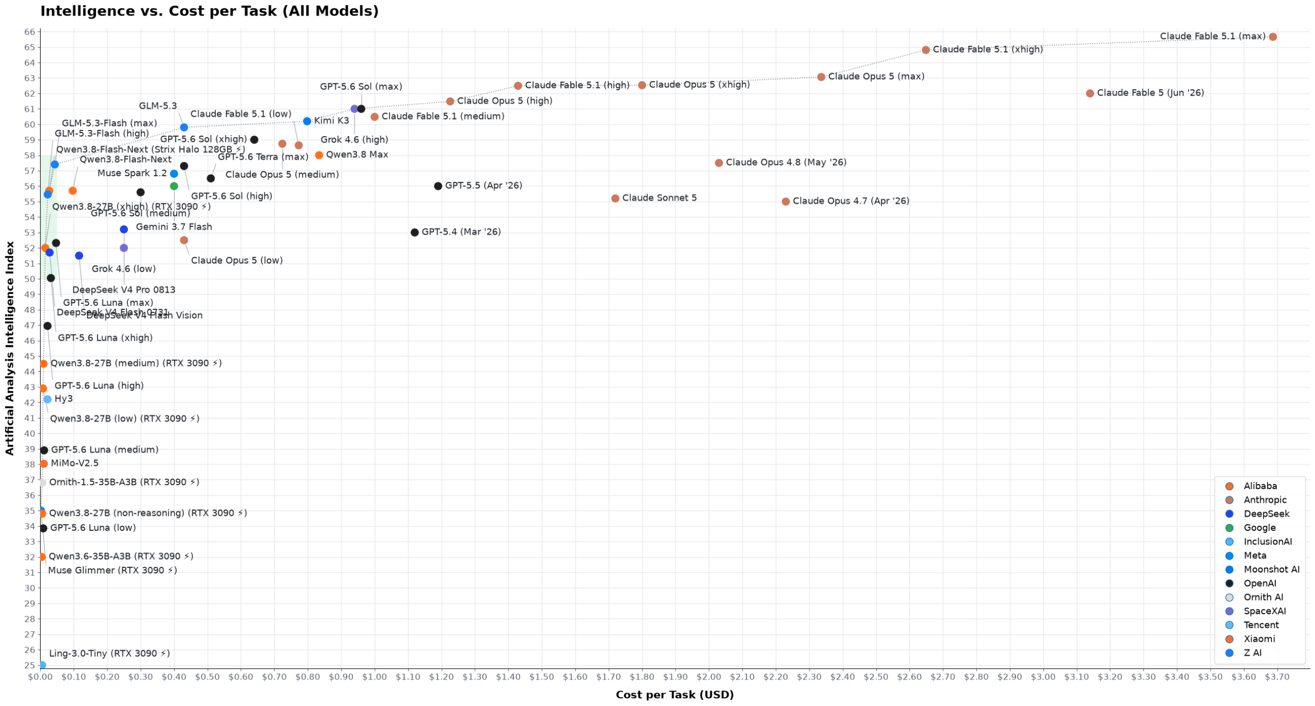
LLMs: Intelligence vs. Cost(openteams.com) |
LLMs: Intelligence vs. Cost(openteams.com) |
For my style of coding (quick back-and-forths and corrections) it makes a big difference if a model comes back in 1-2 minutes compared to 5-10, and I am happy to pay a bit extra for that.
As someone who only needs AI for a couple of tasks per day, I don't really care how much it costs, especially when subscriptions are subsidized. I want to filter by speed (eg, max task time < 1 min) and then choose the intelligence I need for the task. This will surface models like Gemma4 31B (xhigh) running on Cerebras and GPT Sol (med) fast mode. Using these models feels great and are affordable for infrequent tasks.
Go to https://artificialanalysis.ai/ and scroll down to the second graph under “Speed & Latency”.
I think this is the most import graph on their page. I wish they would let us filter by intelligence, or pass rate, and then see this graph. This is the tradeoff that actually matters, cost/token or tok/s can be very misleading (take glm-5.3-flash as an example).
Nebari is officially listed as a JATIC product as part of the next-gen toolchain supporting DoD AI development.
Are we officially ~one degree of Kevin Bacon from the DoD endorsing running Chinese OSS models because they're self-hosted and we're all too dumb to tell the difference?
https://openteams.com/open-source-isnt-the-real-risk-in-nati...
Because speed is important, as the reasoning and hardware determine both cost and speed. it's a three dimensional tradeoff.
there's a fun Excel artifact where it auto-selects the 'relevant' range with no adjustment for how proportionally close to 0 the values are - a professional researcher publishing to a journal should know better (and should be ridiculed for not incorporating best practices) but for a personal blog by an SWE this really isn't the worst sin
[0] https://digitalblog.ons.gov.uk/2016/06/27/does-the-axis-have...
Just look at the first chart: the distance between Fable 5.1 and Sol is <5%, but it looks like 25 or 30%.
What is bad is starting at 0, showing an indicator of a gap, and suddenly starting at 30 or whatever after the gap.
If I'm not wrong OAI tried a similar trick when GPT5 was announced ... they have been criticized a lot.
Filter by quantization, and most providers will have the same price. There is some "base" price even for open-weight models. Anything cheaper means some tricks on the provider's side.
What will happen is that this will be the third consultancy with a lofty narrative after Enthought and Anaconda that Oliphant established. It is always bait-and-switch.
If you own a graphics card you bought for gaming or a laptop you bought for doing schoolwork there is $0 in cost of local AI tokens, because 100% of the cost was assigned to doing other things.
Based on these costs I'd almost expect the amount of gaming graphics memory to go down over the next few years putting more stress on running those local models.
Another thing is if you're using the subscriptions with OpenAI or Anthropic you get an order of magnitude discount relative to the per-token price. So you need to move their models ~10x to the left on the plots to get a fair comparison.
> The first issue I have with it is that it uses a logarithmic scale on the cost axis. Using a log scale is the only way to make you spot the difference between a model that costs $0.015 per task and one that costs $0.032, while the same plot contains a model that costs $3.69 — almost 250 times as expensive. However, the net result is that the viewers can no longer appreciate the immensity of the price difference between the cheap models and the heavy ones; nor can they realize how inconsequential the price differences are between the cheap models.
This is an asinine complaint, and nobody can seriously tell me that the last plot on their page [0] is more readable than the AA one [1]. If I'm using a model at the lower range of the cost scale for whatever list of tasks, and i switch to another model at the lower end of the cost scale, my spending might double anyways! This should be reflected in the plot, and linear scale doesn't do it justice.
It's also much easier to see the mentioned pareto frontier in the log plot than in the linear one.
I can see why they disagree with the pricing determination for open/local models, but I don't think there is one clear right way to do it. So how do they do it instead?
>Hardware is priced at zero, on the basis that both an RTX 3090 PC and a 64GB Strix Halo are desirable gaming/work machines anyways.
...oh
Would have been nice to mention explicitly how the pareto frontier changes with those new calculations.
[0] https://openteams.com/wp-content/uploads/2026/09/all_models-... [1] https://artificialanalysis.ai/#intelligence-comparison-tabs
And as the complexity of your score increases, the cutoff goes up. We can quibble about where your personal cutoff is, but it aint 0.
But even if it was between 0 and Inf+, it still gives you a wrong perspective, especially if you are not paying attention, on model capabilities.
Only if you aren't schooled in reading graphs. It's a given that you always have to look at the axes when interpreting a graph.
How exactly would you zoom into a section of a graph and just show that section?
So we can say the same about the authors "AA’s plot is misleading" claim, he is "not schooled in reading graphs"?
> How exactly would you zoom into a section of a graph and just show that section?
When building a chart is good practice to provide log scale switch and zoom&pan capabilities, so the reader can decide how to look at it.
Oh absolutely - as other commenters have pointed out.
> When building a chart is good practice to provide log scale switch and zoom&pan capabilities, so the reader can decide how to look at it.
For the majority of the time charts have existed, your "good practice" would have been impossible. Charts have historically been static images (e.g. published in a journal). So there have been conventions on how to depict them - and at times it is very appropriate to start from something other than 0.
Here's an article from the UK's Office For National Statistics:
https://digitalblog.ons.gov.uk/2016/06/27/does-the-axis-have...
But that era is gone since decades, nowadays, given how easy it is, it's a shame to not provide log scale switch and zoom&pan capabilities.