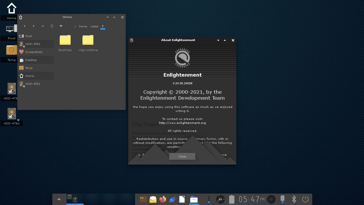
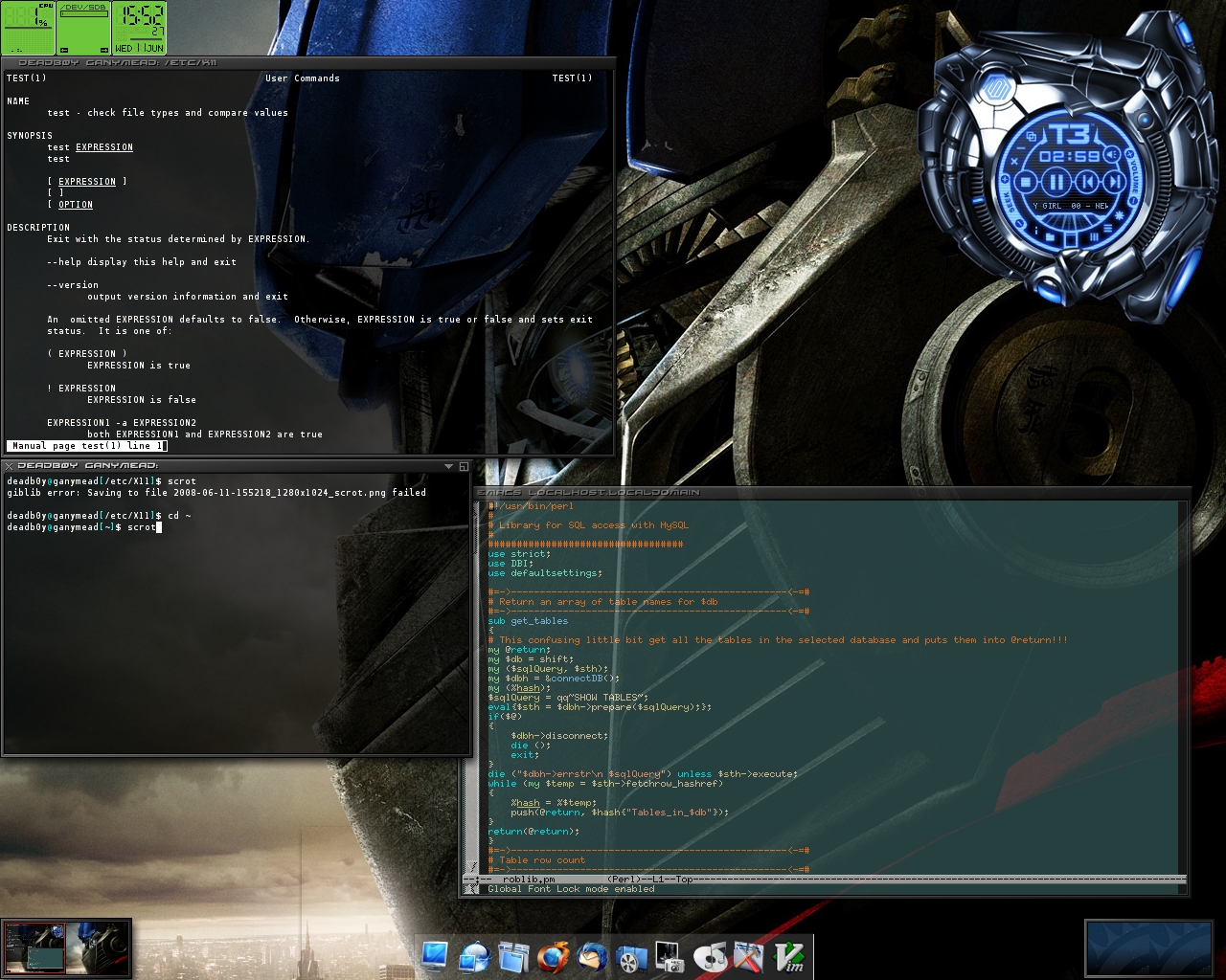
This makes it interesting. I may try it out. Moksha uses 200 MB to 300 MB of RAM
I don't know if it's just because it was better or am I just tired of the current white (like #FFFFFF white) backgrounds with everything flat and not connected. I would like my browser tabs to be in the shape of a physical tab in notebooks.
I don't know if this is accurate, but I blame Windows 8 and, especially, Windows 10 for popularizing this extremely bland and boring design.
https://worrydream.com/ABriefRantOnTheFutureOfInteractionDes...
On the visual pretense: "Pictures Under Glass sacrifice all the tactile richness of working with our hands, offering instead a hokey visual facade."
On touchscreens mimicking real objects without haptics: "Pictures Under Glass is an interaction paradigm of permanent numbness. It's a Novocaine drip to the wrist. It denies our hands what they do best."
On why this design path is short-sighted: "To me, claiming that Pictures Under Glass is the future of interaction is like claiming that black-and-white is the future of photography. It's obviously a transitional technology. And the sooner we transition, the better."
`sudo sh scripts/install_debian.sh`, a 583 lines long script, basically now a whole software just to handle the installation of this project on one distribution, seriously? If we vibecode already, just do the normal packaging.
I don't hate skeuomorphic design but come on man
I don't know why anybody would. It takes all the lessons we learned about UX from user testing in the late 90s/early 00s and throws it all away to produce something that looks "clean" and "sleek", at the cost of being useful. Discoverability? Who needs it?
EDIT: Though I do enjoy skeuomorphism, I do think the TFA goes a bit too far.
They found that words that convey some meaning related to what the command does had little or no effect on the user remembering what the command does. I strongly suspect skeuomorphism similarly has no claim on functional advantage.
Discoverability is good, but it's probably got a little to do with the icon.
This one absolutely over indexes on that second principle, to a borderline cartoonish degree, but I expect the reason it’s resonating so hard is exactly what you’re indicating, that in the industry’s desire to be able to move on from the tether to the shapes of physical objects, they discarded that first principle entirely, instead of figuring out how to maintain the visual cues to form and operation in a new language.
(Here’s where I throw away all that credibility I just got from the prior two paragraphs: I actually think Liquid Glass is getting closer to a “skeumorphism without skeumorphism” than anything else I’ve seen out there.)
Well, there's really two things going on here: consumer vs professional. Does an electrician need to "discover" the modes on her multimeter? Naw. Do I need to discover where the wiper controls are on the car I just rented? Absolutely! But I'm not a huge fan of UI fluff that helps me discover things on my work machine.
Most "flat" designed modern apps fail miserably at discovery. Most hide things in hamburger menus or require weird random swipes in odd directions with zero visual indicators.
Years? The novelty wore off in a week with Enlightenment's constant crashing :-(
Anyway, I look forward to more Window Managers (Hell, even a whole DE) that put the fun and whimsy back into computing.
Enlightenment today (https://www.enlightenment.org/_media/aa/shot-2021-12-13_17-4...) looks nowhere nearly as cool as it used to:
https://imgur.com/enlightenment-are-we-posting-throwbacks-de...
http://robert.thegeakes.co.uk/images/elive.jpg
https://commons.wikimedia.org/wiki/File:E17_screenshot.jpg
https://www.reddit.com/r/unixporn/comments/fq4y3c/e17_found_...
It's hardly even skeuomorphism, it's a almost digital twin rendered with Phong.
They dropped the ball:
DESk would have been Desktop Environment, desk, and Skeumorphic in one word.
> The room is ray-traced
imho, part of the charm of iOS6 was that everything was baked into native-resolution textures.
Indigo Magic or CDE is as close as I'd want to go with that concept.
2004 was a long time ago, and I suppose what is old can be new (again).
The calculator is a sheet of paper..
Compaq Presario 486 1994, I was 10.
And yes, played Myst on it.
Tempus fugit…
We bought a bunch of TabWorks-based Compaqs back then for a medical office where I was doing IT work. I thought it was slick at the time.
I could read it comfortably, whereas usually I can't make it through even a paragraph from an LLM.
"Microsoft Bob presented screens showing a house, with rooms that the user could visit containing familiar objects corresponding to computer applications, such as a desk with pen and paper and a checkbook. Clicking on the pen and paper would open the system's word processor."
Something like Microsoft BOB takes the metaphor too far and gets weird.
I think this project leans on it a little too hard, but a balanced approach can make the systems quite charming and provide a nice juxtaposition to the very austere hardware we have these days.
Fun, but most themes were basically unusable.
[0] https://en.wikipedia.org/wiki/Kaleidoscope_(software)
Some samples: https://web.archive.org/web/20110709175639fw_/http://www.kal...
(The one I used the most, was Ozymandias II).
That may have more to with the skills of the implementors, as opposed to the concept, as a whole.
I do find modern "flat" design to be less "fun," but I get a lot more done with it.
(Bonus points for not throwing AI-tells at everyone in the README - much appreciated).
Weirdly, there is some kind of power play happening with OS UI: "MBA finally in position of influence wants to force their taste on everybody" appears to be a thing.
I think it does, but for new users only. I hate playing the "is-this-a-button" on modern designs, not knowing what is clickable and what is not. Other games I hate:
- Lets find the scrollbar
- Guess which window has focus
- (Windows-only) Try to predict the application to get focus on alt-tab, then alt-tab again.
- How do I find the file that just downloaded?
Many apps present content in such a way that makes it impossible to tell if there is anything more on the screen until you actually try to scroll. The home screen of the app is so clean and so fitted that there is nothing poking out from the bottom.
Used to be a solved problem before some ** messed it up. I hate that game too.
It's almost as if we didn't learn anything about UX in the past 30 years.