iOS 7(apple.com) |
Not bad looking in my opinion, if a little bit weak on color choices.
The parallax effect looks fun but it will have to be subtle enough to not be gimmicky after a week or two.
The inspiration from the original design would continue along the third-party apps and some of them would gain significant users just for its non-flat graphic theme.
The tone of the voiceover is of one taking oneself a little too seriously, I think. What's more I felt it overbearing and that it occluded the message.
Are others liking the "medium" here?
The tone of the voiceover is of one taking oneself a little to seriously, I think. What's more I felt it overbearing and that it occluded the message.
Are others liking the "medium" here?
The tone of the voiceover is of taking oneself a little too seriously, I think. What's more I felt it overbearing and that it occluded the message.
Are others liking the "medium" here?
> distinct functional layers help establish hierarchy and order and the use of translucency give you a sense of your context
...when the MS design guys ditched Aero style aesthetics of skeumorphism and transparency, they actually threw the baby with the bath water, they didn't realize that layering and transparency are the missing ingredient for adding order and hierarchy to flat design. yeah, avoiding hierarchy and "flat is better than nested" are good ideas, but for any non trivial GUI you need some order and hierarchy, and transparency is the only thing left to use for this after ditching skeumorphism. as usual, Apple gets design right! (though kind of late...)
the recent design shrieks of adolescence.
who here predict a wave of apps that go back to earlier designs?
Maybe Bronies are the target market?
Even now, it looks a lot better in video than in still.
Imagine if Google Voice appeared as an antique telephone in the lower corner of the gMail app, and if each message was displayed as an envelope addressed with comic sans.
Flat design is simply, objectively better. The version shown today will likely evolve subtlety as Apple puts its unique stamp on flat.
It's interesting to see how iOS and Android each go back-and-forth swiping features from each other (or from popular accessory apps; Apple's the worst at doing that).
I suppose coming from a art background as well as a computer science background gives me a different perspective.
Its a good way of keeping up with the new trend of flat design without losing the iOS look and feel, my biggest fear for Apple is that they would have made a rip off of windows mobile, but here they haven't, they have made a really good balance.
Has Apple used "double tap" in iOS before? It seems like something they'd studiously avoided in the past.
After Google poached WebOS staff, their card UI is really nice and pretty Palm-like. For some reason they haven't shamelessly stolen the WebOS multitasking UI like Apple just have. I really hope they do, because it'd fit Android perfectly.
That notification bar is really nice too, although it seems to be missing quick actions like Android has. 'Today' and 'missed' tabs seem like a good idea though, I'd like to see them on Android, and I'm sure Google could use Now to make the 'today' one seriously useful.
https://developer.android.com/design/media/ui_overview_recen...
1. It "feels" slower, might be because it's not 100% optimized yet, but what I suspect is causing this feeling is the new animiations. Everything just feels sluggish, kind of like using an android feels to me.
2. It appears harder to locate things in apps.
3. The paralax animiations arent all that obvious and doesnt add as much depth as I initially thought it would.
4. Some of the app redesigns are really nice (address book for instance).
5. The thin font is really hard to see sometimes.
6. The new design of the notification view is really nice.
That's it for now.
What happened to the "Think Different" Apple?
I'm interested to see how long it takes the old UI to look antiquated to me. Isn't human reaction to fashion interesting? :)
Maybe it's actually original? If you think this is Windows Phone, you've never spent any time on that platform. Windows Phone is defined by solid colour tiles and typography. iOS 7 isn't, at all.
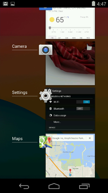
1. Being able to change WiFi, brightness and other "Settings" options from the home screen.
2. An animated weather app with cooler design and more information.
Those are two really big things for me. I don't even focus on the flat design right now - those functions on the home screen are part of why I jailbreak.
Now, if they could have Messages send popup notifications for new texts, this would be even better.
Can't we at least temper our criticisms with a few things we found positive and a good attitude?
Let me give it a try.
I am really excited about the control panel. It has a lot of very useful features that will save me time and frustration. However, I am concerned that the design of the control panel is busy and may make it difficult to make the correct selection quickly, we'll see.
Look at the example screen for "Control Center" -- it looks like a geometric indistinguishable mess. The line around buttons is the same as the line dividing sections is almost the same as the line in sliders.
The example screen for weather shows thin white text against a light blue background, which I can barely make out on my monitor, let alone on a phone.
If anything, phones need extra affordance as what is a label and what is tappable, since we have fat fingers, hold phones faraway where things are small, and often in bright sunlight where there's little contrast we can make out. Phones need extra contrast, not less.
I'm really not one for hyperbole, but Steve Jobs must be rolling in his grave. This isn't about an aesthetic choice, it's just about common-sense usability and quality control. That weather app looks completely useless in the real world, and the fact that Apple's internal processes have allowed this to be launched does not bode well.
On the plus side, it's very speedy. Plus, it makes existing 3rd party apps look glorious, with their attractive, last-generation looks.
No, of course they didn't. Apple is widely acknowledged in the industry as having amateurish design and an utter lack of anything resembling perfectionism or attention to detail.
Seriously, this may be a flop from them, but I cannot comprehend the mindset that would surmise they did no usability testing off a few screenshots.
Yes, it does, actually. As resolution increases, so does the Nyquist frequency, which means you can accurately convey higher-frequency signals. In spatial terms, more resolution means finer lines without aliasing errors.
Indeed.
#slatepitch
You do realize you are on a web site designed for commentary on tech matters?
She flipping loves this redesign and I'm pretty certain my not techie iPhone/iPad using parents will too - and that, is was really matters to Apple, that 98% of their market will love it and not just the 2% of us who build for their platform.
I like most of it, the colours are a bit much for me but in the main it will be refreshing to move on to something new. I have been toying with moving to Android but this redesign is enough to keep me on board - if I'm going to have to learn a new OS I may as well plump for the one most similar to what I already know
Or do you take issue with gender specific viewpoints in general?
In either case, simply quoting an excerpt is fairly pointless, as individual readers will make their own assumption, as I have that you did so because you have a problem with the statement.
I've never thought a screenshot of a mobile device's screen felt even remotely like holding the thing in my hand.
I've never thought a screenshot of a mobile device's screen felt even remotely like holding the thing in my hand.
the last time the entire neckbeard web went apeshit like that was when they announced the iPad. and the iPhone before that. practically all forums are useless right now, including here.
guess that a lot of people also only see the screenshot, have not watched the screencast. iOS looks different in movement, the animations, parallax effect, etc. all add up.
the under the hood stuff is super, multitasking, app updates, per app vpn, etc. like christmas.
iOS7 will trigger a redesign of our own iPad app, it is a welcome agent of change as our (corporate) customers will not be able to hold these upgrades to iOS back as they did with Windows.
Unlike my competition, I went 'flat' out of necessity when I launched last year (I found I could write 'bezierPathWithRoundedRect' a lot easier than I could draw a button in PixelMator). Who knows, maybe my app will look fresher in an iOS 7 context. It already looks utterly different to its competition (synthesizer apps), which are universally retro and skeuomorphic. Thanks to Apple for vindicating my laziness!
(Apologies to real designers: I do know there's more to flat design than not bothering to draw textures).
http://i.imgur.com/JXw7KQA.png
That is ugly. So is the iTunes icon, so is the Safari icon. Not a fan.
At first glance, iOS 7 looks like a hybrid of Android and WebOS. Especially the card multi-tasking approach.
Notification center is cleaner but the colors are all over the place.
Lock screen is pure Android (animated wallpapers, etc.)
They might have made it too flat actually. A lot of text everywhere (the user will definitely get confused on what to tap and what not to tap) Cupertino might be used to UI but a lot of "ordinary" people are still pretty clueless when it comes to interacting with devices whether physical or virtual.
The Safari icon is simply atrocious, although the new Mac Pro looks like a really expensive trash can - I CANNOT believe Ive designed that product. It is just godawful.
Flashlight app? OK cool (RIP Flashlight app people)
Activation lock is a neat feature, probably a top-5.
Oh yeah, and photo filters - PHOTO FILTERS!!! They even included a square Instagram-like camera UI. Are you kidding me?
Apple did a great job of selling a BRAND much less so than selling great new products and features.
One of the biggest pains I think we face as developers is software fragmentation. So far Apple has done a very good job of having users update versions of iOS and keeping consistent with hardware specifications - it's probably one of the top three main drivers for why I develop primarily for iOS (sometimes solely for iOS). I'm thinking this reinforces that build-for-iOS-first mentality for developers. If the quality of apps is such a large factor in what's keep users loyal to the platform, this is an important point.
Biggest let down, no inter-app communication improvements. I think that's a huge problem on iOS now, one I was hoping would be addressed.
Most of these features are just copies of other popular apps/operating systems that came out over a year ago.
A good one?
To me, that looks just like the Samsung UI. (yes, Samsung copied the icon layout but you could still tell them apart... now Apple seems to have come the rest of the way to Samsung's side)
I'm going to wait until it's in my hands and can play around with it.
So, and this is perhaps a small detail, it does seem somewhat interesting, that both Google and now Apple, appear to have adopted Microsoft's flat UI approach.
Take a look at the text screenshot. It is hard to tell where I should touch to start typing. It is hard to tell where the buttons are. Overall, this is incredibly shitty UI.
My guess is, the text box below the message list, which in the same place as it is in every sms app on every modern phone platform, and which is the exact same shape as the text box was in the old iOS sms app (http://i.imgur.com/jSGZADn.png), and which has the word 'send' next to it.
That's just a guess, though. I could be wrong.
edit: And Apple made Bing the default search engine! http://techcrunch.com/2013/06/10/apple-slips-default-bing-in...
It's like Google's UI and Microsoft's Metro had a one night stand, then 9 months later dropped it off at the front-steps of the Jailbreak Orphanage.
Ever since I saw this demo video for Senseg [1]:
http://news.cnet.com/1606-2_3-50115714.html
I've thought long and hard about how Apple might use this in future iOS devices. This clean slate design feels to me like the first step to something more. I personally hope it has a lot to do with haptic feedback as adding another user interface dimension to these types of devices would be incredible.
As someone who uses their ios devices mostly at night, I'm not looking forward to everything having a white background though.
I wish there was a theme that could be enforced on all apps that could be swapped at appropriate times. You know, like Windows 3.1 in 1990.
Personally, I don't think I will like the super flat design though. They are swinging the pendulum into the other extreme.
but seriously meh...
it's like somebody discovered the 2 and 3 color gradient fill in illustrator and called it a day
the new airdrop stuff is cool, but no substitute for a proper intent architecture
and the backgrounds are now all white
meh
So much for apple creating their own distinctive UI/UX. I don't think you can convince a lot of people that Apple does things differently or 'in their own unque way' that easily with this update for ios. And I say this as someone who owns and develops for iOS only.
(Of course, nothing under the hood has changed. So all the reasons for going Android are still valid.)
The sad truth is: once Steve Jobs passed on, the quality of designs coming out of Apple started to decline. The ousting of Scott Forstall and the rumored eschewing of anything resembling skeuomorphic design was heralded as the coming of a great new era, however now that we can see the first results it's apparent that Apple is no longer capable of producing great design at all, no matter where it lands on the skeu vs. flat spectrum. The new designs are still as ugly as the Forstall-era stuff; it's just a different kind of ugly.
It makes me really sad, because the original iPhone was an incredible triumph that led the way of the industry for the next several years. I fear we will not see something of such high quality for a very long time after this. Nothing will change until there is once again someone in place at the top of Apple's hierarchy who can enforce the notion of good taste, regardless of the current fashion or style.
The whole design simply is not well thought out. This has clearly been rushed, which is not something I expect from Apple. If iOS 7 was leaked, people wouldn't believe it's the real thing. Sadly, it is.
I'm staying with Windows Phone.
The new iOS looks half-baked, they can't do anything too bold, else they lose their metaphors, yet they can't do anything radical like Microsoft did without redefining their platform and re-educating their users.
Run away. Fast.
What's ugly about those tabs?
And what's ...skeuomorphic about them? They remind you of real life huge rectangles with webpages on them that you browse through 3D space at home?
What's ugly about those tabs?
And what's ...skeuomorphic about them? They remind you of real life huge rectangles with webpages on them that you browse through 3D space at home?
>The whole design simply is not well thought out. This has clearly been rushed, which is not something I expect from Apple.
BS, if they didn't make any drastic changes the same people would say "oh, they didn't go far enough" etc.
The new UI looks extremely polished and well thought out. And it wasn't just a design overhaul, they changed tons of behaviour and added lots of features too.
>I'm staying with Windows Phone.
Well, if you already have a Windows Phone, I don't think you're the kind of person that would appreciate iOS, anyway.
iOS < 7 had totally non-distinctive icons for Safari, Mail, App Store, Weather and Stocks. I don't think a lack of distinction compared to previous editions is a valid complaint here.
It's ugly because nobody gives a fuck about the SDK icon. It's not even an icon anyway -- there's no "SDK" app.
It's just a picture they put on the slides to represent the new SDK.
Don't you think if you want to make sweeping statements you'd better start with the icons people will actually see everyday? How about the home screen?
They certainly have gone for a very bright look.
John Ive has a minimalist approach on hardware that works really well, because the hardware is not at the center, it's the software. But on UIs, you can't be too minimal, since you only have one sense to work with (vision), so you have to work with strokes, textures, depth and color (the full gamut, you're not limited to primary colors).
It has better usability in many areas, but it was a bad idea making a 180 degree turn on the UI design with Ive at the wheel. Jobs would never let this out so unpolished.
I like the overall new style, however a bit of redefining here and there would be good, like some of the icons. Great update.
This one is a big question mark, since it means that the device is either really locked down, or activation lock is just a marketing bullet point that won't mean much in reality. I'm not sure which of those choices I prefer.
Yea, that's one thing which Skeuomorphism does well is I know instantly what I can interact with and what I can't. I still may not know what to 'tap-and-hold' but at least I know what scrolls, what turns, what swipes.
It does it well when it is done well.
Then there are elements like the red book mark in Contacts. where you think - what the hell is that meant to do?
-- Comes with an Intel XEON E5
I fear the auto-update feature combined with multitasking will drastically reduce the typical battery life of an iOS device.
Another point is that unless updates are being pushed constantly, I don't see why it would suddenly kill battery life more so than if they were pulled - it is just the timing of when to do updates (over time or "update all" as a batch - I doubt people actually distribute their updates according to battery usage).
Still, it would be nice to have more composability in apps. I'm working on a UI plugin / framework for apps and I really wish that I could do incremental updates without developers having to redeploy their entire app. If only you could include app dependencies so that when you downloaded an app that used Dropbox, for example, it would download Dropbox too. That way, when Dropbox wanted to update their SDK, they could just push an update to their app instead.
The composability point is interesting. I like the idea of dependencies, and I've used url schemes to do it. You can test for whether or not an app is installed (given that it has a scheme) by testing invoking - (BOOL)canOpenURL:(NSURL *)url from UIApplication. Something interesting would be for Apple to require that each app have a custom URL scheme, and possibly generate them from a unique app identifier.
Also makes a lot of sense from a user's perspective. Click-to-update is so last decade.
Android is a great R&D department. As long as it takes Apple less than three years to develop and deploy a feature they copy, Apple will still have it in the field on their devices before Android vendors do!
But ya, vendors taking forever to update Android is a big problem. That's why I stick with Nexus devices.
It is indeed much simpler to lead a revolution that has already happened.
WebOS + Android into one and the fanboys clapping
At first glance the multitasking UI looks like Palm's. But, if you listen to the keynote there is a whole lot of logic built on how it's done.
Unlike my understanding of Palm/Android the apps are not continuously running and draining battery. Instead the OS chooses when to give the app cycles. E.g. the heuristic explained is something like: The radio is on and there is a strong connection, the phone just went into standby, so before powering down the radio give the most frequently used apps a few cycles to update their content.
To me that seems utterly brilliant. My phone retains its battery life while the apps stay up to date. To me that is brilliant design and why I appreciate Apple products.
I code on competing platforms and the only one I truly enjoy creating on is iOS — I can make things move, manipulate video and audio, images and typography in ways that are simply not possible on other platforms.
If you play with the scrolling in the new messages app, for example, you will notice discrete physics and collision for each UI element within each table cell. It feels fantastic to scroll through. The new UIDynamics APIs are innovative and so simple to use.
Irrespective of how you feel about the consumer facing side of the OS, the developer facing side is really a thing of beauty (with the occasional warts like Core Data over iCloud, and Core Data migration models).
Personally I can't talk about the other stuff but think stock Android looks and feels great while being extremely functional at the same time.
That's an arrogant and elitist thing to say. Your iWhatever doesn't make you a better human being, it just makes you think you have the right to tell that to others.
Don't be an iAsshole.
I mean, where do you see the: "jarring psychedelic colour schemes"?
If anything the grant-parent brings up the example of the Control Center, which is the opposite of that, just a two-color subdued thing.
I don't like the background of CC myself, but I think that's actually because they're letting the hue of the homescreen icons below bleed through too much. It's "neat" but I think it's kinda visually gross :S
Apple is a lot like the old Mercedes: simultaneously innovative and conservative. Mercedes used to have a lot of new features in R&D years before the competition, but would still roll some things out after the competition, after they got it right.
I would love to see your source on this one, because I never stop hearing the opposite.
Going higher than that probably means thinner blank lines will just appear fainter and not thinner.
Olde' Vista Aero did this better.
At least iOS 7 cranks up the blur radius.
"because HN is a gender-troll breeding ground unworthy of my time"
I believe there are interpretations of the OP that are not discriminatory or sexist, assuming you believe there can be any difference in the point of view of a particular gender given the culture they are brought up in.
I believe it's our responsibility as participants in the discussion to attempt to understand one another before levying charges, not only because it's the charitable thing to do, but because I wholeheartedly believe it leads to better, more rational discourse.
To do otherwise leads to, to paraphrase you, a gender-troll breeding ground unworthy of our time.
Fair enough. But I remember when Apple first made the iTunes icons monochromatic, and everyone complained that they'd no longer be able to distinguish the icons. People seemed to adapt pretty quickly though.
Towards an Applestore? I've been using an iPhone since 3GS, and this is the best release ever. Both in features and looks.
Yes. Along with those high profile designers in Cupertino.
>Tell me you like those new icons.
You don't seem to understand how design works.
It's not about "liking" the icons. Icons are not pretty pictures for you to "like" or not. It's about how the thing works, and if they fit their role.
"Liking them" has little to do with it. If you check top downloaded themes for Gnome, KDE, or Windows theme managers, you'll find out that people "like" all kinds of BS junk.
http://www.blogcdn.com/www.engadget.com/media/2013/06/ios-co...
Speaking of this design, the icons are asymmetric. More so by the unharmonious colour selection. However, the notification centre and animations are well done.
A lot (many? most?) of Apple's design decisions are made by designers who create the best product, based on a combination of their intuition, design sense, and overriding design principles.
Some application (Podcast App) - have clearly never seen any form of usability testing prior to release.
I cannot believe such an App had even a single "average" user attempt to use it - it had to have been entirely the product of one or two individuals operating in a vacuum.
This early build doesn't seem to be optimized very much.
(Or has Apple closed this hole yet with timestamping?)
"That is iOS7."
"It appears to be different from iOS6."
"That's an iPhone!"
"I see that Apple made this."
"Well this discussion is getting a little bit too heated for me, I think I will go and reserve my judgement somewhere else for a minute."
If I showed you a picture of a 4 foot wide ship wheel and said I was going to install it in my Mazda Miata - you'd know instantly that it would be unusable, right? How about a screen-shot of a text editor that only shows you one giant character at a time?
Even as we move away from the ridiculous end of the spectrum of examples - you can know how usable something is based on past experience with similar environments.
Really, all I want is a phone that will upload pictures directly to Facebook.
While Chrome has supported HLS for a WebM backend for some time now, documentation on their support for HLS with an MP4 backend is unclear. It seems to work now as of Chrome 26, but that wasn't always the case. It also works fine on Android devices past 3.2 because of Google TV.
If I didn't happen to have a Macbook as a work PC for the summer, I'd have missed the Macbook Air announcement. But god, do I want one.
The technology is there and can be implemented: http://en.wikipedia.org/wiki/HTTP_Live_Streaming
Most just choose not to. That's not Apple's fault, nor is it a reason to fall back to a worse technology that degrades the experience for all watching to help out those on other platforms.
For the record, it wasn't at all limited to "Safari on OS X". Any device or program that properly implements HTTP Live Streaming could easily view the keynote. Apple listed Safari on OS X, the Apple TV, iPod touch, iPhone and iPad as all being verified, but other devices supported it too.