Btw, I believe touch screens originally was more or less created for military vehicles, so I don’t buy a lot of comments in this thread.
The disappearance of buttons and knobs in cars is super frustrating. Thanks Elon and all the sheep copying his bad UX.
The DAB system is a thousand times better, and I can use it 90 percent of the time without looking at it. The tablet? No way.
Context is important, of course. Many have mentioned airliners with buttons surrounding a screen. That is very different from the automotive use case. For one thing, the cognitive load required to interact with a full touch screen or one with buttons and knobs around the periphery is much comparable. The difference is that pilots are able to take shift their sight and attention to the display for as long as necessary to operate it. Anything important during takeoff and landing is on a physical interface they can just reach for. Also, outside of single-seat fighter jets (which is an entirely different category) you have a copilot to assist. Anything works if there's another person who can focus on the UI while you do something else. And, of course, let's not forget that pilots have far more training on the aircraft they are flying than the average driver has on their vehicle. It isn't about experience, it's about having to pass tests to obtain qualification to operate the equipment.
The problem with touchscreens is cars is that it takes a non-trivial level of concentration, focus and physical interaction to operate them. Beyond that, they are fragile. Very fragile. I don't mean in the mechanical sense (not talking about breaking them). Randomly run your hand on the surface of your iPad and see what happens. That's a fragile UI. It's OK for a tablet, where you are focusing on that task. Not OK for a vehicle where you could end-up in some undetermined state if you touch the wrong area on the screen. I've been involved in some pretty high level evaluations of touch screen technology for aerospace. The outcome is always the same: For things that matter, add dedicated physical buttons.
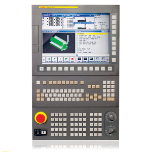
A long time ago we worked on a project to add full touch-screen control for an industrial CNC machine. The end result was to abandon the idea completely when a mistake caused the Z axis to crash into the table at high speed, causing severe damage. As I said: Dangerous.
I would argue that the issue on the road has nothing to do with being able to operate the touch screen and everything to do with potentially causing a horrible accident due to the shift in focus. I am sure accidents have already happened because of touch screens. They are probably not recorded in statistics for us to be able to understand just how prevalent this might be. I know I still see tons of people messing with their smart phones while driving on the highway, which isn't a formula for safety.
"The easiest car to understand and operate, by a large margin, is the 2005 Volvo V70. The four tasks is handled within ten seconds flat, during which the car is driven 306 meters at 110 km/h."
That's my car (2004 actually) and it fits like the proverbial glove. I am pretty anxious about getting a new car. I may just get a newer V70 - like a 2015.
Puzzled how these new interfaces passed regulators.
Why does that need to be tested? Does any driver exist on this planet, to whom this is not immediately and completely obvious?
> WHICH TESTS WERE PERFORMED? Activate the heated seat, increase temperature by two degrees, and start the defroster. Power on the radio and adjust the station to a specific channel (Sweden’s Program 1). Reset the trip computer. Lower the instrument lighting to the lowest level and turn off the center display.
It's only a matter of time, folks.
Edit: saw this has already been posted, which made me say "duh" again.
Oh, and OTA updates to the buttons too, please.
But after a while living with the stupid UX, the buyers would probably rather have the functional than the shiny.
  - no touch screens
  - no embedded screen below the dash, instead screen is at instrument cluster height
  - in center column, where your hand natural can rest, a palm-sized wheel:
    - tactile feedback on rotation
    - multi-directional shifts (cardinal & diagonal)
    - pushing/clicking wheel is selection/confirmation
    - finger tips buttons surround wheel with shortcuts:
      - navigation (either CarPlay/Android Auto nav app or GPS)
      - music (either radio or CarPlay/Android Auto currently playing music app)
      - favorites (can be radio, satellite, etc.)
      - home (one click -> CarPlay Home, double click CarPlay Dashboard with map & media)
      - back
I've seen myriad folks passing judgement on these systems because they've lived with touch screens in cars for a very long time. I was lucky to skip that entire generation going from a minimal LCD digital screen straight to a Mazda with this system. It took a few weeks to feel comfortable, but not once did I ever feel as insecure as I have in a vehicle with an touch screen located below the instrument cluster line.
I think we've numbed ourselves to the routine distraction of touch screens which (generally) bypass most people's ability to mentally map physical buttons to specific actions. It's obvious as has been mentioned in this thread that touch screens are a massive cost saving (initially at least) and vehicle production timeline trick.
The huge missing story for touch screens is user experience and safety. The Mazda input system does take some time to learn, and it does divide my attention when I use it, but it has trained me to be more sparse with my interactions with the multimedia system and to rely far more on voice input control whenever I absolutely need to input data into the system (music selection, route finding, text response, etc.)
This isn't even getting into the surprisingly well-designed software and hardware intermingling that Mazda has accomplished between the instrument cluster (which features one central LCD gauge that mimicks the two real physical gauges that surround it) and the multimedia operating system navigation.
Here's some references for folks who find it interesting and are interested hardware/software design for safety in vehicles:
  - https://www.wardsauto.com/interiors/why-mazda-blindfolding-its-engineers-and-designers
  - https://www.mazda.com/en/innovation/technology/philosophy/human-centric/
"New cars must have dedicated physical controls for critical functions A, B, and C, and always-present displays (physical or otherwise) for critical info X and Y"
Can leave room for nonessential functionality to live on a touch screen
I think it's a safety issue and I think manufacturers will never be motivated to do it otherwise
What controls are we talking about? Air conditioning? Radio? What else? I've always felt the analog controls were made out of cheap plastic regardless of how expensive the car was.
After a few months in a car with tactile controls it is easy to turn on the A/C, radio, whatever with a quick glance or not looking at all.
Maybe the Prometheus era folks eventually got sick of touch screens and sleek, barely useful software that keeps changing for the sake of it.
"Perfection is achieved, not when there is nothing more to add, but when there is nothing left to take away." Hence why the Miata Is Always The Answer.
To me it seems "why not both?" with proper thought to the UI is the right approach.
But I can not stand the touch screen.
What screens make sense for are maps and safety features like showing your cars relation to the road, people, or other cars.
Hopefully this is a fad
> A new study says that people who quit smoking have healthier lungs. Yet another groundbreaking story from the pages of the medical journal "DUH".
Critical (to me) operations like volume control, should be manageable from any context, and with physical controls for precision and no-look-requirements.
To those who want to say “use voice control” let me tell you about all the times I say “turn the fan speed up” and it turns it DOWN.
Maybe one day touch interfaces will evolve into serious performance but most of the time physical interfaces got enough performance as they were before smartphone came into play.
A physical knob, slider, or lever is always going to be a more effective control, but if it's only usable a small percentage of the time, it's pretty wasteful to have it always sitting there taking up space.
There are contexts in which the space and uniformity matters more, like smartphones and tablets, and contexts in which the effectiveness of the control matters more, like in a car.
Cars invented by computer people have touchscreens because they're cheap and easy, and because some computer people don't understand effective interface design. Of course, now cars invented by car people also have touchscreens because they're cheap and easy and because Tesla's getting away with it, so why can't they?
Having a round knob (or slider, but a round knob is standard in cars) always in the same place for volume control is better than having a touchscreen widget that might or might not be visible at all times, because it can be found by touch and doesn't require anyone to take their eyes off the road while driving, and because it can be spun or pushed quickly when needed.
This is really, really basic stuff.
But cars without roofs are getting out of fashion anyway. Next step after no steering-wheel will be no windows.
We have computer with a full keyboard, that all of the commands can be entered, and many key combinations are possible, so a touch screen is not needed. Even many function should not need mouse but sometimes mouse is helpful, though.
Specifically in a car controls (I am sometimes passenger, not the driver), tries to lock some controls while car is moving, preventing the passenger from adjusting the controls. It is better to allow the passenger to adjust the controls in order that the driver will not be distracted from driving the car, I think.
I think that a reasonable design for buttons will including a numeric keypad. You can include other controls such as volume, channel, play/pause/stop/rewind/fast-forward/previous-track/next-track/eject, radio (AM/FM), and possibly a few other function if needed, but many function can be done by combination of other function, e.g. sequence of numbers for a more complicated function option
Even better than buttons are good old fashioned dials and knobs, those little twisty things that click into place and give you mechanical feedback when you are adjusting something in a car. Rocker switches are great too.
And I want my bottom buttons on my smartphone, too. No, I don't need the extra ~50 pixels at the bottom for some video or game, damn it.
If you have to design an interface with physical buttons you need to fully design that interface because you can't easily or cheaply update it after you ship it. This is expensive. This is in addition to physical buttons themselves being expensive.
With a touch screen a UI change is just a software update. The net effect of this is you can be lazy about UI/UX development because hey you can always fix it later.
For cars in particular, physical buttons allow some use without looking at the display. Touch screens do not.
Phones went touch screen because of their limited size, so much so that on iPhones we even lost the home button (which I still miss). Actually the home button is a perfect example because the swipe up gesture is strictly worse. Example: which direction is "up"? It depends on orientation. Also some apps are only in, say, landscape orientation so "up" is actually "right" from the user's perspective.
Driving with a giant iPad is generally suboptimal.
TBH, the test should have been more real world: - Turn off the heated seat (this is more likely than turning it on... most turn it on when getting in and turn it off later) - Turn on the wipers when rain starts - Use the washer fluid - Turn on the headlights when it gets dark - Change the navigation destination - Change the climate temperature - Change the vent direction
The results would have likely been more ambiguous for a car like the Tesla. Heated seats can be automated, so that would depend on whether the person liked the Tesla algorithm. Wipers and headlights are likely automated in the touchscreen car too. Voice works pretty well in some for navigation selection, and probably doesn't work well in the non-touchscreen cars.
OTOH, Tesla would do really poorly at climate temperature changes and vent direction. I suspect some other cars would fare badly at those too, but probably Tesla is uniqely bad at vent direction.
A photo of the winning 2005 Volvo V70 shows it is a pure traditional all controls, zero screen interface. So only intentions that are possible in that era are testable. It is not feasible to have a button for every possible command today.
I've been driving Audis for several years, with their rotary dial interface, and it takes a maddening amount of time to do anything, so much that I often just give up and don't do whatever task I was trying to accomplish.
On a touchscreen, I can be driving along, then 1. take perhaps 0.1s to glance at the screen 2. while watching the road, move my hand to hover a finger where I think is the right place. 3. take another 0.1s glance where my finger is. If I was right, just tap and immediately look back at the road. 4. If I was wrong, while watching the road, adjust and repeat.
At no time am I ever looking away from the road for more than a fraction of a second, and since I don't have to think about finding where some "currently highlighted screen element cursor" is, my mind is relaxed to focus on driving, and each glance at the screen is just to look at EXACTLY what I know is the location of the feature I want to touch.
"$EXTREMELY_OBVIOUS_THING that literally everyone outside the corporations knows, $STUDY_FINDS"
...I lose a little bit of hope for humanity.
Physical knobs, levers, buttons etc. have superior usability and the fact that car manufacturers deliberately closed their eyes on that is only saying bad things about them.
What's even more despairing is seeing comments arguing in favor: "it's cheaper". Yeah well, it's also cheaper to die on the road because you couldn't press the touch-screen control and not live 20-50 more years and pay those pesky bills and food now, is it? Both what they say and what I said are complete non-sequiturs.
What's "cheaper" might seem like an awesome idea to some manager looking for a promotion but they never play the long game. They'll be gone and another more sensible human will take their place... eventually. Any day now... Maybe this century?...
[starts crying]
On a related note I would never own a vehicle that has software control over steering, drive train or brakes. This will be an unpopular opinion right now but I think it will sadly and unfortunately age well with time.
The lane keeping works very well too.
Only thing that sucks about the car is the CHADeMO fast charge port. There's a good number of them around here but not as many as CCS or Tesla and they're probably on their way out. Of course I don't road trip with it that much so it's not a huge deal for me personally.
There are some indie folks working on a CHADeMO/CCS dongle but it's non-trivial. It can't just be a dumb dongle. Basically has to emulate both sides. Will end up being expensive, and would also mean your car has a dongle. But then again in the future everything has a dongle.
I know how to use this but most people I know prefer to start with the touch screen.
My wife's new car, to many screens. My old car, buttons I can touch from memory without looking. The worst part about her car, you can customize the screen in front of the driver but not really. 3 items on the screen - circular thing, status thing, circular thing. There are a total of ~12 versions of the stuff in the circular thing. The information in circular things would work just fine on either side. However for some reason they spilt it 6+6. You want item from right circle to be on left side, nope! There is no reason why. It is a flat display (ie, on flat screen, not 3 screens) and it is just software. No reason for this. It is a display.
For everything that is normal, like AC, etc. please just stick to buttons!
Given the added cost of physical buttons, the compromise was a series of physical buttons along the edges of the screen.
One technique used to convince stakeholders that the added cost was worth it: have them sit an an office chair and ask them to complete tasks on each prototype while someone holding the back of their chair occasionally jerked it around to simulate vehicle movement. Never had objections from anyone who went through one of those presentations.
It's similar to when everyone claimed that touchscreens on phones wouldn't work. They were right until they weren't. Touchscreens on phones didn't work until Apple fixed that. Tesla has done a proper job on car touchscreen UX, but everyone else is putting out garbage.
Sure, phones are a marvel ans show what you can do with touchscreen apps but that is nothing like driving. I also can't play games on a phone well without a controller (or keyboard and mouse for FPS) for the same reason (computer aim/walking assistance is cheating, why bother?!). I use an external mechanical keyboard even when on the road (Keychron K7) because I don't find even the M1 Macbook Pro's keyboard good enough for real work.
So yeah, the touchscreen puts me off getting a Tesla (alongside a bunch of other cars) almost as much as the amount of remote control they have over their cars. No thanks, as much as I love the idea of owning a Tesla.
I’m not fanatical about this, I would use it if I would be forced by circumstances. But I would not be happy about it. And I still would try to educate/convince older colleagues that hotkeys make things quicker/easier/“reliabler”.
From your speculation of source of touchscreen hate, I see that you feel that tesla has superior car touchscreen experience. And I don't doubt that. But however good you can be with touchscreen, you can do even better if you also have bunch of physical buttons (in addition to touchscreen/must look then point device).
I have a 2002 Ford Focus, and I can use everything while still looking to the road. This is very important for my and everyone else's safety. Every other newer car I have driven needs much more attention to do simple tasks, and I'm traveling 80km/h at that point. This is dangerous.
I have read that Ford had a vehicle simulator to test cognitive loads of their consoles and dashboards during driving, but can't find the article now. Hope they're still using that, because new screens are a clear step back with no tactility.
My wife's new car, to many screens. My old car, buttons I can touch from memory without looking. The worst part about her car, you can customize the screen in front of the driver but not really. 3 items on the screen - circular thing, status thing, circular thing. There are a total of ~12 versions of the stuff in the circular thing. The information in circular things would work just fine on either side. However for some reason they spilt it 6+6. You want item from right circle to be on left side, nope! There is no reason why. It is a flat display (ie, on flat screen, not 3 screens) and it is just software. No reason for this. It is a display.
For everything that is normal, like AC, etc. please just stick to buttons!
"I don't think he can fill that void". --Tony Brouwer
'Oh,' but He can. Said fata lu 'Nicki Miraj.
My wife's new car, to many screens. My old car, buttons I can touch from memory without looking. The worst part about her car, you can customize the screen in front of the driver but not really. 3 items on the screen - circular thing, status thing, circular thing. There are a total of ~12 versions of the stuff in the circular thing. The information in circular things would work just fine on either side. However for some reason they spilt it 6+6. You want item from right circle to be on left side, nope! There is no reason why. It is a flat display (ie, on flat screen, not 3 screens) and it is just software. No reason for this. It is a display. For everything that is normal, like AC, etc. please just stick to buttons!
My wife's new car, too many screens. My old car, buttons I can touch from memory without looking. The worst part about her car, you can customize the screen in front of the driver but not really. 3 items on the screen - circular thing, status thing, circular thing. There are a total of ~12 versions of the stuff in the circular thing. The information in circular things would work just fine on either side. However for some reason they spilt it 6+6. You want item from right circle to be on left side, nope! There is no reason why. It is a flat display (ie, on flat screen, not 3 screens) and it is just software. No reason for this. It is a display.
For everything that is normal, like AC, etc. please just stick to buttons!
My wife's new car, to many screens. My old car, buttons I can touch from memory without looking. The worst part about her car, you can customize the screen in front of the driver but not really. 3 items on the screen - circular thing, status thing, circular thing. There are a total of ~12 versions of the stuff in the circular thing. The information in circular things would work just fine on either side. However for some reason they spilt it 6+6. You want item from right circle to be on left side, nope! There is no reason why. It is a flat display (ie, on flat screen, not 3 screens) and it is just software. No reason for this. It is a display.
For everything that is normal, like AC, etc. please just stick to buttons!
That's not a good analogy. The main interface to the car is not the controls/screen, it's the steering wheel and pedals. The controls and screen are interacted with only intermittently. There is more information available allowing for automating most of the controls, and voice control for the rest, meaning the screen is mostly just used for visualization and the occasional action.
Tractors and boats have amazing layouts that accommodate your engagement in operating. Cars are full of gimmicks and showroom fluff
If you look at Gordon Murray's latest car, the t50, he spent a lot of time sourcing buttons and switches for the car because he cares deeply about their tactile feel. There is also not a single touch display in the car. Because he passionately hates them.
If you are into sports cars you kind of want to cry when you look at how badly some of the dashboards tend to age. Some of them look like embarrassing student projects where a 1990s web designer has crammed all manner of animated gifs with a horribly infantile palette onto the dashboard.
That's part of why I have an Audi.
It's a 2021 model with a touchscreen. But it also has high-quality buttons and knobs for each of the tests in the article mentioned and would thus pass with a very low distance measured.
There are some weird issues, however. The audio buttons control the current audio source but don't fall back if the current audio source disappears. Like if you are playing music through your passenger's phone via CarPlay. If you drop them off at their house and keep going, the physical audio controls do nothing at all until you select a new audio source on the touchscreen.
I miss the hold rotation knob so much.
That's lame. 3D printing buttons is a very quick and simple solution to that problem. They can even use my lasts-forever, contactless analog hall effect Void Switch design: https://github.com/riskable/void_switch
Keeping buttons--something that's so quick and easy to 3D print--in stock seems like a huge waste of storage space.
Disclaimer: I haven't actually been inside the vehicle.
Buttons are easier to find without looking. Nice tactile "you pressed it" feedback instantly.
And the fact that all of the cars have such horrible touchscreen UI design. We're used to Apple and Android, and what the cars have is so crappy. And it's always those junky feeling plastic screens. Like how is it they don't just hire Samsung or any tablet maker to build something nice and then hire good designers to just blatantly rip off Apple?
Honda seems about as good as any I've used. I was in a Ford the other day... it was horrible. Just unusable. I couldn't find how to turn the radio on. It was tucked away under "input" and it took me literally 5 taps to get from power off to music playing. And forget trying to tune the damn thing, I had to pull the car over before I realized those buttons were on the steering wheel.
Cars used to be really standard. You could hop into any car and you knew the radio was in the center console. And the lights were on the left (or right if you're foreign), but the brights turned on the same way in all cars. It's just the wild west right now. The designs aren't just non-standard, they're really bad. The tech the cars are using is really bad.
And the new generation are all using touchscreens which need you you take eyes off the road to find the fan settings (return to home screen, touch near the bottom centre, then find the wedge-shaped fan speed widget and adjust that). Temperature needs to pop up another pane and set that by clicking the temperature number and then manipulating a bar chart thing. None of this except the "return to home" button is tactile in any way.
Before: turn the dial. Done. Temperature is the one next to it.
Adjusting the sound balance is downright dangerous (pull down the Android-esque menu and click though levels in the UI). Old car: press the tactile centre of the volume wheel until it says balance, then use the wheel.
https://i0.wp.com/blog.carlider.com.br/wp-content/uploads/20...
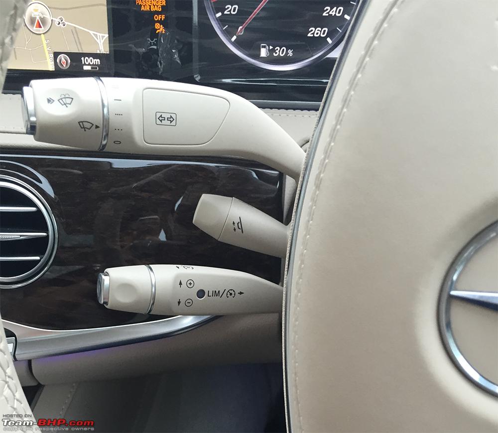
Buttons and instruments would vary depending on the model, of course, but the satellites were there for a long time before being replaced with more usual levers.
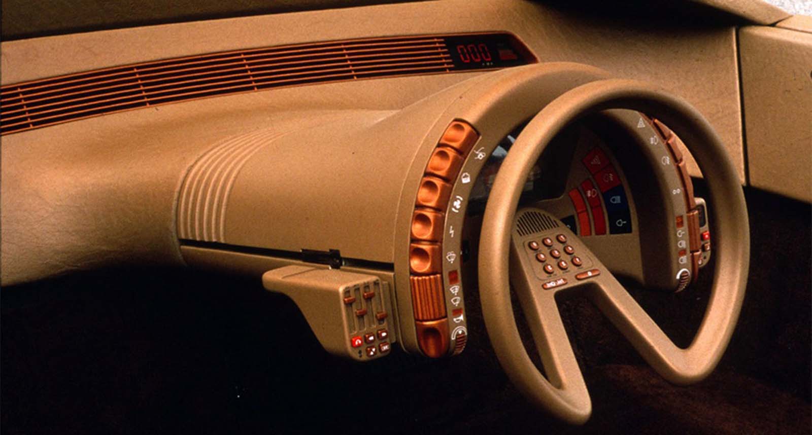
In a sense, it's a design reminiscent of the Citroën Karin concept:
https://1.bp.blogspot.com/-lkoNEToBeSo/YW2L9JqMzgI/AAAAAAAAg...
Perhaps I'm a counter narrative -- I find touchscreens vastly simpler than a bunch of old buttons: you have vastly superior configuration potential, connecting to other technology is easier, the few buttons you have make scrolling through options easy (eg steering wheel for audio & channel select), and the UIs are constantly improving via software updates. Yes, you lose some of the physical affordances, but the benefits outweigh the drawbacks.
(Speaking specifically to Tesla Model-3.)
Sure. I can do the same. That doesn't eliminate the fact that I frequently do want to adjust the environment controls. And the temperature, was, of course, just an example. My argument goes for any common control operation that gets stuck onto a touch screen for the manufacturer's convenience.
Creative Selection is a good book to read. It details the process at Apple from the dev who worked on the very first keyboard of iOS. The design of the keyboard + autocorrect needed to be good enough that people could type on it reasonably well. It was one of the credited reasons why the Newton was said to have failed so they put A LOT of effort into this feature of the handset.
Does this apply to a car screen? Probably. A car is also much bigger than a handheld device so maybe you don't have to choose. But in the end great design is always about making good choices.
This is also a car where when you slowly park close to something (bushes, wall) it has a complete meltdown as if in a car crash.
When in a traffic jam, 10 minutes later it loudly alerts "slow traffic ahead".
It even auto breaks in situations where I had plenty of response time, and then some more.
It feels like I'm in some sociology test. How far can we push this guy before he drives this piece of shit off a cliff? I imagine a team of engineers watching me on a live feed for Friday afternoon entertainment.
For some things (e.g., turning on blinkers, turning on a windshield wiper), a physical control may be the best choice.
For other things (e.g., scanning the map of an area, configuring trunk opening height), a touch screen may be the best choice.
And for yet other things (e.g., choosing a destination, finding a charging station), a voice command may be the best choice.
Finally, if we ever get fully-conversational self-driving cars at some point in the future, most physical controls may become unnecessary. For now, I'm OK having a modest number of physical controls for common everyday tasks and a touch-screen and voice commands for all other tasks.
There's already a market for these things. But the prices are often crazy high because the supply is limited to the parts that people are able to get from scrapped vehicles. For example, see this $200 plastic radio bezel for a 1995 Toyota: https://www.ebay.com/itm/264805497008
And even worse, putting what would have been a physical button on an old dashboard, or car stereo, 2 levels down in a touchscreen menu. If we have to have touchscreens in cars, then at least put "the most used buttons" at the top-most level.
The current touchscreen-in-cars is a dangerous UX disaster.
Frankly, I'm surprised there hasn't been more accidents. Perhaps annual accidents statistics will increase as more cars get touchscreens.
I knew touchscreens were a nightmare path we were going down when I had the Sidekick phone and I was typing without looking at a very rapid clip, while the iPhone had come out and typing on a shitty feel-less keyboard became the latest fashion.
And here we are. I hit backspace probably 15 times typing this (and that's with word prediction). Not on an iPhone though.
The API and how it as accessed (e.g., OBD port, Bluetooth, USB-C) would be specified, along with an extension mechanism to allow car makers to optionally allow more than just the required things to be controlled in a way that wouldn't conflict with extensions from other makers.
Then go ahead and go full touchscreen if they want. I'll buy a nice third party set of controls and use that with the car, and since the API and interface is standardized I can move it to my next car and so on, and so not have to learn a new layout for each car.
I say "non-dedicated controls" above instead of "touchscreen" so that a manufacturer can't do something like have a knob and a couple buttons coupled with a screen where you use the screen (via touch or using the knob and buttons to navigate) to choose a set of functions from a menu tree, and then activate/adjust those settings with the knob and buttons, and say that they don't need to provide the interface and API because they are using physical controls.
I have the touch screen in my Porsche, as well as in my fiancée's Civic. But I definitely prefer the dial.
All that being said, there are some quirks. Mostly around CarPlay "losing" the focus. It might just be an app thing (it pretty much only happens in Apple Music). I'll scroll through some options, and just as I'm about to click something, the focus goes back to the first option.
One of the features of modern cars is conversational UIs (CUIs) that enable a truly hands-off approach from controls altogether, both touchscreen and analog.
I hardly use my car's touchscreen except for discoverability, and definitely not while driving. Speaking to the car is easier and more efficient:
- "I'm cold"
- "Turn on the windshield wipers"
- "Navigate to work"
CUIs have evolved to the point where controls are generally a hindrance to consumers and manufacturers both. Why include expensive, breakable analog controls when you can give the driver a better user experience hands off.
"Can't open the trunk with the car in movement."
Clicking a button is orders of magnitude faster than casting a spell. Voice controls fail more often than analog controls break. You do not want a delay to turn on your wipers when you are at 60mph and hit a sudden localized rainstorm.
It depends on how many buttons there are and how familiar the driver is with them. I like not having to remember/look for the positions of analog buttons on the dash.
> Voice controls fail more often than analog controls break.
I haven't had a voice control failure, but any system can be designed with varying degrees of reliability. CUIs have a lot to offer in the way of safety and convenience.
Buttons are the way. Or those cool switches from fighter jets... I'd like to see those in a car.
"I'm cold" well if you say 'goodnight' to Alexa, she says goodnight and carries on with the music which isn't what I want. I can imagine "I'm cold" being the same, and even if the car does get the hint what do they set the temp to?
"Navigate to work" I know where my work is, I mostly want to navigate to places I don't know, and are therefore not in the memory. So it's "car navigate to some street, city X" "Would you like 1 some street, 2 some street, 2a some street...."
Or "Do you mean some street or sum street or summ street?"
And that's assuming they know the pronunciation, the locals of Slaithwaite can't agree on the pronunciation. And theres many places pronounced weirdly.
I don't agree - I've been very happy with my car's CUI. I can't see going back to analog controls or touchscreen. There just aren't that many commands that I need to execute while driving, and the CUI understands them all.
If I have to press a button to make it work I might as well press the button that does what I want.
It seems like a good idea for adjusting the climate control but I apparently didn't pay enough and it replies something along the lines of "I'm sorry Dave, I'm afraid I can't do that."
So far it hasn't offered a monthly subscription to enable that feature.
- you never drive with your windows open?
- you never drive with passengers that you talk to?
- you never listen to music in the car?
Lets have a home screen consisting of a 2x5 grid of icons, and because we have 14 icons to fit in, lets make that scrollable by swiping, but not give any visual indicator of that at all.
And just for fun, lets have half the icons overlap in functionality, so Radio, CD and USB Media are all different icons to get to mostly the same functionality, and we have two different settings icons, so if we did a better job of grouping functionality we could manage with <10 icons...
Why not testing the navigation system or the radio? I suspect they would not get the same results. Like who cares about changing the luminosity of the instrument system while driving?
This got slightly better with autocorrect fixing some of the accidental misses, but it's really a bandaid over the fact that key misses still happening constantly on touch screens, and now anytime you need to type something other than what the autocorrect expects it becomes doubly hard, since you have to not only fight the touch screen but also fight the autocorrect trying to help by actively changing your inputs.
I'm still looking for a great "smart" flip phone. It should have a decent screen and camera, real buttons, be not too big, but still be able to use most standard apps like maps, web browsing, etc. I did see a friend with a foldable double screen smart phone, which is... sort of in the right direction? Cool tech, but doesn't help with the tactile feedback issue.
Also, after having just read the title my immediate reaction was "duh". I've been aware of this ever since phones switched from keyboards to touchscreens. Back in the day I could text with the phone in my pocket, or while driving. Nowadays I have to steer with my leg so that I can operate the huge mobile phone with both hands.
Studies about how using the touchscreen was less efficient than physical buttons.
Shocker: It's still true!
My new phone which arrives shortly will have a full keyboard.
Also: Stay off my lawn.
I'm sure manufacturers have known since before the proliferation of touch screens in cars that it's a worse product, but they chose it for convenience. Maybe there's an argument that the convenience allows them to make things cheaper or spend the development budget elsewhere, but I'm not convinced it's a good trade-off. The lack of a tactile button is a huge downfall when one needs to keep their eyes on the road.
In a car, maybe they have a place for people who want customization; my personal take is the opposite though.
I just want something tactile where I know that I've depressed, turned or toggled the right knob without any visualization.
My cars have had simple analog buttons that I enjoy using and can switch without distraction through muscle memory.
What's next? Touch screen gear shifting? Touch screen horn? It's dumb IMHO.
Bad physical controls can be almost just as bad initially, but easier to remember and feel for.
But at least it doesn't happen very often, only half a dozen times a month...
Isn't technology progress wonderful? /s
That being said I don't actually use any features during driving, except for adjusting climate control and compulsively checking fuel economy.
I'm curious what features people miss now that physical controls are mostly gone.
Adjusting the radio station is the other big one.
Much simpler to remove something from a digital UI in a way that the consumer knows what's happened than it is to disable a physical button and leave the customer wondering why it no longer works.
I like physical buttons and dislike cars :)
Why do those have to be in conflict? I want a big screen, and physical buttons (for the most common car functions - AC/Heat, Volume Control, windshield control, etc.)
You have to wait for it to boot, button layouts change in different modes, it will be updated by the manufacturer.... All these things add to a feeling of less control which is not what I'd like in a manually driver car
If it's your car, this problem will solve itself for you in short order. There's not that many functions that a dashboard needs to do that you won't familiarize yourself with it in a month or two of driving.
Look to a computer for an example, some shortcuts that you probably use on your keyboard are downright arcane, but because you use it so frequently it's probably natural.
https://www.www3.planetcom.co.uk/gemini-pda
I had few nitpicks. The worst thing was some apps only work in portrait mode (not the fault of the device when MS Teams behaves that way).
Next nitpick was that you couldn't use the screen at various angles - it only had an "open" and "closed" position it wanted to stay in. Minor gripe.
Third nitpick was that it didn't have any kind of water resistance. (Hence why the Gemini is dead - my fault)
The phone version of the Gemini was just a little too big for a phone, IMO. Although I do love the clamshell design more than the slider design. Nobody yet has made something close to the Nokia e90 which was any good.
I can't speak to all cars, but this isn't the case for Tesla. It's a very good user experience. It may be inconsistent across manufacturers right now, but as that evens out I don't see a barrier to more adoption.
Driving a car with touch screens (new BMW or Mercedes) has left me very unimpressed. My 2016 VW Golf has actual buttons, switches, and knobs to twist and turn and press and flip.
Car reviewers, too, often say it's a shame that car manufacturers are switching to touch screen nonsense. It's such a shameful trend if you think about it. The BMW series of pre-2022 had buttons in the dashboard, but the upcoming new series will do away with those entirely.
Touch screens even find their way onto steering wheels and doors.
Of course, it's easy to understand why:
1. It's cheaper to produce; 2. It looks more expensive, so the price goes up; 3. Testing audiences respond positively to shiny lights; 4. Fossils decided that this is what the young people want.
Honestly, I hope European legislation makes it illegal at some point. For the sake of safety. With touch screens, even the most simple task requires you to take your eyes off the road in front of you; with regular buttons you could do many task just with touch.
What was even more surprising, to me, is that Mercedes had this amazing nice center console unit to control things with your arm in a rested position. They removed that piece of brilliance!
So, now you need to do everything with an outstretched arm in a moving vehicle to operate tiny buttons on a flat touch screen.
Oh, and the touch screen can only barely hit 60 frames per second and often feels much slower. They're even saving costs on GPU power in their fancy luxury cars.
Tesla does not skew 60+ anywhere in the company, and they introduced these oversized screen based displays years ago.
So on you four bullets above:
1) True 2) I don't know, perhaps? 3) Maybe a quick 'image' audience, but are they doing usability testing? 4) Completely false.
The big weight is on point #1, for two reasons.
1) Those displays may seem expensive, until you actually price out the panels they are using. Then go and see what those physical buttons cost. They are not cheap. And there are a lot of them. And both technologies have micro processors behind them, so using physical knobs and buttons doesn't save money there.
2) Using modal displays to cover multiple controls saves dashboard real estate, and eases design constraints. Designers love it.
One of the things I hate the most, is that I want a mostly dark interior when I drive at night, and now I'll be stuck staring at an illuminated display that I hate using in any case.
You know they're not. If they were, nobody would ever replace a knob with a touchscreen.
Another of the many reasons to decry the death os Saab as a car company.
Later edit: Added link to YT video demonstrating Saab's night mode [1]
It all makes sense from just the financial point of view. So that means it isn't going away any time soon, unless there's a huge backlash from consumers.
Perhaps the best thing we can hope for is 1 car manufacturer deciding: "Buttons first, touch screen(s) second."
Let consumers decide with their wallets. Though, I wouldn't be surprised that many consumers go for an inferior product just because it looks cool. Because that, unfortunately, is how humans work.
This makes a ton of sense for displaying state.
For manipulating state I need tactile physical controls.
This is how computers work, and for good reason. I have a big screen to show state, and keyboard + mouse to manipulate it.
Doesn't stop Toyota for wanting a solid $1000 to replace the display in my 2014 Corolla. Someone's pocketing a lot of money.
The whole marketing is built on it, you get a small screen and lots of buttons if you get the basic version of the car and you get giant touchscreen if you buy the premium package.
If your new car has a large touchscreen your friends who own 5+ y.o. car compliment your choice and express jealousy(at the time of purchase, most people don't have real world experience with touch screens on cars and touch screens are in these cutting edge electronics that are expensive, so they must be good). If your new car has a small screen you need to explain why this was the logical choice and how much you saved.
It's even the same with the iPhone 13 mini. That device is amazing, you can use it with one hand and fits in every pocket and the screen is actually larger than the first large screen iPhone(the iPhone 6) but people will try to understand why you bought that one. Are you poor? Why would you buy a tiny phone?
It's very strange, the word on the street is that the larger the screen the better. If your $30K product instantly becomes much easier to sell when you replace buttons with touchscreens without increasing the costs wouldn't you do that? I guess you need to have a niche, snobby traditionalist brand to be able to reject that demand from the consumers.
I mean, fsck them. If I had people in my life who though like that (I don't), I'd get rid of them. If they're family and cannot be simply cut off, I'd minimise the contact.
You really don't, and the fact that people consider it a given that you do says some very bad things about society. You should be buying the things that work the best for _you_, not the ones that will impress your friends.
Does this ever happen? I've never heard anyone express jealousy regarding not having a big enough touchscreen in their car. I've heard several owners of modern cars with touchscreens bemoan how complicated and slow to use they are. In my experience literally no-one who actually buys and drives cars thinks they are a good idea and many people - including myself - are deterred from buying a new model specifically because of the technology.
The irony is of course that the decision to have very few buttons (not one, not zero, but very few) with almost all input via the screen was made very carefully by Apple with very specific justification based on understanding of how phones were used and could be used. This is clear from Jobs' iphone keynote.
If Steve Jobs, Jony Ives etc were redesigning car interfaces it's far from obvious that they would have made similar decisions.
Mazda also has this beautiful dial-joystick which we can operate in a rested position. It is so intuitive that I stopped using the touchscreen console itself. On the other hand even when we operate using a dial and buttons we take our eyes for an instant to look at the screen to check the changes. Now imagine looking away at a touchscreen just to see what operation to perform etc. This is a major distraction.
It's mostly a cost saving measure.
Physical buttons are expensive. I you eliminate them, the car gets cheaper to make.
That's all.
It's a sign of low quality and I expect that in 5 to 10 years, consumers will start to realise this.
I'm not so hopeful. The same can be said about household appliances. Yet more and more random things figure they should have touchscreens, or at the very least touch buttons. And this trend has lasted for far more than 10 years.
Consumers is the key word here. Manufacturers already know that buttons have the "disadvantage" that they break independently. They are also easier to fix with a generic replacement part. Which means that you won't have to scrap your car because it suddenly became unusable.
Force manufacturers to provide replacement parts for 25 years after original purchase, and see them flocking back to the basics. But that prob. won't happen in EU (because it's against the interests of Germany) or USA (because "communism"). So I guess we're depending on the common sense of Japanese and Korean manufacturers?
Is there evidence it was 60+ year-olds who decided to lean on touchscreens for cars?
If that's just an assumption, isn't an equally likely ageist guess that it was pushed by people who came up through the ranks in the era of "UX"? (Since I'd expect that old-school, pre-UX human factors engineers, who grew up on research coming from aircraft cockpit optimization, safety, and UI in service of the user... would research the heck out of a new technology option like this.)
Sort of related, I have the exact same issue with portable music players while walking or cycling. Most of the time the only task I need to do is play/pause or forward/backward track.
For a player with buttons it takes a small amount of attempts and after that you've learned the position of the buttons by heart and can control the device even while it's in your pocket, without needing to see it. Usually aided by some tactile feedback. Fast, convenient, and somewhat safer since we're talking traffic situations.
With a touchscreen-only player that is much harder, sometimes impossible (depending on which screen you're in the controls might not be in the same place or not be there at all).
Sad thing is, this was already the case like a decade ago, leaving me wondering if designers have any pride in their UX, simply don't know they're doing it wrong, willingly just focus on other things apart from usability, etc. In any case: driving a heavy vehicle at high speeds should be the last case where simple things like switching a radio station actually requires you to take your eyes of the road. That's just insane.
There is so much opportunity for better regulation, without making more numerous regulations.
I already have a screen showing what radio station is playing, and one on the dash telling me where to go. If a screen is required for a backup camera, just combine it. If I'm reversing I probably don't need the satnav anyway, whereas if I'm reversing or using satnav I probably do need other functions which just means you need an even bigger screen so you can fit everything on.
But that's ok with touchscreens.
Do you have any evidence for this? Seems pretty outlandish to me.
> 1. It's cheaper to produce; 2. It looks more expensive, so the price goes up; 3. Testing audiences respond positively to shiny lights; 4. Fossils decided that this is what the young people want.
What does 4 even mean? If we took 1-3 as fact, then should businesses have disregarded them and instead made something more expensive to produce that looked cheaper and sold for less because people don't respond so positively?
Please don’t play this game where a bad design decision was finally recognized as bad design and a scapegoat is found rather than admitting the “experts” who did it have no clothes.
UX branding itself “UX” rather than any of the half dozen other names we used to use was a clear statement of “It will be different this time, I promise.” It wasn’t. The design trends we got were different, but bad interaction design is still bad interaction design.
I barely use the touchscreen and when not needed I outright turn it off. This is quite easy because BMW has 8 buttons that can be mapped to any function in the touchscreen including turning off the main screen.
Another thing I enjoy is the gesture detector. It sometimes has false positives when I gesticulate a lot but it works when I actually intend it to. It is very satisfying to mute the radio or change an annoying music with a hand gesture. If they would keep trying to integrate and perfect it I think it would be the right direction for innovation.
Touchscreens are fine when parked or for the passenger. Anything else they are useless and often have too much distracting info, so they are turned off.
No doubt it'll get to the point where you can't update it any more - either due to hardware incompatibility, lack of processing power, or some new technology being added. But it has meant that a 2013 Model S looks more modern today than it would have otherwise.
Equally, tech tends to look dated much faster than physical buttons do. It's too early to really say which has more long-lasting appeal.
A car is a dependable tool. Changing the UI during a car's lifetime is dangerous and unprofessional. I'd say the same is true for smartphones and computers but I guess the majority of people think of them as simple "cool entertainment devices"
This is a bug, not a feature.
If I'm driving then I'm driving. I want any non-driving controls to be as simple, consistent and reliable as possible. I don't want any non-essential controls at all. I don't want anything I might want to use while driving that requires me to take my eyes off the road at all. I couldn't care less what some flashy touchscreen UI looks like because I should never have to look at it.
The physical controls on the dash of every vehicle I drive regularly still work as well and feel as comfortable to use as they ever did. In some cases those vehicles are over a decade old. I'll take that over the modern touchscreen junk any day.
Sure, on a minute-to-minute timescale, anyone must obviously agree.
But over the long term of owning a car, it is an immensely valuable feature. My 2018 car still feels quite new and fresh - much less reason to replace it than if it were falling behind.
My MB is a UX disaster.
Have a guess how many controls there are in the car for navigating the (non-touch!) screen?
1? Nope. 2? Nope. 3? Yes 3. A touch surface in the centre console, a spinning wheel in the centre console (which is also a joystick), and finally a little joystick thing on the steering wheel.
Volume controllers? 2.
And don't get me started on how dangerously absurd it is trying to switch between MB's own system and Apple Carplay/Google Auto whilst driving.
The updates are only for bug fixing.Maybe this will change with SaaS but today i never heard of any Car company which does this. And no, i don't consider Tesla a car company.
More generally: I want to be able to feel the state something is in. Whether it is push/pull, turn, or flip doesn't matter, but it has to physically maintain the state I put it in.
An exception to this of course are functions that are used temporarily, like the horn, and the wipers swipe-once. And if direction indicators turn off automatically, the input device has to change its state accordingly.
Not surprisingly, this test is highly contrived and nonsensical. Let's review:
> 1. Activate the heated seat, increase temperature by two degrees, and start the defroster.
> 2. Power on the radio and adjust the station to a specific channel (Sweden’s Program 1).
> 3. Reset the trip computer.
> 4. Lower the instrument lighting to the lowest level and turn off the center display.
1. Seats, steering wheel, air are warmed by the app before I leave. Seats and air temp are set on auto and I rarely have to change them during a trip. defroster is a button on the bottom.
2. I click a button and say "Play <Blah> on Spotify". Sometimes I play stuff from my phone. Four years in, I have not yet used the radio.
3. Car has auto trips from last charge, last park as well as two manual ones. They are burried deep, in the menu. But why is anyone resetting trip counters while driving on the highway?
4. Ugh, it's set on auto brightness and I've never touched it after setting it up. Switches to dark mode on sunset as well.
Touchscreens are better because you don't need to fiddle with the cars they come with.
Honestly I barely feel the need to use the touch screen in my car while driving, and if so I always make sure autopilot/high way assistant is turned on as extra safety.
If we had to dial every number we want to call manually, physical buttons on phones would outperform touchscreens too. But nobody does that anymore. And it is nicer to select the name of a friend on a touchscreen than to type it with physical keys.
Same goes for cars. Humans spending their time keeping the car in lane, stopping at red lights, starting when the light turns green, doing turns etc will phase out more and more over the next 10, 20 years.
The interaction we still want to have with a car is probably nicer on a touchscreen. Especially when you are not dabbling with a steering wheel anymore.
Stuff like seeing the route on a map, selecting waypoints etc. We would not want physical keys for that when we are at home at our computer, right? I think dedicated keys are just legacy from the "I'm busy with the steering wheel and need to do other stuff blindly" area.
Much of it will probably also move to voice control.
In a previous discussion someone mentioned that part of this trend toward screens in cars is that new cars are now required to have rear-view camera. So once you are required to have the screen, it's really almost nothing to waltz over to touch screens. Of note: the "winning" car is so old it doesn't have rear-view cameras.
https://www.carbuyer.co.uk/tips-and-advice/170098/bmw-idrive...
edit: Nevermind.
> The main part of the BMW iDrive system is a control wheel, which can turn clockwise and anticlockwise like a volume dial. It can also be pushed forwards, backwards and to each side as if it were a joystick, and the centre acts as a button that can be pressed to confirm a choice or select an option. As mentioned above, later versions have adopted touchscreen technology, gesture control and voice commands, so there are multiple ways to operate a newer iDrive system in addition to the rotary control.
It's a physical user interface with buttons and a joystick. Which is basically what everybody here wants.
My steering wheel has volume controls and the environmental controls are still button based.
If Toyota half-way through shipping their latest car realize it's better to have two knobs on the dashboard, they can very easily add one if the dashboard is just one big touch screen.
With touch screen and OTA updates, you can skip the hard part and leave it for future you to improve if needed. But as we all know, when it's already sold there is no motivation to spend money to improve. So touch UI stays half baked. And only gets improved with future models.
I do agree with the premise that physical buttons and knobs are generally far superior to touchscreen UI's, at least for the common core basic things.
However, I don't agree that it's about the boomers, or the capitalists, or any other Internet strawman forcing something onto the masses against its wishes. I think it REALLY IS a matter of test audiences and "casuals" having tastes that differ from power users and other people that think deeply about a thing. You see this in many different domains.
I’m a flight sim nerd and it’s immediately clear when you have to keep track of more states than your are used to how much attention is needed and how much is freed up if you can reach over and feel the state of the switch.
I would love that for many functions in a car. And a knob with some bump or whatever at the ac temp setting, so I can adjust its position based on feel alone as well.
On a modern keyboard the caps-lock key would probably benefit from one too =)
I think switches that can set themselves to current state (flip back) are a bit pricey but can be had from $12 or so (iirc).
Honestly it makes driving a real chore and is a huge safety problem; just that one little anti-feature ruins driving.
I hope the automobile manufacturers take a note of this, and bring back some of it that’s worked for decades. I believe few German manufacturers like the Mercedes-Benz to have a sense of this, hope they don’t get along with this trend too.
The exception would be to put a tiny motor on each control to keep it synced up, but the cost to reliability (not to mention just money) would be unacceptably high.
Power windows are close to fulfilling this (up/down separated, and it might be argued that the state is sufficiently obvious, though questionable for the rear windows). A central lock controlled through a common lock/unlock button does not satisfy this.
Joking about the price aside I always loved that the original design goals for the F1 included that if someone found one in a barn in 50 years time they should be able to repair it.
I think that leads to quality, simple, tactile controls.
I wanted to make a call to my partner recently, whilst driving. I have an old car, with all physical controls. But my phone was in front of me with maps running. I said "OK Google.." and waited for it chime that it registered. "Call [my partner's name]", I commanded it. It responded that the name was unrecognised - even though it repeated the name back to me, so it wasn't a case of mishearing. I repeated this at least 5 times, getting increasingly frustrated.
Then eventually it started calling. Joy! But I notice it doesn't say my partners name on the screen, just a phone number. "OK", I think to myself, "perhaps this is some quirk of voice dialing, it doesn't show the name" (I don't know my partners number by heart so I could not recognise it).
It rang through to voicemail, and whilst the name given by the voicemail recording was correct it was definitely not my partner's voice. It turns out my phone had just dialled a random mobile number from the Internet that matched that name. It may have been a business, or a personal number, I'm not sure. Either way, I would never want this behavior!
I guess the point is that voice commands have terrible error handling and recovery modes. Give me physical controls any day. Even if they're slower, at least they are accurate, discoverable, and do not make guesses about intention
It really isn't for me, it's much easier with the T9-style 3 letters per key on a physical keypad and then up/down on the steering wheel.
Some cars have a click wheel that lets you set letters one at a time, which also works well.
What doesn't work well at all is typing with one hand on a centre console touchscreen.
IF we get to more autonomous driving, sure add in the touchscreens, but until then I think we may have started that trend about a generation too soon.
Google started development 13 years ago and now already has fully autonomous taxis on the road in a 4 cities. If they double the number of cities every year, in 10 years they will be in over 4000 cities.
Tesla started around the same time. Looking at videos of tesla in self driving mode, my feeling is that without human interaction, it would crash maybe once every 50 hours of driving. Double that every year and in 10 years it will crash once every 50000 hours. A human driver, driving 1 hour a day, would need 136 years of crash free driving to achieve that. But the average driver has 4 accidents in their lifetime. So we are already in superhuman territory by then.
I suspect that the engineers fighting them is really just a case of the hardware team and the software team not understanding the world the other lives in. The hardware team is working with a slow as molasses processor that is the only thing thats been approved for the ridiculously rugged life that a car CPU lives and the software people don't understand that just because a webkit rendering engine is completely fluid on their 6 month old Precision workstation it won't be on a 500mhz in dash processor.
* The one and only physical button car took 10 seconds total to complete their tasks
* Two touch-screen cars (Volvo C40 and Dacia Sandero) took only 13 seconds to complete the tasks
* Most touch-screen cars take 20-40 seconds
These results are certainly consistent with the hypothesis, "A moderately well-designed physical interface is likely to be better than an extremely well-designed touch-screen interface". But it's not really enough data to support the hypothesis that all physical interfaces are better than all touch-screen interfaces. You'd want to see what the curve looks like -- with it so close, it's quite possible that some, or even many, physical interfaces would take longer than 13 seconds for their benchmark.
And if you slow people down by 30% but reduce costs by a significant fraction, I think that's probably worth it.
Relative to other iPhones, yes. I read that it accounts for 3% of iphone 13 (Pro, Pro Max, mini, standard) sales. The 13 line itself accounts for about 75% of sales. If Apple sold 40M phones per quarter, that 120M of the 13 line, so 3.6M of the 13 Mini. At 699, that's a 2.5BN business. Not too shabby.
I much prefer to just stick to like-minded people and not try to be friends with people where our fundamentals are completely at odds.
Not so good for typing, but can be quite good when there's a good UI that narrows down options for you at each entered letter.
I think the big sticking point is usually climate control and radio since that's what people fiddle with most while driving. Maybe little things like the ride mode selector (but I'm not sure how many people actually fiddle with those sorts of things in practice). But nowadays the "radio" is rarely just radio or disc/cassette player. It's music, audiobooks, or podcasts off a phone. I don't really know how you do that with integrated controls that aren't screen based, like most luxury cars already have the little control wheel and also controls on the steering wheel. So what more would you need? Maybe some haptics on the control wheel to give you more feedback?
But maybe the jealousy is a too strong of a word.
The thing is, it's actually really hard to judge quality of a design(takes a bachelor degree in Industrial Design and masters in related field and a few studies like the one in question to objectively evaluate a design). Most people like the new trendy one and unfortunately in cars that's a large touchscreen.
Don't think of car enthusiast, think people who like the car because of the shade of its color and feel of the leather - which is most people.
Horse hockey. Spend a couple years in Quality Assurance with your eyes open. It:s trivial to seperate wheat from chaff. The key that your Industrial Design might give you insight on is the fact that Industry has decided unilaterally that cost to produce > joy of end user in use. I.e. if it's cheaper to make and sell, it's higher Quality, rather than it's damn good, now lets streamline it.
Yes, your process weighs into it, but I assure you, the cognitive load of a haptic interface vs a touchscreen is so much lower it's absurd to even try to compare. If you really care about the end user, you take the time to get them buttons, and don't distract them with touchscreen finicky BS.
Those are exactly the people I'm talking about though. I'm in the UK - maybe the current culture is different here to some other places?
Of course it's also possible that my own experience hasn't been representative but I've heard the same story so many times for so long now that it's hard to believe I've encountered some freak sample of outliers.
Precisely. Millions of people (intelligent, rational, highly-educated) still buy cars with specific color/trim as their primary motivator. Until the trend reverses, a screen will continue to be a value-add to any vehicle because of the "modern" association.
Honda has features they implemented in some attempt to streamline the experience but you still get lost easily.
After having a few vehicles with large touchscreens and then buying an F-150 XL to simplify, I can't even describe the elated feeling of operating a vehicle where the screen does what it's supposed to do with the vital controls all being physical. Yeah, I look like peasant but I get to keep my sanity.
Was looking at [1] and even with the joystick it is less than ideal. I would need to try though. The joystick is good to navigate the screen but navigating a screen while driving is still not the way it should be.
"UI revision 1.23: move the Passenger Seat Blender switch further away from the air conditioning controls"
Also, chalk me up as someone who has never heard a positive thing about car touch screens after a week or so of interaction.
Years ago when I was working in IT at FoMoCo I recall seeing a piece of paper on an office bulletin board outlining how they had managed to save like $40 on the production cost of a Taurus, a vehicle that at the time was about $20,000. Those savings were the result of multiple sub-$1 to several dollar cost savings tweaks made between production years.
Ford has built something like 8 million Tauri, save a few dollars on each of them and it adds up to real money, like enough to redecorate the executive cafeteria.
There are also reliability expectations. If I need defrost because the windshield just fogged over, it better activate when I turn that knob on my sixteen year old car. And so far, it always has.
My favourite feature of touchscreens in cars is when you try to click a button but go over a bump[1] so your finger misses and you press something else. Genius.
I do get that touchscreens allow manufactures to add and remove controls though.
Rolling out UI changes for self-driving cars, like getting rid of the, knob behind the wheel, will help with safety no end.
1. Not sure what the bump was, probably the neighbour's kid or dog or something. Too busy trying to get the latest Smartless. That Will Arnet, what a card, etc, etc...
Gluing a single tablet is much faster.
Back in the day, you could easily tell the difference between an expensive high-quality amplifier and a molded piece-of-plastic mass-produced boombox.
Car companies are already kind of doing this, usually just a button or two on the steering wheel. But IMO the entire dash should be a bunch of blank configurable buttons.
Actually, Porsche Taycan apparently has an amazing knob. MKBHD was very impressed by it[0].
While there has been a lot of progress made to date, much of it (IMO) has been around the low-hanging fruit kind of stuff. Sure, we've mapped a lot of roads and covered many of the basics. But none of the systems are really able to do human-level context awareness, like you see a bunch of kids running around near, but not on, the road a few hundred feet up, might want to slow down or at least be extra aware, or people clearly driving in "tourist mode", etc.
My personal assessment is that we are still 20+ years away from the point where the human driver is mostly along for the ride (and thus to the point of this thread, can fiddle with a poorly implemented touchscreen UI without risk). I am led to believe the ultimate solution is going to involve altering/enhancing the road infrastructure, along with the general improvements for the in-vehicle stuff (which itself has at least a decade of development still to go). Combine those things together, and we're still quite a ways off from the vision that was sold 10 years ago.
I expected something like this. That's why I said "quantifiable". We humans are animals of habit and have a hard time imagining a changing world. But every time a few decades pass, we look back and see - damn! - a lot has changed.
A way to get away from feeling and towards a rational prediction is to look at rate of change. In my experience, doubling the performance of a new technology (self-driving is only 13 years old) is usually doable. And that means 1000x improvement in 10 years. And from where we are now, that gives us Waymo in every major city and Tesla with super human capabilities.
I do not think your rate of change assessment is accurate. With many newer technologies, like the DNN/CNN frameworks, we see a more or less immediate order of magnitude improvement, and then declining rate of improvements as the easier bits are done and we are forced to do deeper development or refinement.
Saying that Tesla has super human capabilities sounds to me like you are not assessing it rationally. Super human would mean, to me, that it manages to do better than humans in extreme conditions. Instead, we have seen a number of very preventable causalities in the current generation systems.
In terms of self-driving, some factors are:
The amount of data grows exponential. Not only do the existing Teslas keep adding data, but more and more Teslas are added to the fleet, accelerating the pace at which data is generated.
Crunching the numbers gets exponentially faster, because compute power is growing exponentially.
The algorithms used to crunch the data become better.
As more and more revenue comes in, more and more can be spent on data crunching.
The sensors become better.
Maps become better.
All of these factors multiply. Adding another exponential force. Even if the data would grow at a linear pace and the algorithms would get better at a linear pace, this would result in exponential improvements, as these two factors multiply.
this is a unproductive conservative attitude
no I won’t get off your lawn
I’ve been burned by changing UIs but it’s the price we pay for progress
tell me more about how updating your car's UI overnight can make you more productive
all updates taking together will allow for progress
The car won't update itself, so:
1. Ignore any updates as they become available.
2. Problem solved.
There's a substantial group of people who lease cars, and just get a new car after the lease is up. For that group of people, that's probably a substantial reason along with the exterior styling.
Hardware buttons and switches have to be designed, tested, re-designed, and validated very early in the process of designing a new model so that there is time to figure out how to manufacture / source all the parts, how they integrate with the rest of the car's systems, and how they'll be wired and assembled. Just imagine what the impact would be if late in the process a new feature needs to be added! Pretty much forget about it, add it in the next major model refresh.
With a touchscreen all those dependencies go away. The hardware team just says "there's going to be an iPad sized capacitive touch screen here for climate/infotainment, and another custom sized display here for the instrument cluster". The software guys can independently do the design of the UI, changing things down to the very last moment, or even after the last moment if the car can be updated.
With a decent response time and hierarchical menus, it's easy to make a system that is navigable without looking. Throw in some (hopefully non-annoying) audio feedback, and it is extremely accessible--even by a blind passenger! In fact, that's a good benchmark. If a blind passenger could operate the thing, then the driver should be able to as well.
This, though functions like climate control, audio, and anything needed to operate the car while in motion should still have dedicated buttons. Touchscreens in cars are an abomination.
> I have no idea why you absolutely need to put buttons in the middle of the screen to be touched.
They don't need to, they're just following the touchscreen all the things UX fad. Turns out capacitive touchscreens were a great fit for cell phones, but that doesn't mean they have a place anywhere else.
https://www.ableton.com/en/products/controllers/apc40mkii/tr...
https://www.native-instruments.com/en/products/komplete/keyb...
There is a difference between working with a touch screen where you can focus on it and using a touch screen where you need to focus elsewhere (like the road). There is also a difference between something like a plane where you have a great distance from other moving objects most of the time and a car where you are regularly around other cars.
My wife has a slightly older car with no touchscreen. We can operate it by feel. Without ever needing to take our eyes or focus off the wheel. My car has a touch screen. I can't operate that by feel. Constant glances are required.
These are different experiences. Looking at the situational environment is important when creating a good user experience.
I wish I could buy a car with more physical buttons. Would make the whole car driving experience more usable with me as a less distracted driver.
Even commercial and fighter aircraft -- which have human-interface requirements of incredible depth and complexity -- are transitioning to large touchscreen displays. ALL of which require physical boundary buttons and knobs as a redundancy for touchscreen controls.
In fact, controlling the screens via buttons are the preference for many pilots since accurately fiddling with touchscreens during turbulence, pulling Gs, evading missiles, while being task-saturated etc is very hard to do, but doing the same with physical buttons is far more reliable. Button-pushing tasks can be performed from memory in the blind (or while not looking) (a.k.a. "memory items").
There's always been a dichotomy in human-machine interfaces between airplane customers (airlines, charters, governments, and militaries) vs. their own pilots. Airplane builders have to keep up appearances and look cool by putting in putting in flashy, futuristic features like big screens and AI, and ditching old button-laden displays and the "old way of doing things." It too often disregards the needs and wants of pilots and "human factors" engineers. Fortunately, safety comes first, so the buttons and redundancy must stay.
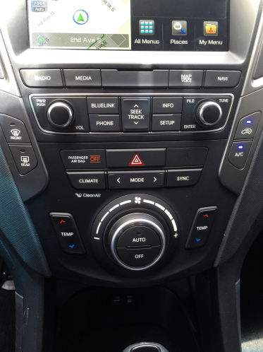
The control panel has:
* 6-8 buttons for switching between different MMI modes, labeled
* 4 universal buttons, function contextual to the current screen
* 1 return button
* Turn/press controller
I can navigate 90% of the menus blindfolded. Despite my older MMI not being a marvel of UX, I can access functions 5 actions deep, while driving, from pure muscle memory.
Absolutely. It's why smart-phones and tablets (the ultimate 'touch' devices) still put some physical buttons (power, volume control).
A well designed UI, complemented with physical input (buttons or knobs) is best.
Give those physical buttons and 99.999% of complaints vaporize, and people are happy. Apply your idea for stuff that's up in the air. Boom. Done.
To the automakers, when two controls have overlapping things they're good at doing, maybe pick the one that fits best and just include that, but at a bare minimum make sure they are always used consistently and clearly, please.
* a row of programmable buttons with LED or lit e-ink screens for software developers to go nuts with =) – and for end users to customise to their preference. * static physical buttons for basic functions (climate control, wipers, cruise control, volume, etc.)
And of course a large touchscreen with buttons on the sides as well.
ok, ok, it’s probably too expensive… As an option maybe? Let the end users vote with their wallets.
I'd love more physical buttons because, and this may come as a shock, usually when I need to use these darn things, I'm driving.
They're thinking about making their vehicles look differently than everyone else's instead of thinking about what would work the best?
I've tried building out several projects like this, and using HID keyboard as standard, you are relegated to ANSI keystrokes or combos that a user/os wouldn't need, or third party drivers that come with their own headaches. Another option is a video game controller.
I never understood why we can have a billion emojis but adding some additional unused input mappings is a bridge too far.
The problem is that it’s contextual, so you still have to look to it you can trust that a hardwired button won’t change purpose; that’s the important property here.
This works for cheap oscilloscopes because you're not simultaneously driving a car. What you're proposing would make the safety issues worse, and probably be unacceptably frustrating for most people.
With simple menus (or a custom setup of your own), the common things could be on buttons, instead of taking your concentration off the road.
but not by a deaf driver
Normalized functionality is required by law for air and medical to reduce risk of operator error.
The auto industry does not have to consider a confused operator killing someone else. That risk is on the individual driver, not a hospital, airline, or airport.
You don't have to aim your finger at anything, you just have to scroll and check whether you're there, yet.
And you'll start remembering how many notches you have to scroll to reach the functions you need, becoming less dependent on the screen at all.
The difficulty is in balancing the number and arrangement of submenus and the buttons/menu entries triggering whatever function, although the same issue exists with regular touchscreens.
It's a bad interface for everything but a car screen, and an unquestionably superior one for a car screen.
That sounds dangerous. It's basically the interface that AppleTV uses.
I find it extremely confusing, as I frequently select the wrong item (and I have been using AppleTVs for years).
Also, it's no fun to program.
edit: hire me VW, I'll fix your awful infotainment lol
This does NOT mean that it is a good reason.
The design team saves time & project risk once, and every user for decades (the car is supposed to live that long, right?) pays for the entire life of the car, a few pay with their own lives or the lives of a random pedestrian/cyclist because they are distracted by a bad UI at just the wrong moment and end up in a preventable accident.
Plus the test in the article is GREAT! It should be enhanced and required as a manufacturing standard. The test should also include blindfolded trials, or with a screen blocking the dashboard — it's not rare to have to operate the controls without looking at the dashboard — rainy, cool, dark, in 2-way traffic, and your windshield is fogging fast... that should require 1.5sec blindfolded for a person new to the car.
To be fair though, the buttons should be pretty standard from the previous model or other models. Vehicle design is generally iterative, building off the prior models.
I'm contacting you to tell you that I bought the house, and I have finally moved, and I love it here.
But guess wha? We have hornets. And I already hate them. 10 minutes ago I removed my first nest. It was a small one, inside our mailbox! Highly inconvenient and disgusting.
There must be some other nest nearby, those buggers keep coming to pester us while we eat.
Do you have any pointers about how to find where a hornet's nest is?
I drive in rental cars quite often and it's always a huge relief when I'm at the desk to pick up a vehicle and they hand me a key for either an Audi or a VW.
Before even I've even seen the vehicle, I know I'll be able to use the controls in it.
My wife, on the other hand, thinks voice recognition is a joke, and doesn't even bother trying. Its hard to call voice recognition redundant or helpful to the touch screen.
Having a touch screen means they can (and will) half ass the UI/UX because they can update it later.
Also, this isn't just a car problem. You can see it all over the web and mobile apps. I'm a huge fan of rapid iteration, but it has the unintended side effect of allowing people to ship half baked products because they "will iterate on it over time"
This is a feature of the physical process... can you imagine how annoying it would be if the dial for your aircon or volume control kept changing it's position!
If they can't plan the feature properly, I don't want it, I don't want a buggy piece of software with UI that changes every week. In a way I wish this was true for modern software as well... no more updates at any time, at least try to get it right the first time rather than just rushing any old shit out of the door "because you can fix it later AKA never".
I understand there is a balance to be struck with these manufacturing decisions and quality - sometimes it's worth sacrificing some things so that other areas can benefit and the overall quality can improve or the reach that a product has is greater - but this is nuts, touchscreens in cars is just dangerous and annoying.
Let's say touchscreen version would end up having a bit more accidents, say, one death more per 10000 machines sold.
And then the critical step: for every other touchscreen car ever designed by anyone, charge a manager who signed off the touchscreen with one manslaughter for every 10000 machines produced.
Do aftermarket physical panels exist for consumers to replace their touch dashboard with physical buttons linked to the same functionality? That'd sidestep the long pole issue and give drivers the ability to customize their cars.
If they don't, I imagine the Devil's in the "linked to the same functionality" details. It could be that carmakers make doing this legally or technically impossible or maybe just that there isn't demand for aftermarket adaptor software.
Oh, and a reminder: Stand for freedom and NEVER buy a car that has a data connection (Internet or private radio) back to the manufacturer. I want my car talking to its manufacturer (and by invisible proxy, the big ad tech corps, governments, and insurance companies) exactly never.
In fact my 2022 Honda Civic has climate controls with dynamic labels like this, with LCDs in them. I see no reason why these couldn’t be programmable.
Also the left half of the gauge cluster in my Civic (behind the steering wheel) is an LCD that can almost perfectly imitate a physical needle gauge one moment and or be a settings menu the next, and a fully customizable output the next.
Mazda learned it already and prefers HUDs. Tactile interfaces (buttons, wheels, keyboards...) perform generally better when well arranged. Mercedes did a good job about that thirty years ago. Logical layout, one button one task, LEDs within a button representing the status and the buttons arranged in the layout of the seat.
I wonder how a complete industry just assumed that touchscreens are somewhat better just because their widespread in smartphones. Smartphone are small devices, require visual attention, every app is different and distracts the users, touchscreens are cheap and - therefore working on them is slow. Apple and Lenovo tried both the add a "TouchBar" but the tacticle keyboard has proven to be better. Apple tried also a touch area in Apple Remote, the current one is back to tactile buttons ;)
I've driven a LOT of rental cars in the last 5 years, and the de-standardization of the interface elements -- even how to shift!, increasing distraction and eye-aversion has made the highway driving experience much worse - both as a driver and someone who has to share the roads with distracted people baffled by their cars.
There's a reason professional cockpits still largely eschew touchscreens when 250+ lives are at stake in the back.
I remember once driving, I think a Renault Megane, which had all the controls (stereo, climate, etc) replicated as buttons on (behind) the steering wheel. A slight learning curve, but completely seamless driver-car integration once learned. Someone had obviously thought carefully about how this should work, instead of just slapping in a touchscreen and a bunch of menus.
https://twitter.com/jazz_inmypants/status/138178395638376038...
I’d also point out many of the things they asked the driver to do are things you wouldn’t normally be doing once you’re already driving, you’d do then before you started. A much more representative sample of things you’d do while driving would be something like “turn down volume, turn on windshield wipers”.
Familiarity is my personal favourite part of driving. Knowing the road, how much input you need to apply to a turn, knowing where the buttons for things are, just being able to feel for a control and know its purpose. All while my eyes are on the road.
You lose this with a screen.
Simply put, with physical controls you can operate them without looking. That is impossible with a touch screen.
There are also physical controls on the steering wheel for the most used functions, but they aren't absolutely necessary.
I'm also curious about how they accounted for bad UX in this study. They didn't just test Teslas, but also other cars with touchscreens. My experience is that the touchscreens in other cars are smaller, slower, more janky and have worse UX in general.
His daily driver is a 2012 Hyundai Elantra GLS. He also occasionally drives my 2007 Ford Fusion. Both have fairly logical physical controls.
He hates how non-intuitive the touch screen controls are, and how you physically have to look (even if briefly) at the screen to see what state it is in, and to find the buttons. You cannot just operate them by feel.
He also does not like electronic shifters. I have never driven a Mercedes, but he says the shifter on the newer Mercedes is frustratingly slow. You have to put you foot on the brake, tap the lever, then wait for the indicator to actually change.
What I find particularly frustrating on all this, I know that the knob driven climate controls are just inputs to a computer that is driving servo motors under the dash. There are no cables. But it is intuitive, it is tactile. I don't have to look to change the fan, or the temperature, or the vent configuration. Same with the radio. I know where the on/off and the volume is. I know where the AM/FM/CD buttons are. I know where the six preset buttons are. I can run the radio with out looking. And when I move the shift lever on the Elantra, it has a very distinctive 'gate' flow. It is easy to know what gear it is in without looking. Doubly true for the five speed manual in the Fusion.
So this change to glass panels is not for the consumer, it is for the manufacturer. It is for the designer. We have reached the age in electronics where the display is cheaper than physical controls. The manufacturers are trying to sell it as a 'feature'. It is not a feature, it is cheapness. It is crass.
Except it's not a screen at all, the interface is entirely static and the function of each "button" is always the same; so really it's "touch sensitive buttons" with something masquerading as a screen. I don't understand why. They're annoying because they don't always register the touch, and sometimes over register so you go past the option (e.g. setting the timer or spin speed).
Then there's the start/pause/stop button, which is a mechanical switch/button that is also touch sensitive. It boggles the mind, we interact with this thing a couple of times a week - why does it need touch sensitive buttons rather than just being fully mechanical switches?
My LG washer is the same (albeit frontloading) and its far easier to clean than the Miele my parents use.
This mostly comes down to the fact that Mazda has buttons for those right alongside the wheel.
It’s not just cars. You now get high end cookers with touch buttons that can’t be quickly adjusted, require long presses to turn on and off and don’t work when wet.
Same with high end digital cameras. My old SLR from the 90s had instant access to shutter speed, focus, f-stop, +/- with clicky dials that you could use with your eyes closed. Modern ones have half that buried in a menu somewhere.
The Touch Bar on mac - now you have to look at the keyboard to use shortcuts. Useless.
This was a god damn solved problem! Buttons let you use them without looking, touch screens don’t.
- is the touchscreen in the right context? (Sure you could make important controls the same independent of the submenu, tab, page etc, but you still have to hit the right button)
- did you actually hit the button?
What annoys me is that many manufacturers are still adding as many buttons as possible as some form of luxury. Seat memory buttons in the door that you only use once per drive max, can easily be added to a screen (or smart, through key recognition). This adds a much larger number of options too. There are other options like this too that would be much better suited for screens than buttons.
I wish that, in stead of picking 'buttons or screens' as the options for cars, manufacturers will start looking at the best choice for specific functionality in stead of continuing how they are right now.
Hoping it comes back after being turned off overnight, or I’ll have to find a manual online somewhere.
Touchscreen interfaces give you a worse reaction time than drunk driving [0]
This alone should be reason enough to regulate infotainment into oblivion.
[0] https://trl.co.uk/publications/interacting-with-android-auto...
What about the experience when the car is not in motion, or by the passenger? Personally I like having a large touch screen when going through the media I'd like to play rather than a tiny screen far away. Same for going through the settings of the car. Same when planning out a route or even just entering a destination.
I have a car with a big touchscreen. I have a car with a ton of buttons and a small screen. I prefer the car with the big touchscreen, hands down. When stopped it's a much better experience as I'm almost exclusively using the screen. When driving, I'm practically never pressing any of the buttons on the dashboard. Meanwhile, the screen being much smaller makes the map and directions harder to see, just about the only thing I do bother to to care about on the center console while the car is in motion.
My car with a bunch of buttons has lots of buttons that practically never get pressed. That's such an immense waste of space on that dashboard.
https://arc-anglerfish-arc2-prod-tbt.s3.amazonaws.com/public...
You're telling me having a SETUP button is useful for driving? INFO? BLUELINK? Should I be using the PHONE button to scroll through my address book while driving? No! All of this is essentially a waste of space. I shouldn't be pressing most of these buttons while driving, so the argument of safety of a physical button is moot.
In 2016, They thought they were going to be pushing level 4 self-driving capability to their cars in 2021. As soon as a car has true self driving, a giant screen makes the most sense.
But now we are getting a bunch of cars which still require traditional steering and that’s obviously much worse.
  1. Video touch-screen
  2. Mini numeric keypad
  3. Audible User Interface
Voice feedback was iffy and the touchscreen was distracting and finicky. What ended up sticking was the numpad and audio feedback. I could navigate every single aspect of my UI without ever taking my eyes off the road. I would hit a "Menu" button, and the car would say "Main menu." I would hit the down-arrow and it would say "Music." Another down-arrow and it would say "Settings". Hit the Enter key and it would say "Settings menu." And on and on... Any selection could be made by scrolling through a menu or typing a number, and I could hear where I was in the menu.
To impress people at car shows (well, to impress girls) I mapped an RF remote control to the numpad. I'd stand outside the car and hide the remote behind my back and talk to the car, then hit the right button on the remote, and the car would talk back, like Kitt. People loved it :) mostly guys though :(
That was 18 years ago. I don't know of a single device that provides an Audible User Interface today, but it's still my favorite.
In my experience I have more false touches on the capacitive versions but it balances out reasonably well by being able to swipe. Swiping is better than buttons or a scroll wheel for me.
So you just don't know if it's receiving your inputs, there's no tactile feedback, and it's too easy to activate things by accident. Especially faux-buttons on the steering wheel activate if you just rest your hand on them.
Most cars, most of the time, are driven by people who are very used to their particular interface. I couldn't find mention of this in the article, but it's necessary to state.
Furthermore, increased automation in many of these cars means you don't have to do many of the listed sequences as often, or at all:
"Lower the instrument lighting to the lowest level and turn off the center display." Why would I ever do such a thing when this is fully automated already?
Why was that switch there in the first place? Being familiar with the car didn't help her remember it existed, even when she encountered the "windows wont move" problem repeatedly. Assuming you want a "stop the windows working" switch, why put it up in the corner of the dashboard and in a form where it's easy to hit accidentally and hard to tell that it's not in the right position?
The problem is deeper than screens and older than "legally required backup cameras;" the ergonomics of the car interior became secondary to "but marketing says people want feature $X" checklists.
To verify that a mountain was indeed being made out of a molehill, I checked the manual [1] for the 2002 Insight: page 78 explains this is the case in a single sentence.
[1]: https://techinfo.honda.com/rjanisis/pubs/OM/AH/AIN0202OM/enu...
Mechanical keyboards have mastered haptics, replaceability and reliability over high repetitions. They could easily iterate over a mechanical keyboard housing that's custom, but the individual components within it stay completely interchangeable.
Also, why is it so hard to understand that touchscreens can be good if they've got haptics ? Is a mac-book-sized haptic-trigger motor THAT HARD to facilitate in a vehicle ? Is a blackberry like physically moving touchscreen a complete no-go ?
Lastly, I wonder if touchscreens can be used as a large capacitive backend to put physical buttons on top of. That way the UI can be designed independently, and the independently tested buttons get added last minute onto whichever grounding spot on the touchscreen is agreed upon by the designers.
I don't even like electronic climate controls. I drove a minivan last week that had a click-wheel for the blower speed, which inexplicably suffered from a several-second lag. Yes, multiple seconds before the fan speed changed, making the selection of one a ridiculous pain in the ass.
And any UI that makes you poke at a button or twiddle a dial to iterate through a list one item at a time, without showing the whole list at once, is a monumental failure. You see this blunder way too often, when there should simply be a drop-down list for a finite number of options.
Not quite. You need a rough idea of where the controls are going to be so you can make sure that the user can reach them. The placement of that "iPad sized capacitive touch screen" is incredibly important, especially if the user has to search for the control.
That's no less true with hardware controls, and I'm probably splitting hairs, but it's not as simple as just allowing for it. There is still hardware to consider early on.
And when manufacturers do forget to plan for it, and shovel a touchscreen into an old-design cockpit, it's super-obvious, and awful.
No they don't, just use the same ones as the previous model.
What are you going to need to do while driving?
Operate the headlights. Operate the wipers. Operate the climate control fan speeds, mode, and temperature. Operate the windows.
There are not an endless number of essential operations that cannot be foreseen at design time. These are the ones that should have single-purpose, fixed context physical controls.
Designers need to be able to make decisions and stick to them. If they can't do that, it means they suck at their job.
We also went through a phase where we had a hybrid interface, the most common interactions done through hardware controls, everything else on the touch screen. There was always some level of regret associated with the hardware stuff, like we had some extra LED we never actually needed or just one more button would have been nice.
Development/schedule impact is NRE, but any addition to COGS impacts the bottom line in every car.
On the cost of what? Driver safety?
They didn’t assume that they’re better for drivers, only for themselves. Touchscreens are considerably better for manufacturers, and their severe usability issues in a moving vehicle were until recently “unproven” and therefore could be disregarded with plausible deniability.
It would be very revealing for automotive reporters to ask car manufacturers what their views of the safety of a touchscreen are compared to physical buttons.
Hardware buttons are the way to go, always. The most basic and common tasks apart from driving should be doable without taking eyes of the road (volume, AC, rolling windows, ...).
When the requirement for backup cameras mandated a screen in the car the automakers responded by utilizing that screen for other functionality.
There was a set time for when screens were going to end up in cars which is why they all seemed to do it at the same time.
With this in mind it makes sense to not have a touch screen, but what happens when the front seat passenger is controlling the music? It's not a great setup if you tend to have multiple people in your car often.
If most of the time you're a solo driver (perhaps like Uber?) then Mazda's focus on building everything with driver in mind makes sense.
We as people have learned to trust technology... I miss the times when we were more skeptical about it.
Mercedes old layout way great and a good example of a well thought out analog interface.
Last two are via steering wheel controls on both our cars (BMW, Honda). But, on different sides of the wheel, so I frequently hit cruise control buttons when intending to hit volume.
First two are via physical buttons in both cars. However, buttons are located in very different locations, one uses dials and the other paddles. Also, the BMW has what I feel is a needlessly complicated fan control/temp system with a left/right split and also a chest vent temp setting that functions independently of what the HVAC panel displays, which means even in "auto" mode, there are manual settings that need tweaked (and this is all in a small 230i coupe - total overkill).
I can't imagine the mental load using a Tesla, where the seat heat control is burned 2-3 menus deep at the bottom edge of a touchscreen where the virtual buttons actually change function depending on what your doing. It's a UX mess and never should have been allowed.
Once in a while, the system locks up, and you can't change AC anymore (can't turn it on/off, can't change the intensity). You have to shut down the engine, walk away from the car (with the key) for more then 20-30 meters and then wait 10 minutes.
I love my Seat Leon for many reasons, but the lack of buttons is not one of them.
If you listen to the radio, switching stations is common (a not-safe-for-kids story comes on the news, a song you hate comes on, there are obnoxious commercial breaks).
- Adjust temperature
- Turn off automatic high beams if it misbehaves and starts blinding oncoming traffic
- Switch suspension to comfort mode if bumpy road is ahead
- Turn on/off fog lights
- volume
- change the song
- air conditioning
- signalling
- cruise control
All of those are on the steering wheel besides air conditioning which is still a dial.
For the touchscreen I open Spotify and then Waze and use voice commands to set a destination before I drive (which is pushing one button to toggle voice and one button to select the top result). I might ID a police car or hazard using Waze if I'm in slow traffic but usually my passenger does that. That's the only touch screen apps I use.
Lights, wipers, and cruise control are critical adjustments. I also often change A/C and audio settings because I can do it without looking (though it wouldn’t be the end of the world if I couldn’t mess with those while the car was in motion).
1. Activate the heated seat, increase temperature by two degrees, and start the defroster.
2. Power on the radio and adjust the station to a specific channel (Sweden’s Program 1).
3. Reset the trip computer.
4. Lower the instrument lighting to the lowest level and turn off the center display.
Also the AC and the recycled air.
The only legal standardization in the US is the PRND layout (and the direction of automatic column shifters). Before this was codified, in the 50s, some cars had PNDLR layouts which resulted in people accidentally selecting reverse while driving.
(There is also a requirement that the shift pattern of a manual car needs to be displayed somewhere visible to the driver, except if it's what is still, amusingly, called the "standard" 3-speed H pattern. The last passenger car available in the US with a 3-speed column shift was the 1979 Chevy Nova, though it hung around on trucks for another 8 or so years.)
I've never actually heard of (or noticed) the entire fuel gauge being on the respective side. Only ever noticed the arrow.
E> means right <E means left
The flat screens look good, and work great in calm situations, but in heavy seas and/or rain, they can be challenging at times. In my case the manufacturer (Raymarine) offers a wired remote control, so I have a knobs-n-buttons controller that is easy to reach and offers more direct control when needed.
I predict in 10 years car manufacturers will bring back physical controls for some things (if not all).
One advantage physical controls have is that I can operate them sightless once I learn the layout. Most touchscreens I've seen in cars don't really have that feature because of the design of the system behind it (whole screens shift so returning to navigation isn't often simple, for example).
I've heard from friends in the aviation industry that pilots take extra care to put as little stress on switches and buttons as possible during normal use to prolong their service live.
The uninitiated might think why bother when a switch or button is dirt cheap, like several cents per unit cheap. And they would be right, the best kind of right. But when a switch/button does inevitably fail and needs to be replaced, the cost can easily come out to at least several hundred bucks between the labor, reinspections, and recertifications among other red tape that help ensure safety.
So if (if!) touchscreen interfaces are more durable and last longer, that is one fair argument in favor of them over mechanical switches and buttons.
The main ones (autopilot and flight controls), rarely fail if at all. The only ones failing from time to time are small switches for radio channel volume or cockpit light adjustments and system buttons at the overhead panel that are easy to replace by maintenance.
Touchscreens are not a good option for main controls due to poor visibility(dirt from fingers and sun reflections), hidden submenus, turbulence making hard to press the correct button…
The A350 and 787 are using trackball controlls for submenus and the onboard computers, not a touchscreen.
Before a touch interface fails from long-term use? I highly doubt it. Plus, a switch is a very easy component to replace. Touch screens can be but aren't always.
I think service life arguments are just poor effort. We well understand the appropriate average service life of a variety of switches. We don't understand the same for touchscreens, especially modern ones, as they haven't been around as long.
This is one of the biggest reasons I dislike touch screens in cars, yeah. Tons of roads are more than turbulent enough to make it hard to hit buttons. Not having a physical edge / clicking / etc to tell you where you are and when you've done a thing means you have to use your eyes, which means disabling what is by far your biggest safety tool while driving.
I bet Lockheed Martin sells a $50K glove that works with the F-35 touchscreens.
It's not that bad, however. In a car you need to be constantly aware of the road ahead of you. On a plane, you are not required to have your hands on the controls while on autopilot and you can pay attention to the screens, as well as operate them - there won't be any wildlife crossing ahead of you, not any red lights forcing you to brake.
And if the plane sees a threat it will warn you well before your human senses can so you can pay full attention to it (and the helmet-mounted displays). I assume the F-35 also has stick-mounted controls to operate in the helmet display.
The "crapification" you describe is the creep away from the scientific principles that once underpinned this field. Before UX we had HCI (Human Computer Interaction) which was in turn a development of CE (Cognitive Ergonomics) and other "human factors" sciences.
These sciences were rooted in very rigorous but time consuming tests, observation, psychology and physiology.
from TFA: "Designers want a "clean" interior with minimal switchgear"
This is where the wheels fall off the wagon. Should "what designers want" be high amongst the priorities for safety critical products?
Speaking as someone with an Interaction Design (IxD) degree: no we fucking don't. Tactile buttons being superior has been known for ages. For example, Bret Victor wrote "A Brief Rant On The Future Of Interaction Design" in 2011, so over a decade ago[0]. Not that anyone with the power to change things listened, because these decisions aren't made by the designers.
This is mostly a consequence of people higher up trying to save costs by using touchscreens, which is cheaper to buy and cheaper to develop for. HCI and IxD have always had this issue that we're asked to fix things up after everything else has already been decided. Basically, we're mistaken for graphic designers who decide on what the final product will look like. So we're given a touchscreen to develop an interface for, not a blank-slate car interior (or whatever) for which we get to decide the button layout.
At the risk of pulling a "no true Scotsman", this is a consequence of cost-cutting first and foremost. Don't blame the people who actually have a background HCI or Interaction Design. We all knew this was coming, and we hated it. If we're told to make do with the touchscreens we are given, with the alternatives of actual physical buttons being ignored before we even get to make decisions, then don't blame us for the lack of those buttons.
[0] http://worrydream.com/ABriefRantOnTheFutureOfInteractionDesi...
> tests, observation, psychology and physiology
Is that not their job?
Eventually the usb port just stopped working so I use VLC on the phone and stream to the car via bluetooth.
I just want it to recognize that I sort my music into folders and show the folder hierarchy. Instead, in my last car, it would flatten the entire structure and then sort by filename. To top off the shitshow, it would also only show up to 99 files, and scrolling through the list was painful. Each tap on the scroll button would only move one line, not one page, so if I wanted to play the 80th song, I'd have to tap to scroll 80 times.
seriously though, the USB audio player is a dumpster fire. They completely redid it with the last update -- and it got worse, not better.
some random examples off the top of my head: - switch to another input source and you lose your audiobook position - sorting is completely utterly broken - audiobook has no skip-back-a-little function - soooo many bugs
The only nice things I could say is that it mounts linux filesystems plus it plays FLAC and Apple lossless directly.
Now, you control your car, though with increasing friction.
The soft top folded down pretty nicely. The rear seat could also fold down, as did the windshield. The half doors were still removable, and there were still only 2 of them.
It was a manual transmission but had A/C. The heater had two settings: "lava" and "off" :D
I think Apple's design choices provide a better analogy but the point is still taken and I tend to agree. They want cars to be disposable technology that consumers are continuously upgrading (like their phone)
Fine for me as the driver, absolutely infuriating for my partner as passenger.
Joking aside, I wonder if it's a difference in much pride is tied to cars in USA vs Europe, or if there's the same amount of pride but just fewer predatory loan offerings allowed in Europe. Is it a legal limit, or just people unwilling to commit to 8 year loans?
I suspect if there were some government mandated limit of 5 years on car loans you would see no-frills cars take off like gangbusters in the USA as well.
I don't need any big screen or surveillance things. I just want to drive, with a little music and that's it. Nothing more nothing less. Maybe navigation, but even that is not necessary. I have my phone, which works fine.
... But no way to keep the commercial relationship going after the sale - huge downside, for the manufacturer !
The second is even more distant, and that is for the right to repair to extend to cars so that we can safely mod all the software that comes with a modern car. Then, at least if we don't want it we can turn it off.
One bright spot though is a massive growth in non-car transportation. I work by the window in a lower middle class neighborhood in a small town and I already see all kinds of cool e-bikes, scooters and hell-knows what whizzing by the house. No room for awful electronics on those, they're just wheels, motors, and helmets. Here in Colorado something like that would serve 80% of my transportation needs. Maybe renting a car for the other 20% becomes more of an option.
[1] https://www.electric-cars-are-for-girls.com/electric-car-con... [2] https://canev.com/
In this case, I wonder what the story is. Ideas... - Feedback loops are very slow to close in auto design/manufacturing, widening the stakeholder-execution gap. - I have the impression that disconnected, unaccountable "futurists" lead auto design and obfuscate real human needs - Classically, there is a big gap between what people say they want and what they're actually willing to pay for
What else might be contributing factors?
The other is that, when it comes down to it, consumers probably care more about other things, like price, MPG/range, exterior styling, brand loyalty, etc. This means that even if the car has a sub-optimal UX, customers will still buy it (because the positives outweigh the negatives).
It should in be easier to create low tech versions of cars (no need to have an entirely different transmission) so perhaps this is a flimsy reason.
But then consumers who imagined all sorts of problems with a system sit down and try the system in real life (not in a contrived test) and they find they surprisingly like it and it works very well.
It may make more sense for regulators to get involved. "Include physical buttons for commonly-used controls" is a clear common-sense goal, although I'm not sure which things would qualify as commonly-used. And of course automakers could maliciously comply - maybe Tesla would bury tiny controls in the bottom of the center console or something and just keep focusing on touch-screen controls and minimalist dashboards.
Based on conversations I've had with people involved, I think presuming competence is too generous. The huge number of variables and gigantic bureaucracy involved is highly stifling to legitimate improvements and ends up making terrible decisions. They do try to make data-driven decisions, but they're quite incompetent at it. And, most of the decisions they do are to comply with regulations and protect their asses from lawyers. Much better (from their perspective) to have an enraging user experience for navigation than to have a person crash because they were plugging in an address while driving.
Honda said they're not too keen about touchscreen-mania [1], but that seems to have gone away in more recent model-years (at least based on what I saw displayed at a recent auto expo).
https://www.thedrive.com/tech/32797/long-live-buttons-hondas...
The Fit was redesigned with a touchscreen for 2015. ONe of the biggest owner complaints was lack of a a volume knob for the audio system. In 2018, Honda responded with a mid model change that added a knob. I have a 2018 with Android Auto, with a side array of fixed buttons (Home, Back, Menu) that have proved useful when underway and making split-second decisions (need to see map right now for instance).
The Fit's HVAC system is delightfully simple: Fan, Temp, and a mechanical lever for fresh/recirc. We would have liked dual zone controls and the dozen-speed fan control in higher models instead of just 4 speeds, but also I'm old enough to remember car air conditioners with 3 speeds (1964 Impala, for example). To me even the 4 speeds still seems like something of an upgrade.
Sadly the HR-V with its increased weight, cost, and height siphoned off sales from what was an already anemic sales performance for the poorly marketed Fit. It was dropped in the US in 2021. The Jazz (the moniker for the Fit in most places) continues to be available in sales territories when people still buy cars.
[citation needed]
> Instead, you want buttons on the dash or wheel for commonly used actions,
Yes.
> and you want less common actions on a nice large touch screen that also functions as a good GPS screen.
No, I don't want a whole second set of controls tossed willy nilly into an entirely different physical interface as a second-class afterthought because the designers were too lazy to figure out how to do it properly with physical controls. Consoles like the XB1 and PS4 have been doing fine building gamepad-driven user interfaces with a relatively limited number of physical inputs, no touchscreens required. Yes, including such things as scrollable menus. And given the disappointing nature of bespoke car GPSes (my current one can't even handle my home address!) I'd honestly prefer a proper phone dock replacing that touch screen, and allowing my car's manufacturer to focus on their core competencies, and allowing me a modular choice for handling what the car lacks.
> [...] gives significantly more customization opportunity than pure physical controls allow.
A power which is used for evil far more than it's used for good. "Customizable" and "bespoke and standardsless" are synonymous here. The limitations and constraints of physical controls are a wonderful forcing function that made for more consistent, tactile interfaces, that will inevitably be skipped over for some gauche touchscreen based vomit whenever there's an opportunity to do so.
> [citation needed]
Yeah, citation isn't going to convince me. Touchscreens are still shit. Data can be tortured into submission depending on how and what metrics we look at. To be fully thorough is hard.
So you are not against touch screens, but against poorly designed touch interfaces
You can do this while also having actual physical interfaces. You just have to put actual effort into making a design. Touchscreens are not the end-all-be-all of good design.
I do want a screen for GPS navigation, and for the backup camera, but I don't need it to be touchable at all. I'd rather have fewer features that need customization than add a whole system that allows me to customize those features.
Oddly (perhaps not?), I use this same thought process when shopping for smartphones. One or two physical buttons is not enough, especially with screens being prone to the same failures they were 10 years ago.
Just always thought it was odd to have a physical control for something but then relegate the display for that control to a pop up on the touch screen.
The Tesla touchscreen is very good. I would be annoyed if I frequently had to use it while actually driving, but I don't. Everything in the Tesla is pretty much automatic, including climate control, windshield wipers, lights, and door locks. It's easy to use the touchscreen to raise or lower the temperature a degree - that's the main thing I find myself doing while driving that requires the screen. Everything else I do has a physical control on the wheel. The one frustrating exception is defog which the latest update put behind a menu. I have them shortcutted on the home screen but it is obnoxious.
I think having a big screen is nice. It does require thoughtful UX design and a few physical controls. Tesla probably errs a little too much on the side of automation + no buttons but it's generally well done. As driving becomes more automatic I think it really is less important to have tactile controls and more important to have screen real estate.
But the touch screen is not as bad as it sounds like. The trick is to grab the screen by the edge and use the thumb to tap it precisely. It can even be done withou looking.
Steve Jobs said it best in 2007. They have all these phones with full physical keyboards. But what happens if three months down the line you get a new brilliant idea on how to improve the interface? You can’t add more buttons! The devices have already shipped.
I'm wondering about the test though. "the drivers had time to get to know the cars and their infotainment systems before the test started". They tested 12 cars, how many testers? How long did they really take to get to know the system? I know for me, when I'm driving a new car I feel like I just stepped into the pilot seat of a plane. It takes me several days to get comfortable with any car. In addition, they only performed 4 tests which could have easily been memorized prior to driving. One test being "Reset the trip computer" give me a break, who does that and while driving??
Does safety improve as length of ownership increases? Does age make a difference? Do people who grew up with touchscreens fare better than those who didn't?
Configuration settings like "always try bluetooth first for audio and just wait for it to connect instead of falling back to FM radio" are too subtle to be done by switches, and seat adjustments seem like another easy one where better UI would make a big difference.
At the same time, I think if it could be done securely [1] then having an app-based configuration would be much better; like configuring a consumer router or similar. You just use an app or a browser on your phone to make all the necessary static settings for your car, and the car then needs very little interactive UI.
[1] Although most likely it cannot be done securely. Cars are too mission-critical to move very far down the security/usability tradeoff curve.
For critical things like all the normal vehicle functions, they should have dedicated controls that aren't overloaded.
Oh, and a big damn volume knob that shuts off the radio/entertainment system.
I am of course joking, but sadly I would not be surprised if at least one manufacturer actually tried something like that if they decided to fix the problem of the previous driver not resetting the seat.
Key recognition is great, unless you took the wrong key, or swap drivers...
My in-laws' Jaguar has preprogrammed settings on the door, that take about 5 seconds to settle.
I chuckle every time I swap cars with my wife and savor the four seconds saved.
It has a 10" infotainment screen with physical climate control. I much prefer looking at google maps on a bigger compared to using a phone mount. It's easier to glance and get the direction, where I am, next turns with a bigger screen. The steering wheel has change tracks, change mode, volume which is all I ever need while driving and can be navigated by feel without looking at them. A bigger screen also allows for a bigger backup camera view and 360 view. The climate control has knobs to change the temperature which is perfect.
> What about the experience when the car is not in motion, or by the passenger?
Yep, on the right seat, navigating the map with drag, pinch to zoom is intuitive. Using Android Auto/Carplay without a touchscreen or with a poor one is a miserable experience. My friends have always commented on the intuitive infotainment and thought about replacing the ones on their cars or looking at cars with the same infotainment.
I do agree with the idea that not everything should be behind a screen. There's one button I miss on my car with mostly just a touchscreen. My many-buttoned car has a button to engage the 360 cameras while at a low speed even in drive. That's so useful for parking rather than waiting until I get close to something for the car to automatically show it.
But even then, theoretically that could easily be achieved without me needing to press a button. I'd love for there to just be a toggle to say "if I'm creeping and the radar senses I'm probably in a parking lot or garage, engage the cameras". It wouldn't be that hard for the car to tell that I'm going slow in a narrow space with lots of probably-car-like-things on the sensors and cameras.
When my car is not in motion, I don't care what's on the screen because I'm probably about to get out of it.
So do you just not stop at stop lights? When you enter your car, do you somehow manage to get it to engage into reverse without you being in it and you jump in it while its moving?
No?
I guess when you get to a stop light you shift into park and step out of the car then?
No?
Huh. I guess you probably do spend some amount of time with your car not actively in motion then.
> I view my car as a tool for driving. You seem to view yours as an entertainment center.
If anything my comment is arguing the opposite. I'm arguing when you're in the driver's seat, and the car is in motion, the only thing you should be doing is driving. You shouldn't be fine tuning to a radio station or changing some other stereo setting. You shouldn't be adjusting the AC. You shouldn't be pressing that PHONE button or BLUELINK or INFO button or NAV button while you're driving the car. You shouldn't really be doing anything on the center console, at all. Both your hands should be on the wheel, and all your attention should be focused on the road ahead, the environment around outside the car, and how your car is currently moving.
So with that, it shouldn't matter what the center console is like, because the driver shouldn't be messing with the center console at all while driving. It might as well not even exist to the driver. That's my argument. I'm far more leaning towards your car being a tool for driving when you're in the driver's seat and the car is in motion than you probably are, as I imagine you'll probably say the driver should be adjusting the fine tuning of the radio, the driver should be changing how the AC is blowing, etc.
When I'm driving my car, if I can't do it from the steering wheel or the toggles immediately around the steering wheel or is manageable from the voice commands, I don't mess with it when my car is in motion. When I'm at the wheel and the car is in motion, my focus is on driving not playing around with dozens of buttons and knobs and wheels on the center console.
The issue is when car manufacturers put stuff you need modify while driving in their touchscreen. Stuff like climate controls, pausing music, or switching driving modes. Sometimes these controls have associated buttons on the steering wheel, but not always. This causes issues because it's harder to navigate touch interfaces by feel, which forces the driver to look down at the screen to make necessary changes.
None of these things are things you need to be doing while actively driving.
In a fantasy world where everyone follows every single rule, correct. In the real, actual world, I'm driving 70mph down the highway and want to skip this song without risking my life to do so.
Do you really think it’s ridiculous to change the radio in those scenarios?
Most folks in California would literally never be able to do anything at all to their car otherwise.
When I'm sitting at a stop light and want to change the music, I prefer a big touchscreen versus a single-row seven segment display, several knobs, and a bunch of dials.
When I'm wanting to quickly type an address I prefer a QUERTY keyboard on a touchscreen than a list of letters alphabetically and a wheel to scroll and select them.
I need a sub menu to switch the headlights to parking lights
I need a sub menu to adjust the mirrors
I need a sub menu to open the glove box
Not knowing for sure if your car is locked when you get in or having to walk several feet away before it auto-locks is really bad if you live or stop in sketchy areas. Instead of a quick lock button you have to go into... you guessed it: sub menus. This may seem benign but let's say you walk out of your house a couple minutes before your passenger and you're waiting for them. When they get to the passenger door is it open or not? With a Tesla you don't really know until they try to open it. Now what if you're in a sketchy block and you just got in? You also don't know. There's no quick "lock all doors" button.
If you want to idle/wait in your car somewhere with everything off you have to go into sub menus and power the AC and headlights off one by one. It's not like an ICE car where you just flick the key back until only the radio is on.
I thought voice commands would redeem it:
"turn on parking lights"
"set lights to parking"
unknown command
It's worse than siri. Car UI designers need to understand that we are not online shoppers needing to be funneled into a single call to action. We are operating complex machinery in sometimes life-or-death situations - minimalism and machinery are a bad combination. Even if we achieve full self driving in 10 years we'll still be piloting our cars not just sitting in them waiting for the AI to guess what we want. We need instrument panels too.
The mirrors are automatic and set themselves for you as soon as you sit down based on the profile tied to your phone. Changing driver profiles is super slick in the Tesla and way easier than any other car.
I’ll take the glovebox being behind a second tap because I also get to put access to the glovebox behind a PIN.
It can work. I remember so many people sticking with their Blackberry for so long because it had physical buttons. And to be honest, I'm still not comfortable with touch screen keyboards. However, I can see a lot of benefits in having a touch screen for text input; predictive text, language switching, character set switching, 3rd party keyboards to combine emoji into monstrosities (https://emoji.supply/kitchen/), etc.
The cost was ergonomics; the gain was dynamic options as described above.
Anyway, I think that's what Tesla was aiming for, I don't know if they or other car manufacturers have achieved it. I don't have experience with it myself, only drove a VW for a while that had a screen for the gauges so you could change the styling and get some sweet animations; I didn't mind that, it was workable enough, and allowed for more efficient use of available real estate.
That’s not a problem with cars. Particularly American ones. “Acres” of dashboard to work with there.
I can't imagine anyone in Tesla _actually_ thought that.
> One important aspect of this test is that the drivers had time to get to know the cars and their infotainment systems before the test started.
Having tactile, easily memorized controls with screens is a solved problem in the avionics industry. It's just that car makers refuse to learn any lessons from them.
1. The entire page hierarchy was only one level deep. You had 10 buttons that select a parameter, and a single data entry slider. So, with two hands, you could very rapidly manipulate parameters. I believe the Yamaha DX7 also had this, but what made the ESQ-1 cool was that the button usages were listed right on the digital readout next to the buttons themselves, rather than off to the side and hard-coded to the parameter. So it was like hitting a hardware button that could automatically remap.
2. Again unlike the DX7, there was no button-press needed to "edit" -- you just hit the button and moved the slider. It felt very natural to use even though it was technically a digital parameter being editing. If you needed additional editing power, you could still hunt for the other buttons outside of the 10 "screen" buttons.
I had one about 5 years ago, and swapped it for a JP-8000. I regret it. Very cool synth, very innovative UX.
In a clickwheel car the wheel moves the focus rect. You twist it blindly to approximately the right spot. Then you look at the screen and adjust one or two clicks and press to confirm. You won’t trigger the wrong action by accident and the focus rect makes the operation async: you don’t have to look while you turn the wheel, you can look at the screen when it suits you.
Physical dials and buttons for all the important controls for, y'know, driving the car - but for stuff like interacting with maps, streaming music and all the other CarPlay/Android Auto apps - what you've described is exactly what they have, and I got used to it very quickly. Even though the touchscreen works at low speed, I never use it.
I'm sure there are other manufacturers who have resisted the urge to copy Tesla's omni-screen and I'd love to know who they are.
Context-sensitive buttons are less awesome. They might be superior, if you memorize the combination, but they're decidedly inferior to touchscreens for the long tail of infrequently used features.
The study linked here focused on "simple" tasks, and the top performing cars probably have dedicated buttons for everything measured. The story would likely be very different for context sensitive buttons, and subjective reporting would likely be unreliable, if studies on the speed of mousing vs keyboarding are anything to go on [1].
[1]: https://ux.stackexchange.com/questions/30682/are-there-any-r...
(I think it is not trivial to buy a dumb TV set that doesn't phone home… that'll soon hold for cars as well, I'm afraid.)
Like, just changing the window open/close button to a capacitive touch surface is bad enough - you rest your arm there, and the window opens.
But no, that wasn't bad enough for VW engineers - they reduced the number of buttons from 4 down to 2, + another(capacitive of course) button to switch between front and back windows. How do you know which ones are being controlled? The button lights up, of course! Don't you love looking down by your elbow to see which window you are about to control? It's great! So futuristic!
Soft keys specifically have an intuitively understood relationship - usually through physical placement - with the screen to link them to their purpose. The "softness" is about the keys purpose, as it can change depending on context of the screen.
A key without a intuitive link to the patch of screen, is just another F-key...
I wish there was a way to disable the directional part of the touchpad.
Asynchronously, yes. And since there's physical feedback (detents in the turning), you can do it by feel eventually.
> you also can't just click the thing you want directly.
If it's off screen, you still have to do some kind of scrolling, and hope you don't inadvertently select something while trying to scroll. I do this ALL THE TIME with the touch screen I have.
Also, our car (BMW i3) has 8 programmable buttons (like old-school radio presets) that let me jump around in the user interface to frequently used screens.
Some niche things I use frequently (check my email for new GPS destinations, bypass FM auto-tuner, and advanced energy efficiency monitors) are buried two or three menus deep, so I created shortcuts for them. I use buttons 1, 3 and 8 all the time.
I use the jog dial more frequently than the shortcuts though. The menus provide fast access to more commonly used stuff (pair bluetooth, choose podcast / artist / album, control GPS zoom and routes, turn off screen). You can skip audio tracks and initiate phone calls to people in your phone book with dedicated buttons and a thumb dial on the steering wheel.
There are dedicated buttons and knobs for climate, and eco drivetrain modes.
I don't agree with not giving you a paper copy of the manual though, especially when its a luxury car. The digital manual should be in addition to the paper one. They shouldn't be pinching pennies like that.
In my current and previous cars, there's been a separate button which turns the AC heat to max, fans to max and directs it all at the windscreen.
When you suddenly lose visibility while driving, you definitely appreciate having a physical button in a known location that fixes the issue.
Then as I get away I turn the volume back up
You might think that, but lots of people complain about how BMWs have different turn signal stalk behavior than other cars.
Easy enough to dodge but it'd be nice if people didn't simply assume they are alone at the front. I don't.
Is there actually a way (apart from pulling a lever to open it and looking in a mirror if it is the type which flips open)?
The symbol on the fuel gauge indicating the side of the tank opening is a myth isn’t it? Doesn’t consistently hold true for my car, and people seem to remember the version the does - does the hose indicate the side of the flap or the side the hose needs to be on?
It exists. It's a small arrow, and most _rental_ cars have it. For cars sold to the public it's hit or miss. My new car doesn't have it either.
[1] https://6abc.com/gas-tank-indicator-prices-road-trip-tips-su...
[1] Which is totally ridiculous IMHO, because even with my completely amateur skills, wiring up a few buttons to an embedded chip is NBD.
Sadly, BMW seems to be switching to android auto. Having a jog dial is about as important as the overall vehicle form factor, being an EV and safety. Hopefully, they'll become more popular over time.
My main gripe with touch screens is not that you have to look at it at all, it's that you have to keep looking at it while you're touching it. With the shuttle control, you can glance over to see that the focus is on the right item, then look back at the road while you click it. Hitting a button on a touchscreen at arm's length while driving a vehicle over even minor bumps is basically impossible without looking. And in most cars, you have to slightly lean forward as well. Aiming error is introduced all the way from your upper back through your shoulders, arm, and fingertip. It's absolutely ludicrous that some car manufacturers don't see this.
Other than that - it worked and somehow had all the needed papers to be street-legal.
Very unrelated.
Disabling chunks of the UI while the car is moving should be illegal. First, I learn how to use the car while it is not moving. Then, I have to re-learn the damned UI on the freeway with people cutting me off because I'm swerving or whatever.
I wonder what percentage of rental car accidents are caused by this effect.
2) Those who want to keep up appearances with their richer friends (often in group 1), but are financially savvy enough to lease rather than finance a loan, especially since they would not be caught dead in a five-year-old car. This is by far the largest group, and why there is (or has historically been) such huge depreciation on high end luxury/sports brands, excepting Lexus.
3) The group who really wants to fool people into thinking they have more money than they do, and actually takes the idiotic road of financing a depreciating asset in such a way that they will be perpetually "upside down" on it, and responsible for horrendous maintenance and repair bills once the warranty period is up.
I'm tempted to say that cars matter less here - they're usually parked out of sight - but I bike to a different neighborhood and there are young guys in pristine luxury cars cruising around. If you visit a different part of the countries the composition of cars changes too.
It definitely varies according to nationality, too. Perhaps it's a function of culture, insurance prices and petrol prices.
Put another way: I dispute the existence of touch interfaces - at least for cars - that aren't poorly designed. I will admit the possibility of the existence of touch interfaces for other things that aren't poor, but I'm becoming ever more skeptical of that over time as well.
However, I have figured out that I can turn on the turn signal and the 360 cam will turn on and stay on after the turn signal is off.
For anyone else curious, "allows the truck to be started without the clutch pedal depressed". This generally causes the vehicle to lurch forward as the engine starts with first gear already engaged.
I am curious if you've ever had to use that button?
If you are in 4-lo it means you can start the car in gear on a tricky section and not have to worry about using the clutch or rolling backwards while the clutch is disengaged. Part of this is probably to do with the unconventional parking brake that toyota trucks use. They have a t-handle under the steering wheel, so it is harder to use the parking brake as a hill-holder than it would be with a truck with a traditional lever style brake handle.
It has a very limited use case, but its handy when you need it.
will say with the newer one has hill assisted breaking, makes starting on hills while off-roading quite a bit easier :) wasn't sure I'd like it, ended up liking it quite a bit
It just requires context. How that context is critically important. If it is a hierarchical menu, then the context is the navigation path (i.e. the sequence of previous button pushes, each of which transitions from one state to the next). Importantly, with a fixed hierarchical menu, the path to a button's functionality doesn't change and can be memorized. With some audio feedback, the current state can also be announced, so that a person's mental state matches the state the interface is in.
There are several problems with touchscreens, not the least of which is the context issue. The next issue is there is no tactile feedback, which requires you to look at where you are touching, often because interactive things can appear anywhere.
The lack of tactile feedback on touchscreens is an issue when using it, but I'm not convinced that it's any better or worse for partial-attention tasks. For full attention tasks (e.g. navigating a settings menu) it's far superior to a button-based approach.
Also, hard no to "just as bad". I have no issue with volume control buttons also being camera triggers on my phone, for example.
Details matter.
When you aren't driving, if you have to set up something (like configure the doors to auto-lock when when you shift into drive or something) then a touchscreen is clearly superior. You can navigate to a menu and read the options and select the appropriate one. But like the camera shutter button, this is a situation where you can afford to pay some attention to the task at hand.
While operating a vehicle, if you're trying to turn up the fan on the A/C, then using a button to switch to climate controls, then using a button to switch to fan settings, then clicking the up button three times, is just as bad as a touchscreen, because if you switched to climate but didn't yet switch to fan settings, and you have to put more attention on the road because you're exiting, you've lost context and can no longer know where you are in the navigation with looking and assessing the situation.
So dedicated climate controls >>>>>> touchscreen or context-buttons. The difference is close enough to be indistinguishable.
If you get a popup saying "there's traffic ahead click here to accept a new route" then dismissing it by jabbing the screen and dismissing by jabbing a button, it's really hard for me to see a lot of air.
There's a place for middle ground though: sequences of button presses.
For instance, keying in 1-3-4 to enable this or that feature (where the buttons are 1 to 5).
It can be done purely by touch, but it'd be hard to discover and memorize such sequences without a screen. However, once you discover them, you don't need to look at the screen.
I'd love buttons with braille on the surface so I could read what they said without looking at them. Does someone make mems braille screens?
*edit, looks like there is a bunch of stuff in the works
https://duckduckgo.com/?t=ffab&q=mems+braille+screen&iax=ima...
From experience, in aviation nothing is simple or cheap to replace. Cheaper than replacing the entire Garmin unit though, yes.
Of course it is relative but I would still assume a switch in aviation is easier to replace than a touchscreen.
The capacitive slider for volume seems fine, until you realize it was implemented entirely in software, so if the touchscreen hadn't finished booting, or was slow because it was too cold, that experienced extreme lag. Since the steering wheel buttons ALSO didn't work until the touchscreen booted, it meant if the wife was listening to music super loud with the windows down at night, when you turned the car on in the morning it took about 10s to be able to turn the volume down.
It gets others, too: https://www.insightcentral.net/threads/passenger-window-stuc...
Ahh, that is a high touch area. Thanks for the response, I was worried that my question was a bit blunt.
You shouldn't need to engage your defogger, your windows should just never fog in the first place.
I do agree though, most cars sold today don't bother automating this and that critical safety controls should be controllable by the driver. I think defrost controls should be controllable on the same stalk that lets you control the windshield wipers, its a pretty similar concept of controlling outside visibility, even if there automatic systems in place to prevent fogging. I don't think it should necessarily be at home on the center console seeing as how its an important safety control a driver should be in charge of and should take precedence over any climate setting.
At first, I didn't like the lack of spacial positioning you have when you turn around and look with your own two eyes, but in reality I only need that when navigating an odd route in reverse, whereas I always benefit from the increased view that a camera provides.
Maybe. If new cars are all self driving, I could see manufacturers keeping with touchscreens. It's safer to stay distracted longer if you're not in direct control of the vehicle.
Eventually if we get to actual full-self-driving they might go that route. That's way more than 10 years out though, I think. You're talking about a point where cars are able to not have a driver at all before that becomes a reasonable option IMO. That said, even elevators have buttons.
Not hard to make an insertable switch component that snaps into a slot, and which can be removed and replaced in 10 seconds using a simple tool (or maybe no tool at all).
We own a second, gas car for long trips, but if you don't have a need for a second vehicle, you can supplement this with ride sharing, or vehicle rental. Would I like more range? Sure, it wouldn't hurt. But do I need it? Really very rarely, and there are certainly options to charge mid-day if I do.
I have a not-too-old Mazda 3, and will switch to an EV the day after Mazda comes out with a 200mile range EV.
On one hand, their focus on tactile controls is a key differentiator for their brand.
On the other hand, it is very difficult for automotive companies to diverge from their peers, as we saw with their universal lemming-like cancellation of chip orders in 2020.
That is the ideal scenario, but its not realistic. The fact is that there are situations where the driver needs to be able to turn the volume down, adjust the ac or whatever and they don't need a giant screen to do it - they need easily accessible controls that don't require them to take their eyes off the road.
You can wrap it in whatever justification you want, you're still arguing for a car to be an entertainment center first and a usable tool second.
As for adjusting the AC, if their car is equipped with auto climate they shouldn't need to adjust the AC when the vehicle is moving. I've driven many, many thousands of miles through changing weather without needing to adjust my AC on any car I've owned all the way back to a 2000 Honda Accord which also had steering wheel media controls.
I do agree, not all cars have steering wheel media controls. Not all cars have auto climate. But if your car does have these things, you should not need to mess with the center console while the car is in motion. And any car that puts things like climate behind the screen almost certainly has auto climate controls and almost certainly has steering wheel media controls.
When you're driving a car and the vehicle is moving, your sole focus should be driving the car. Not making fine adjustments to your stereo. Not messing with the air conditioning. Not changing some other settings on the center console. Just driving. If you cannot achieve it with the buttons on the wheel or immediately around it, you probably shouldn't mess with it while driving because its probably not entirely a necessary thing to moving the car safely. If it is something that's necessary to move the car safely, it should be on the wheel or immediately around it, not the center console.
I really recommend you practice never using the center console while the car is in motion. Try and drive your car with only the things on or directly around the wheel. Try trusting your auto-climate. I made a point to get into the habit of never touching the center console, and I've definitely found you never need to mess with it on a modern car. Try focusing on only driving your car when it is in motion instead of making any adjustments to the center console. It can be done, I do it practically every trip I take.
> You can wrap it in whatever justification you want, you're still arguing for a car to be an entertainment center first and a usable tool second.
I'm literally stating over and over again that the only thing you should be doing is driving the car when the car is in motion. How can that possibly be seen as the car as an entertainment center first? I'm literally saying you should not mess with your radio while you drive. I'm even saying you shouldn't mess with your AC while you drive!
I don't know how else to say it. When the car is in motion, driving the car should be your sole focus. Do you disagree?
I don't. But adjusting the AC is normal for most cars, I've also driven thousands of miles across the US in a much newer car and had to adjust the AC depending on the weather. I've also had to adjust the playback or volume of audio because it was distracting (i.e. songs with sirens or car sounds in them, sudden change in radio station volume, etc).
Either A) The car should not have any of these options at all.
Or B) Those options should be adjustable by the driver without taking their eyes off the road.
There is no scenario in which it is both safe to have those options and those options require the use of a non-tactile interface. Your perfect ideal of never interfacing with the non-driving portions of the car is not something that could every possibly apply universally.
I’ve always thought touchscreens were a huge hassle and terrible for anything you needed to do regularly without looking. I bought my current vehicle avoiding touchscreens.
But the assertion was it shouldn’t be a thing using any non-driving essential controls at all while driving, correct?
When you're sitting at a light, sure, adjust the stereo, adjust the AC, change your seat position, change your driving mode, do whatever with the center console. You're stopped. Just make sure to start going when the light turns green and the intersection is safe.
When you're creeping in stop and go traffic, no, I don't think you should be making lots of stereo adjustments or fiddling with the AC or doing anything else with the center console. Your car is in motion! You should be paying attention to the road! Maybe if we didn't have people fiddling with the center console and actually focusing on just driving we wouldn't have so many rear-end collisions of people crawling in traffic. Why do you think its OK to be distracted when the car is in motion, even if only at low speeds? Why is it OK to be distracted by buttons and knobs but not a screen? In my opinion, doing anything other than driving when the car is moving is less safe than just focusing on driving. But for some reason lots of people here think buttons and knobs are perfectly safe to play with while driving but screens, those are the devil!
If the car is in motion, you shouldn't be messing with the center console, at all. And when I drive my cars, when my car is in motion and I'm in the driver's seat, I do not mess with the center console. At all.
Or are you white knuckling while staring straight ahead the entire time, and thinking you’re being safer?
And no, I haven’t had any accidents despite driving a lot.
My car actually has both. I think the rear view mirror display is primarily intended to be used at night to avoid glare, and is enabled using the same toggle as a traditional prismatic anti-glare mirror. To keep the image at approximately the same scale as the real reflection, the image is significantly cropped compared to what is seen on the dash display. It is fine for situational awareness, but I never use it for backing up.
"Touchscreen all the things" was cargo-culting. Apple made a trillion dollars with touch screens, therefore we should use touch screens too.
If an operation is infrequent and doesn't need to be made when driving, burying it in a touchscreen menu sounds great: conserve those physical control surfaces for stuff that matters so you don't have a ridiculous surplus of buttons. You can go and put the majority of functions on touchscreen menu hell. But don't go and put the climate or windshield wipers or even audio modes on touch surfaces, please. :/
That's a bit of a straw man. No one seriously says literally every function needs a button.
And it makes sense to bury seldom-used things in menus. However, there's no reason those menus need to be touchscreen menus.
E.g., in my car, care settings are in a menu, but the screen for it is in the instrument panel and controlled by buttons on the steering wheel. I believe the reason is when it was made they still offered a low-end trim level without a touchscreen entertainment system. This menu is better than a touchscreen, but IMHO it would have been better with done with menu-buttons in the center console screen.
I agree with that, but I don't see any added value of a touchscreen for the other things you mention. It could as well be a deep menu that is still accessed with many button presses to drill down into it.
Swipe keyboards are good enough and physical keyboards are out of fashion long enough that it’s been a while since I’ve seen an bluetooth keyboard build into a phone case. But I haven’t actually tested my preference in years.
In similar way as current/recent SUV cargo-culting. For premium performance manufacturers like Porsche or BMW it didn't make sense, why have bulky car with shitty driving characteristics, slower, much higher roll risk, much higher center of gravity, much smaller inside space than usual family wagons, that costs more to run and buy it from premium brands... thats what you have Fiat Peugeot etc for. Especially for people who drive on paved roads 99/100% of the time, ie typical soccer moms.
I know that inexperienced drivers enjoy higher seating position and feel safer, but I would suggest taking some driving lessons if thats a problem for a given driver, much better results and resulting real safety.
Yet Cayenne and X5 and whatnot sold like hot cakes for premium money because footballers and other celebrities bought them, so eventually every manufacturer jumped on that bandwagon, screw any logic if people buy it. The more performance the brand, the longer it took them to pick this trend up, and thus Ferrari is the last (from what I gathered, not following this topic seriously). And so folks today buy crossovers and god knows what other names are in vogue these days, which are tiny short cars with high ground clearance. To drive in cities.
Touchscreens let you build arbitrary UI/UX. You can click anywhere and do gestures anywhere and type anywhere. When there doesn't need to be UI, like when watching a video, the whole phone is the screen. So the UI can optimize for the best UX. It's much more powerful.
With physical buttons, software is pigeon-holed into UI designed around those buttons. It's a massive trade-off. Something we take for granted like navigating a website becomes much more tedious when you only have buttons.
Just look how much effort goes into making software-specific hardware like the scroll wheel/drum on old-gen music players like the iPod, yet it doesn't solve something as simple as typing in a song search query.
Because you are always staring at the display while using it?
Why would I want I/O to become IO?
It would be great, there is very little in the way of a worse UI than trying to use a touch screen in a moving vehicle.
IMHO, that's one of Apple's biggest competitive advantages. They have so much cachet that everyone assumes whatever they do is "best" and mindlessly apes it. That way they never have any real competition, because followers are always at least a step behind.
Yes but to be clear they are still an enormous compromise there. Maybe it is this generation of UX people, maybe it is fundamental to the technology, but there hasn't been much advancement in touch interface tech in years. Apple tried "deep touch" or whatever with feedback but then abandoned it because nobody (users or devs) wanted to deal with it. We just deal with all the downsides of touch screens because the rest of the device gives us such an incredible capability, even with the (sometimes literally) painful UX.
Sure. However removing the physical buttons on cellphones was a pretty big loss that the touchscreens do not make up for.
You can now watch a movie, play a game, even browser a crappy website with desktop-only layout on an iPhone Mini. Try to do this if half the screen estate is replaced with physical button.
I am a big fan of physical buttons though, I which apple would add more of them on the sides, with some programmables, that would be awesome. Some Android devices have this for example.
As you know, products aren't made for the customer, they are made for the equation: customerMoney - (ProductionCost + MarketingCost etc etc) = Profit
Alternatively, what do you mean, quit?
You've bought a recent model car that didn't have steering wheel media controls? Why would you choose a model where you had to take your hands off the wheel to do such a basic media task that a driver would probably do a lot? Or have you just trained yourself that its so normal to take your hands off the wheel that you haven't bothered to build the muscle memory of using the wheel to control the media volume? Even my 2000 Honda Accord had steering wheel media controls. You have to almost go out of your way to find one without it these days. Taking your hands off the wheel to control the volume is not a valid reason for any car with steering wheel media controls.
Can you clue me in on why you had to adjust the AC? Were you using auto-climate? Did you have it set to a reasonable temperature, or an extreme temperature? Did you have it set to auto-fan speed? Did you actually have to do it, or are you just so accustomed to playing around with your AC instead of just trusting the auto-climate that you felt compelled to adjust it while moving? What bad thing would of happened if you didn't make a change right then instead of waiting until you weren't moving?
Note that I do not consider defrosters a part of the AC those are a part of controlling visibility like wipers. Those should have physical controls near the wheel to engage which all my cars with screens have a physical defroster toggle. Do note I'm not anti-physical-controls, physical controls for important safety features absolutely make sense and should be on the wheel or immediately surrounding it.
I've made over a couple dozen trips totaling several hundred miles in my cars since the start of this comment thread. I've gone from >100F bright sunny days to 60F overcast days with high humidity (lots of storms). I have made zero adjustments to the AC on either of my cars and they're still wonderfully comfortable. Not only have I made zero AC adjustments, I haven't had to make any adjustments to the center console at all while the vehicle was in motion.
It seems you suggest that just by having tactile controls its then fine for the driver to operate while the vehicle is moving. Take a look at the list of tactile controls on my picture above. Sure, I could press SETUP and use the knobs to navigate menus in the car to toggle all kinds of settings. But I should never actually do that while driving. There's no reason to, there's no excuse to. But hey, its physical, tactile controls I can use, so I guess I can feel free to play around with those knobs as its safe because its physical!
In the end, there will be a lot of controls in a modern car that should never be adjusted by the driver while the vehicle is in motion. Even older cars, you shouldn't be going into the passenger glove box while the car is in motion, you shouldn't be reaching over to the passenger side door to adjust the little mirror adjustment knob or the hand crank window while the car is in motion. Should cars just have not had a passenger side adjustable window? Should the cars not have allowed someone to try and adjust the mirror from inside the cabin of the car? Should the car just not have a passenger side glovebox in the dashboard? All of these things are unsafe for the driver to operate while the car is in motion, so option A states those features shouldn't have been on the car to begin with.
People want navigation in their cars. Having something like navigation means there will be controls which are unsafe for a driver to attempt to operate while the vehicle is in motion. But, navigation can be used safely by a driver, pretty easily. It just means they need to set their route and routing options ahead of time. If its a good navigation system the trip information is well integrated into the rest of the system and it can be referenced easily in the same way the driver references other gauges and critical operating information. These days navigation steps will show up on heads-up displays and on the instrument cluster, places either within or near the driver's focus. Knowing and having confidence on your path is absolutely a part of the driving process. Having a good, well-designed navigation system in a car is a good thing when used properly.
Even something like pairing a phone with Bluetooth is an example of a feature of a car which makes a lot of sense to include but shouldn't be adjusted by the driver while the car is in motion. Its entirely possible to play back music through Bluetooth through the car safely while the car is in motion, but you shouldn't be opening your phone to change the music nor should you begin the pairing process while the car is in motion. But to your standard, a driver should be able to pair the phone or choose a different app to play music on while driving, or there shouldn't be Bluetooth available at all. This is even though its entirely possible to set it up before you're driving and then use the steering wheel controls to make adjustments once moving.
And no, an AUX cord isn't somehow magically safe compared to Bluetooth. You shouldn't be juggling your phone, the cable, and the car's jack while you drive the car, even though its physical. And using an aux cord pretty much means you're not going to have any next/previous controls from the steering wheel.
Once again, I really recommend you try never touching the center console while the vehicle is moving. It can be done, I guarantee it! Just set up your car properly before you start moving, and you shouldn't need to make adjustments outside of the steering wheel controls or controls immediately surrounding the wheel while you're in motion. Reflect after your drive all the times you adjusted something on the center console and think about how you could have set it up so you didn't have to do it while driving. Reflect on if you even really needed to make that change at all. Over time I imagine you'll find all the things that you tweak throughout your drive, you probably don't really need to. You'll break the habit of making tons of micro adjustments to your AC and you'll resist making unnecessary changes to your stereo. You'll stay more focused on driving, something you claim to highly value.
> Your perfect ideal of never interfacing with the non-driving portions of the car is not something that could every possibly apply universally.
They really can be, if you bothered to try.
My Ford (which brand I will never buy again by the way) disables much while driving as well, which is utterly infuriating for the passenger. If they think it's "safer" then they didn't do much research because it just leads to us using our phones instead, which are far more distracting.
Thanks for mentioning this about the Mazda. I had considered looking at one for my next purchase, but I'll look for something less tyrannically paternalistic and full of misplaced self confidence and hubris.
Toyota owner checking in with this exact pain. Whenever my wife and I go on a road trip, we rarely use the built-in nav because the car needs to be at a complete stop in order for you to program it, even if it's the passenger manipulating it which has effectively zero safety risk. Total madness.
1. The backup camera faults out about 40% of the time. Usually it gets riddled with digital artifacts that make it impossible to see important details (like was common when watching video files under weak hardware during the 90s/00s). This becomes a major problem when backing up to a trailer hitch or backing into a tight parking spot. I took it in twice to the dealer and the first time they said they couldn't find anything wrong at all (and charged me a hefty diganostic fee) and the second time they said the camera was bad and replaced it (for almost $1,000). Within a few days the new camera was glitching like the old.
2. The Throttle Body fails every two years and has to be replaced (which is not cheap). When this happens also, it enters "limp mode" which essentially leaves me stranded wherever I happened to be when it decided to die. Unlike an older (and better) vehicle it doesn't give me the owner/operator (who has to pay the bill) the option of saying, "I accept the risk and command you to run." I lived in Alaska for a few years and this could literally be a death sentence to somebody if it happened in the wrong place. As much as I hate the inconvenience of the design, I can't even imagine the rage and hate I would have after freezing to death because it refused to operate.
3. The blower motor stopped working, so Heater and A/C don't work. This is at best highly uncomfortable (and when paying $40,000 for a new vehicle, is unacceptable), but at worst it's a major safety issue. In the winter time the windshield and windows will fog up and I can't clear them. The dealer has replaced nearly every part involved (blower motor, resistor, etc) at $700 per pop, and it never fixes it. Utterly infuriating.
4. The bluetooth is awful. I frequently have to pull over to the side of the road and reboot my vehicle in order to fix the damn radio. It's like having a windows 95 powered car.
5. The physical controls for the rear heater/AC (which does at least blow unlike the main) are broken for some inexplicable reason.
6. The tail light bulbs burn out every few months and frequently need to be replaced. It's not terribly hard but I have to get out my tools and take off the tail light to change the bulb. Takes about 15 minutes but I'd much rather do something else with that time, and I hate randomly becoming a cop magnet every time one burns out.
There's more, but I am weary and must stop.
Using a dial is significantly less ergonomic than using your fingers to just touch things on the screen.
Dial interfaces hurt ergonomics without improving safety.
Some remarks stood out for me:
> talk about technology. That's the easy part, in a sense, because we control it. (my emphasis)
Yes, I agree with him strongly. But - there's been a dreadful anti-intellectual tide this past decade - a descent into "technological determinism", or the idea that technology is its own process to which humans must bend. It's the idea that we don't control it. It comes along with the overuse of words like "inevitable", "ubiquitous", "unavoidable" and endless talk of cats escaping from bags and genies refusing to go back into bottles. It's a defeatist and lazy creed that seeks to excuse a race to the bottom of cheapness, as you describe, with a narrative about how we "have no choice".
> if a tool isn't designed to be used by a person, it can't be a very good tool, right?
Increasingly, tools are designed to be used by other tools. Humans are being sidelined amidst the interplay between machines. For example; the demise of the Web is largely due to bots and the arms race to create other gatekeeping bots to defeat them.
> Hands
Bravo! Not "a finger" or "your thumbs". That's why I use a keyboard, interact through text-based technology, and cannot fathom thumb-twitching smartphone users. I totally get what he's saying, having worked in sonic interaction design with musical instruments (NIME) stuff like the ROLI seaboard (or whatever they changed the name to)... hands and touch, with mechanical haptic feedback is the way to go.
I wish more people payed attention to this understanding of our relation to technology as embodied beings, instead of chasing a "clean" disembodied dream - which I think hides within sublimated Orthodox Dualism in the tech community - but that's another story.
I don't think we're going to get physical interfaces back until car manufacturers (or whatever) are forced to because of said cost-cutting.
For example, we're not talking about one button, we're talking about a lot of buttons, usually custom-made for the car in question. The whole dashboard physically has to be designed around them. Meanwhile Tesla just slaps a screen on a mount in the middle of the car and calls it a day. It's basically "we have to get everything right the first time" vs "fuck it, we can always fix things in a later software update". Which is a way to save costs by cutting corners.
The buttons all have their own complicated logic too, although I suppose that even with physical buttons one can handle almost all of that purely through software these days, so that's not really as much of an issue any more as it used to be (it does make me terrified that cars can be hacked and bricked, but I digress).
Speaking of a lot of buttons, that's the other thing: if all your buttons are virtual, you can have infinite buttons! The only thing we have to do is introduce a ton of mode switches! Which is absolutely terrible when you're driving, but nobody seems to care! So we can cram a ton of features into a screen that would otherwise require a million buttons, and use that in marketing. Even though we'd probably be better off if some time was spent to whittle things down to the essentials and design the interface around those cleanly.
A touchscreen is largely just a single fused physical unit with ~two cables: a data ribbon and power. Utterly trivial to install and wire up in comparison.
The total assembly cost adds up very quickly.
I think if I'm not driving, the usability of picking from menus by touch is usually nicer than using buttons to navigate.
If I'm really experienced with the controls, buttons are better than a meh touchscreen.
In a rental car, I appreciate the touchscreen menus.
Try a new Golf 8. It turns out manufacturers can even screw that up.
I will say that my wife had a Pacifica (the crossover, not the minivan) that is one of the best thought-out cars I have ever driven - not the best built (though it was tolerable), but definitely the best thought-out. (And we've owned dozens of cars from America, Italy, Japan, Germany, and Korea) Absolutely everything about that car oozed the thought and consideration of the designers thinking about how the car would be used. We'd still have it if it hadn't been totalled by a careless wench shoving her Jeep's winch deep enough into the Pacifica to total it.
We’re talking about these stalks, right? https://www.team-bhp.com/forum/attachments/test-drives-initi...
How do you hold your steering wheel to manage that?
The turn signal stalk isn’t low at all, it’s exactly where your hand is supposed to be https://i.pinimg.com/originals/56/73/61/567361ad8bb3e7313a38...
I find the BMW way more confusing, since I can never remember which direction does a single wipe and which direction actually turns them on (one of them is up on the stalk, one is down, don't ask me which one was which). And you can't actually know by feel which wiper setting you are in since the BMW stalks are fixed. The Mercedes has completely different actions for single wipe (push button) and activating wipers (rotate the knob) and since the knob rotates, you have tactile feedback of which setting you are in.
The only thing that seems annoying about Tesla is the A/C is toggled via the screen.
Otherwise it has those same controls for changing songs/volume/assist on the wheel.
Every car I've owned in the last 10 years has had this feature, except it's tied to the key fob, so there's no tapping beyond unlocking the door. If they truly have to tap a few times just to get an electric seat into their saved position, then Tesla screwed that up (but I'm pretty sure Tesla ties those settings to the owner's smartphone/key).
My friends wife only drives once in a while so I doubt they have to change from the default preset often.
But I’m pretty sure it’s universally agreed on HN Tesla took the touch screen thing too far.
This was a feature on a truck my dad bought in like 2002. It was mapped to physical buttons near the seat controls. Tapping a few times is a regression.
If you open the driver's door with your key fob in your pocket, your presets are loaded and the seats and mirrors move to what you want. If your spouse opens the driver's door with their key fob, everything changes to their settings. If you have more than 2 drivers, you can buy extra key fobs at the dealer (expensive!!) and the car will keep track of settings for those too.
It's not just luxury cars that do this ;)
Note that "customer" can be a manager or similar higher up in the hierarchy.
Couldn't agree more. I have ~50 hours of seat time driving a high performance mid engine car on a track but in any amount of traffic I prefer my truck. Better visibility, and (imo) better safety due to weight.
It's rarely brought up but even an elementary understanding of physics makes it obvious that less massive things are more fragile and susceptible to deformation than more massive things, all else being equal. Sadly that last point involves a zero sum game: the safer a heavier vehicle is to its occupant the more dangerous it is to others. Even more sadly its a game many people are forced to play.
1. https://www.iihs.org/ratings/driver-death-rates-by-make-and-...
Worse safety for everyone but the driver I would argue. Same for most heavier cars, such as SUVs.
Apart from the remit being just too broad, designers in any case are part of a complex team that deal with a multitude of functional, non-functional, regulatory and financial requirements.
Now, we have many different definitions of "designer", which I am very aware of, but I believe that, in some circles "designer" has become romanticised and extended to include a set of perceived "magical" powers to "deliver what a boss wants". That is a distortion of the role to something grotesque.
Speaking from a domain in which I have expertise; in sound design a great battle ensued between designers, users (audiences) and the 'bosses' (studios and publishers) as to how music and films should sound. You probably know this as the "Loudness Wars". I think it remains a textbook example of misalignment between technical, artistic and financial factors. It also remains an example of why I think "Markets are a myth" [2].
Despite listeners saying over and over that they "Don't want it", the producers, through a mess of internal motives (mainly financial), repeatedly foisted their values onto them, being obsessed with what they think users want in preference to flat-out contradiction that would be evident in even the most cursory market research.
The job of a designer is to balance factors, and in a sense act as an advocate (stand-in) for the user by mentalising their actual needs. It's a very demanding and complex skill. Doing "what your boss says" is absolutely not it and reduces a designer to a tool.
On the other hand, a job of the designer is also to listen to expert technical advice outside of their skill-set, and so must not get carried away with any grand "aesthetic vision", wanting to be Steve Jobs.
A hard line to tread, and one requiring strong will and ethics as well as judgement.
https://www.slashfilm.com/673162/heres-why-movie-dialogue-ha...
I've only tried it in a VM for a few minutes so far, but was unnerved by the general feeling of 'pretty, but impractical', mainly thanks to the taskbar and the right-click 'hide everything by default' context menu.
Evidently not if the work they're producing is reportedly outperformed by old school physical controls from more than a decade ago and in most of the vehicles tested it wasn't even close.
Designers can do all those things, but often they're not given the space to.
The best products are typically produced in an environment where the people running the company care about the design. This is a rare environment.
Buttons and actual things that let you use the device/vehicle for 8+ hours a day, not so selected for.
UX usually focuses on the critical path for the top-5 tasks. So turning on the car radio makes sense, but changing the radio station didn’t make the cut, so some rando engineer guy stuffed it in a menu.
When it’s done well with a great team and time it’s magic. It’s easiest to see when Apple gets software right, like Keynote - the functions of making a presentation are immediately obvious to an elementary school student. But even then, once you leave the happy path, woe to you - modifying a template is a dark art to most people.
I'm convinced most people really don't like iCloud, but since the alternative is iTunes, they basically have no choice...
iTunes is the equivalent of legacy VB apps in enterprises. As far as I can tell, there was essentially no design for many years.
I don't miss noisy potentiometers :D
And having a bus with user operations being streamed to it means that designers can choose mappings and behaviors late.
The issue is the delay. I have a lot of amplifiers with knobs that are perceptually instant, even if they really are encoders behind the scene. Stuff is fast enough now that there's no reason for delay. I've built control systems that use encoders that operate at 1000Hz over slower embedded networks than are in modern cars.
Figure maybe 65dB of useful dynamic range in a car + 10dB of range needed based on levels of the recording. That implies you want about 150 steps.
Go ahead and display a number between 1-30 if you want-- that's probably good for usability. I can find "13" and be close to what I typically want. Just, have the actual control surface move 5 steps per number so that I can fine tune.
I'm not white knuckling it, but I'm also not lying to myself and thinking that messing with the stereo or anything else isn't reducing my focus on driving.
Why is it OK to be distracted by adjusting buttons and knobs that are superfluous to driving when the car is in motion?
If someone can't handle it, then sure. But pretending the moment someone glances over and taps a button they're going to die isn't borne out by real life experiences either.
You shouldn't be adjusting mirrors while you're driving, they should already be adjusted before you even put the car in drive. Do you really start driving first, and then once in busy streets decide that's the time to adjust your mirrors? It's incredible the number of things you don't even realize distract you while you drive and think it'd entirely normal and fine to be distracted.
Next thing I know you'll be telling me you need to be buckling your seatbelt while driving highway speeds and that everyone eats sandwiches while behind the wheel.
It's not a matter of handling it or not. You are less focused when operating distractions on the center console, no matter who you are. I'm not saying the moment you look away to press a button you're guaranteed to die, don't put words in my mouth.
Why do you think it is OK to be distracted with buttons and knobs when driving your car?
It's not a straw man; it's nuanced agreement. It's a shame that people expect argument so much that they can't see where the edges of one opinion are being offered.
> However, there's no reason those menus need to be touchscreen menus.
Might as well be touchscreen menus. Using up and down buttons to pick things in a modal interface isn't clearly superior to a touchscreen for experienced users and worse for new people.
A good button menu system is better than a bad touchscreen, especially with experience. But in a rental car, I appreciate the touchscreens to pair my phone, etc.
I understand that, that's why I said it was "a bit" of one.
> Might as well be touchscreen menus. Using up and down buttons to pick things in a modal interface isn't clearly superior to a touchscreen for experienced users and worse for new people.
IMHO, if you have the space, f-key/button menus (e.g. the hardware shown at https://www.informatique-mania.com/en/tutoriels/quest-ce-que...) are better than touchscreen menus.
I like avionics and ATMs where you see these. They're great for experienced users with relatively fixed functionality.
You can't tradeoff UI factors so easily, though. If you usually have 5 options, and found you have 6 somewhere-- you need to break up the section or add a page, etc. And if you add an option the user UI workflow completely changes.
While, with a touchscreen you could accept a smaller target for the least-used option, and adding a new target on a page doesn't change things too much for users (and is arguably more discoverable).
I found the car related announcements in Apple's most recent WWDC key note monumental in their reach. Many manufacturers signed on (notably except Tesla, Mazda, BMW) to support the next version of Car Play, which in a sense might reflect a surrender of the UX ownership:
> Ford, Lincoln, Mercedes-Benz, Infiniti, Honda, Acura, Jaguar, Land Rover, Audi, Nissan, Volvo, Porsche, and more
https://www.macrumors.com/2022/06/06/apple-announces-multi-d...
I've been considering a light-duty hybrid/electric vehicle for a while and the Ford Mavericks have caught my interest - I've been holding off because I don't want to be an early adopter of new technology that may or may not spontaneously break/wear out after a few years.
I'll have to do more research on vehicles - It sucks how you can only get massive heavy-duty giant trucks in North America - there's an entire market segment that wants light-duty trucks but nobody wants to serve it (regulatory emissions restrictions or otherwise)
Those can be placed side by side with buttons that have fixed purposes delineated by printed or debossed lettering.
I realize that we're getting pretty far from the automotive use-case, but this style has worked remarkably well over the years, and has made it into all sorts of equipment.
He was doing it for his grandfather, a wheelchair user, who was nearby. The grandpa couldn't use the ATM himself because there was no wheelchair ramp. Seeing the teen's failing attempts he started asking passerby for help.
My takeaway from this story: we need more wheelchair ramps, not touchscreens.
I’ve never seen an electronic voting machine and hope I never will.
The context dependent buttons on old feature phones
The red/green/yellow/blue buttons on old TV remotes for Teletext
Things like eliminating lag, organizing menus into predictable paths that can easily be committed to muscle memory, and designing buttons and dials that can be used even in high vibration environments, are all key design criteria for these cockpit controls. It's so sad that automotive design refuses to take any lessons from that industry.
It suggests it was meant to be part of a series but I've not found any other examples????
https://www.fanucamerica.com/images/default-source/cnc-image...
https://www.fanuc.eu/~/media/corporate/products/robots/acces...
https://i.imgur.com/3vsHBhl.png
(OK, maybe the AB went a little overboard on the number of function keys...) but these are really effective tools to structure menus and build HMIs.
This is just absolutely not true in practice.
Many synthesizers have the described design where you have a set row of knobs or buttons and what those controls do changes based on the current mode or state. A screen tells you the current function of each control.
It is much easier to build up muscle memory that lets you grab the right control and do what you want than it would be if you had to interact with the screen itself. The difference is so stark that it's hard to even explain if you haven't experienced it first-hand.
And this is for musical instruments used in live performance, often in the dark, where muscle memory and interacting instantly and correctly is vital.
The same it turns out is true of steering a multi-thousand pound metal rolling deathbrick.
I have a VW car with a basic HUD (2015-ish era HUD, where a glass pops up). It can show lane keeping state, adaptive cruise control, current speed, recognized signs and navigation directions. Those features are essential for normal driving, so I don't look at all on the instrument cluster (either dials or the screen). The fact that you don't need to look down and change the focus of the eyes makes a significant difference.
Philip Greenspun wrote about some of its problems (back in 2006):
> In some ways this makes life more difficult for the pilot. For example, suppose that you are busily trying to fly the airplane and study an approach plate when ATC gives you a new transponder code. With a less integrated system, you know exactly where the buttons are to enter a transponder code and your fingers will find their way there almost automatically. The buttons are always in the same place, i.e., on the physical transponder box, and they never change their function. With the G1000, you find the soft key labeled "xpdr" and press it. Then some more soft keys take on the function of digits. It is clearly a less direct and more time-consuming procedure. Similarly for entering a frequency into COM 2. With a traditional radio stack, you reach over to COM 2, which is probably underneath COM 1 and labeled "COM 2". You twist the knob that is always there and that always adjusts the COM 2 frequency. With the G1000, you study the COM freqencies display (typically four numbers) and figure out which number is surrounded by a box. This is the number that you are going to be changing if you twist the COM knob. If the box isn't surrounding the number you want to change, you have to think long enough to push the COM knob to toggle between "I'm adjusting COM 1" and "I'm adjusting COM 2" modes.
> A 1965 Cessna has what computer nerds would call a "modeless interface". Each switch and knob does one thing and it is the same thing all the time. This is a very usable interface, but it doesn't scale up very well, as you can see by looking at the panel of a Boeing 707. Both the Avidyne and the G1000 have some modal elements. Knobs and switches do different things at different times. The G1000 is more deeply modal and therefore, I think, will always be harder to use.
In some ways I would. I wouldn't call it "intuitive," but once you understand its semantics, it's phenomenally predictable in its behavior. And quite well thought through I think. Here's one of my favorite examples: On the MFD, in an urgent situation, two of the most helpful pages are the "map page," and the "nearest page." These are (unintuitively) the first and last page. Until you realize that that means you can access both without looking which page you're on by spinning the page knob either all the way left or all the way right.
It isn't perfect, but I find it generally well thought through.
I certainly can't argue with the points about transponder and com1/com2 inputs, but within the parameters for the device, I consider the UX for the G1000 to be ... maybe not a paragon in its entirety, but certainly much more thoughtful than what I encounter in other life daily.
Having said that I like machines enough that I assume I can figure anything out because it was intended to be used by someone, so I rarely struggle unless it's a truly awful design. Touchscreens are way more intuitive for most people, though in cases such as you describe I wonder what the helpless people think the buttons outside of the screen are there for and why they're reluctant to try pushing them.
Seriously, do you think anyone actually is going to stop and pull to the side of the road to tweak their AC setting or change the channel on their radio unless it’s some crazy scenario where it’s actually not safe to do so?
I don't think people should pull over to the side of the road to change their AC setting or change their radio. Lots of cars these days have auto climate controls. Lots of cars have media controls on the wheel. There's practically no excuse to touch a single button or knob or screen control on the center console when the car is in motion.
You're saying its necessary to play around with the stereo. Its not necessary to change anything with the radio that you can't do from steering controls while you drive. You may want to do that. People may want to eat a sandwich while they drive, but that doesn't mean it doesn't distract them. Maybe they think its necessary to text someone they're running late while they're driving. That's a common thing people do. I guess by your standard of "a normal human being does it" then its OK. Something tells me you'd probably think its not a safe thing, texting and driving. So maybe your standard of normal people do it all the time should probably be adjusted?
I haven't even had to adjust my AC once in the last several dozen trips, and I definitely don't live where there's only nice weather outside. You shouldn't need to adjust it either. I haven't needed to make any kind of minute adjustments to my stereo outside of changing to different presets or hitting next track or turning the volume up or down or using my voice to change what playlist or artist I'm listening to. I set all my presets of the stations I care to listen to ahead of time and make playlists of the music I like and I don't need to mess with the stereo while the car is moving.
You're bringing up the NTSB and arguing you can easily multitask and the NTSB agrees with you. You're wrong on that one. Don't drag people into an argument unless you can actually cite them.
> Many drivers believe they can multitask and still operate a vehicle safely. But multitasking is a myth. Humans can only focus cognitive attention on one task at a time. That’s why the driving task should be a driver’s sole focus.
https://www.ntsb.gov/Advocacy/mwl/Pages/mwl-21-22/mwl-hs-05....
The NTSB agrees with me. When you're operating your vehicle, "the driving task should be a driver's sole focus." Not messing around with the stereo. Not adjusting the air conditioning. Not playing around with your mirrors. Not adjusting your seat. The sole focus of the driver should be driving the car, what I've been saying all along. Please show me a citation where the NTSB says "its perfectly fine to play around with your stereo while you're driving a 4,000lb death machine 110 feet per second." I imagine they say nothing of the sort.
Why do you think it is OK to be distracted with buttons and knobs when driving your car?
None of what you're responding to are things I've said, and your evidence doesn't contradict what I said either - if you read it as we're supposed to be reading it in this forum.
But you keep doing whatever you're doing, I guess.
On a second thought, if the options are hierarchical, the sequence of clicks may not be cumbersome at all. Also, in a car the state can be something really easy to keep track of, like "the car is running", but even then, I'm not sure it's safe to rely on this.
> Believe it or not, it’s actually possible to pay attention to two (or more!) things at once!
Here you're suggesting it's not a problem to mess with the stereo because you can multitask. This is directly against the quote from the NTSB, which relates you arguing:
> If by distracted you means ‘occasionally pokes it when necessary for comfort when it’s safe’, and ‘operates it as a normal human being’ (including tweaking a mirror when you notice it’s not where you want to be able to see, including gasp while driving when safe) then the NTSB, every state and federal government, and 99% of the driving public says yes. Including me.
The NTSB does not agree with you. They do not agree it's fine to adjust your stereo when you drive, they clearly state the opposite. They state you should only focus on driving. Not just that it should be your primary focus, but that it should be your sole focus. There's zero way you can read that as an endorsement from the NTSB that it's OK to adjust your stereo while moving, which you absolutely claim here.
Another part of the comment is based around the concept in that above quote that if the majority of the public (measured how? Who knows) thinks it's OK, then it's OK (99% if the driving public says yes). You're definitely making that argument there, that since 99% of people agree messing with the stereo while driving is acceptable then it is. I don't know where you're getting that 99% figure, as obviously the NTSB disagrees. I'm then pointing out that just because a ton of other drivers do some action or find it acceptable, it doesn't mean it's truly a safe thing to do. If you took a poll and 99% of drivers admitted to texting and driving, what would your position be?
Then finally I'm arguing against your statement of it being necessary to make changes to the center console. It's not necessary, I assure you that the car will continue driving down the highway regardless to however you configured your AC or if your radio is getting nothing but static. Making those adjustments are definitely not necessary to drive the car, which the NTSB says should be the sole focus. If you're needing to make center console adjustments so you can continue safely driving the car while it's in motion, you didn't fully configure your car before it started being in motion. I know it's not necessary, because I haven't touched my center console while the car is in motivation for many thousands of miles. And I routinely do hour+ long highway drives, so it's not like I'm stating this only driving short drives with lots of lights.
I don't see how that affects the comments you're replying to in any meaningful way. They only mentioned a particular election to establish a timeline.
> Around here
Voting varies wildly between parts of the US too.
I have seen the bubble sheet type, but the voter interface to those is a pen and paper.
https://www.washingtonpost.com/investigations/2022/08/15/sid...
Seems like a reasonable path to me, though I'm still a bit distrustful of the whole process (I live in Texas currently, so Shenanigans(TM) are not out of the question).
Not that it's directly relevant, but this phrase reminded me of this moment in Dr. Strangelove: https://youtu.be/zZct-itCwPE?t=96
It seems both sides have reason to push for voter-verifiable paper trails, but I'm not seeing a lot of momentum along those lines legislatively.
My banking group has (I guess) >90% of their ATMs indoors; I can only think of ever using 4 or 5 locations that were outdoors (my dataset is probably something like 100 ATMs). But there are also some banks which seem to favour outdoor, or at least have less of a strict "indoor policy".
Especially "generic" ATMs at tourist spots or train stations seem to be outdoors.
Because many countries won’t have had a meaningful difference in election systems in that window?
It's not like this is inherently bad or anything like that, it's just a remainder that sometimes the inhomogeneous composition of the HN commenters should be considered. And as you pointed out, that's also the case inside the US.
Also, others used the opportunity to state how their country/state uses (no) computers for voting. So there seems to be some meaning to it.
> the second is more along "we do it like that, so all the others probably do it like that as well"
2016 is quite recent for a first encounter anyway, so I don't see it as "we do it like that", just an anecdote that it's spreading. No "others probably do it like that".